Bootstrap Layout
Introduction
In the past few years the mobile devices became such significant part of our lives that most of us can't actually imagine how we got to get around without them and this is being said not only for getting in touch with others by talking as if you remember was the initial purpose of the mobiles but actually connecting with the whole world by having it right in your arms. That's why it also became extremely important for the most common habitants of the Internet – the web pages must display as good on the small mobile screens as on the regular desktops which meanwhile got even wider making the size difference even bigger. It is presumed that somewhere at the beginning of all this the responsive frameworks come to appear providing a convenient approach and a handful of clever tools for getting pages behave no matter the device viewing them.
But what's probably most important and lays in the foundations of so called responsive web design is the approach itself – it's entirely different from the one we used to have for the fixed width pages from the last decade which in turn is much similar to the one in the world of print. In print we do have a canvas – we set it up once in the beginning of the project to change it up maybe a few times as the work goes but at the bottom line we end up with a media of size A and artwork with size B positioned on it at the specified X,Y coordinates and that's it – once the project is done and the sizes have been adjusted it all ends.
In responsive web design however there is no such thing as canvas size – the possible viewport dimensions are as practically infinite so putting up a fixed value for an offset or a size can be great on one screen but quite annoying on another – at the other and of the specter. What the responsive frameworks and especially the most popular of them – Bootstrap in its latest fourth version provide is some clever ways the web pages are being created so they automatically resize and reorder their particular components adjusting to the space the viewing screen gives them and not flowing away from its width – this way the visitor gets to scroll only up/down and gets the content in a convenient size for reading without having to pinch zoom in or out to see this part or another. Let's see how this generally works out.
Efficient ways to make use of the Bootstrap layout:
Bootstrap features a variety of elements and opportunities for installing your project, consisting of wrapping containers, a efficient flexbox grid system, a versatile media material, and also responsive utility classes.
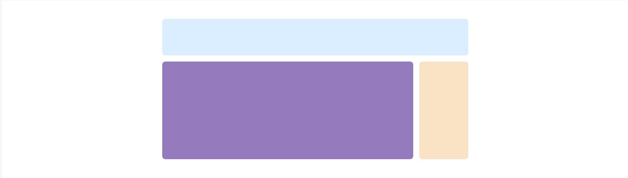
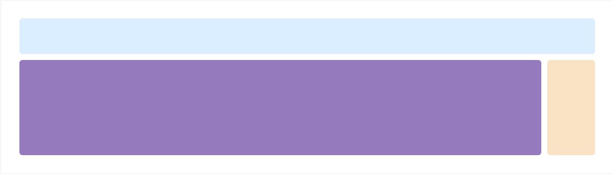
Skipping a bot forward I'll tell you the Bootstrap 4 framework uses the CRc structure to handle the page's content. If you're just starting this the abbreviation makes it easier to remember since you will probably sometimes wonder at first which element contains what. This come for Container – Row – Columns which is the structure Bootstrap framework utilizes for making the pages responsive. Each responsive web page consists of containers holding generally a single row with the needed number of columns inside it – all of them together forming a meaningful content block on page – like an article's heading or body, list of product's features and so on.
Let's take a look at a single content block – like some features of whatever being listed out on a page. First we need wrapping the whole thing into a .container it's sort of the mini canvas we'll place our content within. What the container does is limiting the width of the space we have available for placing our content. Containers are set to spread up to a specific width according the one of the viewport – always remaining a bit smaller leaving some free space aside. With the change of the viewport width and possible maximum width of the container element dynamically changes as well. There is another type of container - .container-fluid it always spreads the whole width of the given viewport – it's used for creating the so called full-width page layouts.
Next inside of our .container we should place a .row element. These are used for taking care of the alignment of the content elements we place inside. Since the latest alpha 6 version of the Bootstrap 4 framework utilizes a styling approach called flexbox with the row element now all kind of alignments ordering, distribution and sizing of the content can be achieved with just adding a simple class but this is a whole new story – for now do know this is the element it's done with.
Finally – inside the row we should place some .col- elements which are the actual columns holding our precious content. In the example of the features list – each feature gets placed in its own column. Columns are the ones which working along with the Row and the Container elements provide the responsive behavior of the page. What columns generally do is display inline down to a specific viewport width taking the specified fraction of it and stacking over each other when the viewport gets smaller filling the whole width available. So if the screen is wider you can see a few columns at a time but if it gets too small you'll see them one by one so you don't have to stare reading the content.
Basic configurations
Containers are probably the most standard layout element in Bootstrap and are required whenever operating default grid system. Select from a responsive, fixed-width container ( signifying its own max-width changes with each breakpoint) or maybe fluid-width (meaning it is certainly 100% wide constantly).
Even though containers may possibly be nested, a lot of layouts do not require a nested container.
<div class="container">
  <!-- Content here -->
</div>
Employ .container-fluid for a full size container, spanning the whole size of the viewport.
<div class="container-fluid">
  ...
</div>
Explore certain responsive breakpoints
Considering that Bootstrap is developed to be actually mobile first, we utilize a handful of media queries to produce sensible breakpoints for designs and user interfaces . These breakpoints are typically based on minimum viewport sizes and allow us to size up features just as the viewport modifications .
Bootstrap basically uses the following media query ranges - or breakpoints - in Sass files for style, grid system, and elements .
// Extra small devices (portrait phones, less than 576px)
// No media query since this is the default in Bootstrap

// Small devices (landscape phones, 576px and up)
@media (min-width: 576px)  ...

// Medium devices (tablets, 768px and up)
@media (min-width: 768px)  ...

// Large devices (desktops, 992px and up)
@media (min-width: 992px)  ...

// Extra large devices (large desktops, 1200px and up)
@media (min-width: 1200px)  ...
As we develop source CSS inside Sass, all of Bootstrap media queries are obtainable through Sass mixins:
@include media-breakpoint-up(xs)  ...
@include media-breakpoint-up(sm)  ...
@include media-breakpoint-up(md)  ...
@include media-breakpoint-up(lg)  ...
@include media-breakpoint-up(xl)  ...

// Example usage:
@include media-breakpoint-up(sm)
  .some-class
    display: block;
We from time to time apply media queries that go in the various other course (the presented display dimension or smaller):
// Extra small devices (portrait phones, less than 576px)
@media (max-width: 575px)  ...

// Small devices (landscape phones, less than 768px)
@media (max-width: 767px)  ...

// Medium devices (tablets, less than 992px)
@media (max-width: 991px)  ...

// Large devices (desktops, less than 1200px)
@media (max-width: 1199px)  ...

// Extra large devices (large desktops)
// No media query since the extra-large breakpoint has no upper bound on its width
Once again, these types of media queries are likewise obtainable by means of Sass mixins:
@include media-breakpoint-down(xs)  ...
@include media-breakpoint-down(sm)  ...
@include media-breakpoint-down(md)  ...
@include media-breakpoint-down(lg)  ...
There are also media queries and mixins for aim at a specific part of display sizes utilizing the lowest and maximum breakpoint widths.
// Extra small devices (portrait phones, less than 576px)
@media (max-width: 575px)  ...

// Small devices (landscape phones, 576px and up)
@media (min-width: 576px) and (max-width: 767px)  ...

// Medium devices (tablets, 768px and up)
@media (min-width: 768px) and (max-width: 991px)  ...

// Large devices (desktops, 992px and up)
@media (min-width: 992px) and (max-width: 1199px)  ...

// Extra large devices (large desktops, 1200px and up)
@media (min-width: 1200px)  ...
These media queries are at the same time readily available by means of Sass mixins:
@include media-breakpoint-only(xs)  ...
@include media-breakpoint-only(sm)  ...
@include media-breakpoint-only(md)  ...
@include media-breakpoint-only(lg)  ...
@include media-breakpoint-only(xl)  ...
In a similar way, media queries may possibly span various breakpoint sizes:
// Example
// Apply styles starting from medium devices and up to extra large devices
@media (min-width: 768px) and (max-width: 1199px)  ...
The Sass mixin for targeting the identical display screen size range would certainly be:
@include media-breakpoint-between(md, xl) ...Z-index
A variety of Bootstrap items incorporate z-index, the CSS property which helps command configuration simply by giving a third axis to arrange material. We apply a default z-index scale inside Bootstrap that's been created for appropriately level navigating, tooltips and popovers , modals, and far more.
We don't recommend customization of these types of values; you alter one, you probably must switch them all.
$zindex-dropdown-backdrop:  990 !default;
$zindex-navbar:            1000 !default;
$zindex-dropdown:          1000 !default;
$zindex-fixed:             1030 !default;
$zindex-sticky:            1030 !default;
$zindex-modal-backdrop:    1040 !default;
$zindex-modal:             1050 !default;
$zindex-popover:           1060 !default;
$zindex-tooltip:           1070 !default;
Background features - like the backdrops which make it possible for click-dismissing - often tend to reside on a low z-index-s, while navigating and popovers apply much higher z-index-s to assure they overlay bordering content.
One more recommendation
With the Bootstrap 4 framework you can set up to five different column appearances according to the predefined in the framework breakpoints but usually two to three are quite enough for obtaining best appearance on all screens.
Conclusions
So now hopefully you do have a basic idea what responsive web design and frameworks are and how the most popular of them the Bootstrap 4 framework handles the page content in order to make it display best in any screen – that's just a quick glimpse but It is believed that the understanding how the things work is the strongest foundation one should step on before digging into the details.
Look at several video guide about Bootstrap layout:
Connected topics:
Bootstrap layout main documents
A strategy in Bootstrap 4 to set a preferred configuration
Layout samples around Bootstrap 4