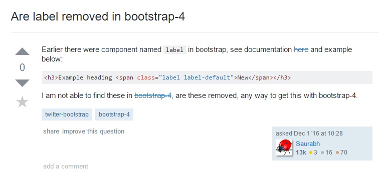
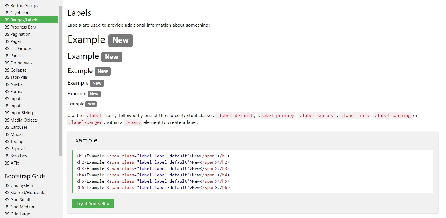
Bootstrap Label
Introduction
As discussed before, in the webpages that we are creating, we often need including simple or more complicated forms to ask the visitor for a point of view, feedback, some personal data or preferences. We do that including the appropriate controls inside of our forms carefully thinking about the form structure and the exact controls which should be used regarding the information we need and the particular case involved – like we can't have an order for a single colored phone case which is both white and blue, a person can't be both male and female in gender or a product should be accompanied with a multiple extras which do not exclude each other so clicking on each one should add it not excluding the others already selected.
Sometimes, of course, we do need a correct email provided or a phone number which in turn needs the input that should follow specific format in order to be correct and of course at particular cases we just need visitor's thoughts on a subject the way they feel it – in their own words.
For all these cases we use the appropriate controls – like radio buttons, checkboxes, input fields, text area elements and so on but there is an essential element bound to each one of these fields which makes our forms easily legible and comfortable for the visitor to navigate through knowing at all times what's needed and effortlessly handling even the small controls like radio buttons and checkboxes. Especially nowadays when the internet turns more and more mobile with the pages displayed on various small sized displays this element is crucial in providing productivity and speed in filling out our form. This element is a Bootstrap Label.
The best ways to use the Bootstrap label:
What so far has been said concerns the <label> element which is fully supported in the last version of the most popular mobile friendly framework – Bootstrap 4. The <label> element does not stand out with appealing appearance or multiple functionalities but it serves the probably most essential purpose in our forms – lets the users know what interacting with a particular form control will lead to and adding some clickable space for activating the control itself which in cases of small controls like radio or checkboxes and mobile device screens is essential.
The construction is pretty simple – just place a <label> element inside your markup assigning it the for =" ~ labeled form control ID ~ " attribute and write the appropriate text you need to be shown inside of it. The for="" attribute tells the browser which form control to get activated if the user clicks on the <label> element and can be omitted keeping the very same behavior if you just wrap the needed control inside the <label> itself. However wrapping form controls inside labels is rather complicating the code and it's better to omit it – additionally with the for ="" attribute you gain some freedom in designing your form's layout so it's the better way to go for.
Along with a plain text inside the <label> you can also place some simple HTML tags like a heading or a short paragraph maybe – that's not a common case but is possible and of course it all depends on the specific purpose of the form you're dealing with.
An example of form with no label
If you have no content within the <label>, the input is actually located just as you would certainly expect. It simply does work on non-inline checkboxes and radios. Remember to also give some form of label for assistive modern technologies ( for example, utilizing aria-label).
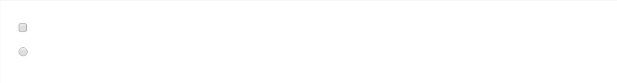
<div class="form-check">
  <label class="form-check-label">
    <input class="form-check-input" type="checkbox" id="blankCheckbox" value="option1" aria-label="...">
  </label>
</div>
<div class="form-check">
  <label class="form-check-label">
    <input class="form-check-input" type="radio" name="blankRadio" id="blankRadio1" value="option1" aria-label="...">
  </label>
</div>
Interesting thing to note
Interesting thing to note about labels in Bootstrap 4 is that in the new version of the framework this type of element's styling has been changed a bit. The <label> elements now are not displayed as inline-block which obtains better flexibility in placement allowing some margins to be set.
Conclusions
So now you know what the <label> elements are for and how they act in Bootstrap 4 – all that's left is thinking of the appropriate form fields you need to attach them to.
Take a look at several on-line video tutorials regarding Bootstrap label
Connected topics:
Usage of the label within in Bootstrap Forms: main documentation
Bootstrap label training
Taking away label in Bootstrap 4