Bootstrap Switch
Overview
Each day we spend almost equal time using the Internet on our computers and mobile devices. We got so used to them so even some common questions from the everyday conversations get transferred to the phone and receive their answers as we continue speaking to another real life person – like it is going to rain today or what time the movie starts. So the mobile devices with the comfort of carrying a bunch of answers in your pocket inevitably got a part of our life and along with this – their structured for providing easy touch navigating through the web and adjusting various settings on the device itself with similar to the real life objects graphical interface like the hardware switches styled switch controls.
These are actually just plain checkboxes under the hood but styling in a way closer to a real life hardware makes it much more comfortable and intuitive to use since there might possibly exist a person not knowing what the thick in a box means but there is almost none which have never turned the light flipping up the switch.
Effective ways to utilize the Bootstrap switch:
Since when something gets proven to be working in a sphere it often gets also transferred to a similar one, it's kind of natural from a while the need of implementing such switch appearance to the checkboxes in our regular HTML pages as well – of course in more or less limited cases when the overall design line comes along with this particular element.
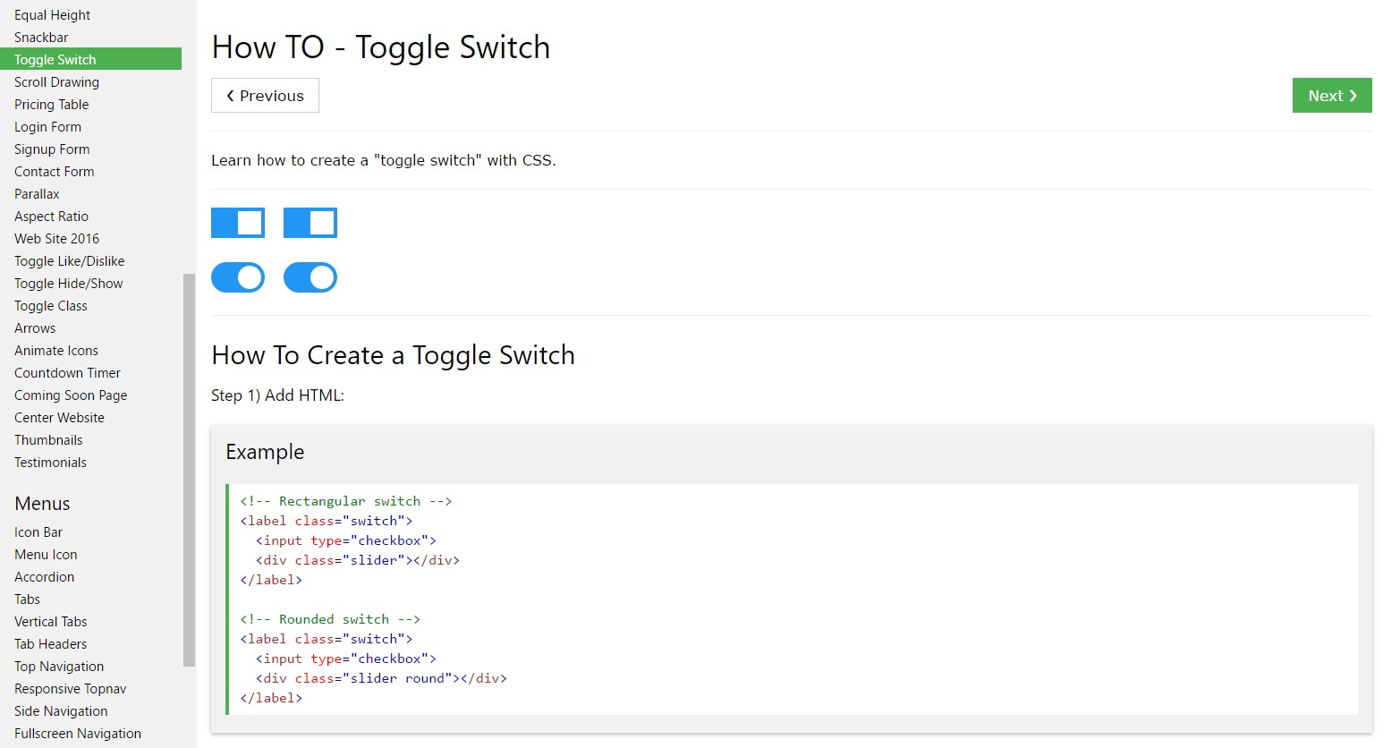
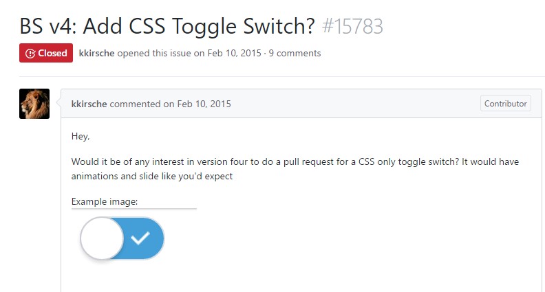
When it comes to the most popular framework for creating mobile friendly web pages – its fourth version which is still in alpha release will probably contain some native classes and scripts for doing this job but as far as knowned this is still in the to do list. However there are some useful third party plugins which can help you get this appearance easily. Additionally plenty of developers have provided their approaches as markup and styling examples around the net.
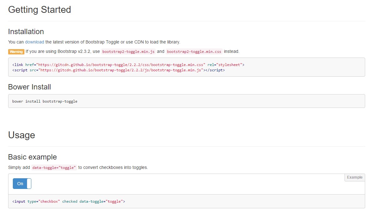
Over here we'll take a look at a third party plugin consisting of simple style sheet and a script file which is quite customizable, easy to use and most importantly – quite well documented and its page – full of clear example snippets you can use as a starting point for getting to know the plugin better and afterwards – achieving exactly what you had in mind for styling your form controls initially. But as always – it's a give and take game – just like the Bootstrap 4 framework itself you'll need to spend some time getting to know the thing, exploring its options before you finally decide of it's the one for you and how exactly to implement what you need with its help.
The plugin is called Bootstrap Toggle and dates back form the earliest versions of the Bootstrap framework growing along with them so in the main page http://www.bootstraptoggle.com you will also find some ancient history Bootstrap versions guidelines along with a download link to the styles heet and the script file needed for including the plugin in your projects. These files are also hosted on GitHub's CDN so if you decide you can also use the CDN links which are also provided.
Toggle states provided from Bootstrap switches
Add data-toggle="button" to toggle a button's active state. Supposing that you are simply pre-toggling a button, you need to manually put in the .active class and aria-pressed="true" to the <button>.

<button type="button" class="btn btn-primary" data-toggle="button" aria-pressed="false" autocomplete="off">
  Single toggle
</button>
Final thoughts
Generally it's a good idea including the style sheet link inside your pages <head> tag and the <script> - at the end of page's <body> to make them load just when the whole page has been read and displayed.
Examine a few video short training relating to Bootstrap Switch
Related topics:
Bootstrap Toggle Switch plugin

The best way to generate Toggle Switch

Adding CSS toggle switch within Bootstrap 4
