Bootstrap Select
Introduction
Bootstrap is the most popular framework for creating entirely responsive websites for the several few years now and it gets more and more powerful, easy to use and well thought with each new version trying to keep up with the web design trends and web designer’s needs. The new Bootstrap 4 version is even faster and easier to use than its predecessor which became the absolute favorite when it comes to mobile friendly. It is however still just a great thought set of styling rules and classes and not a magic wand capable of providing practically anything a web designer could possibly think of or a client could possibly need – no framework could ever do that.
That’s why in time various plugins get created in order to fill in the small gaps fulfilling the need of specific appearance and behavior in this rare cases when the main framework can’t do the job. This actually is a good approach since generally we only include the main framework files for best appearance and functionality and the plugins come in and get loaded by browser only when needed providing the optimal server load and speed for our pages.
Over here we’re going to take a glance at one of those plugins – the bootstrap-select. It provides a significant expansion to the default <select> element covering practically any way you could think of using it. It also comes with a great documentation, examples and even a CDN link so installing and using it is really a breeze.
Ways to use the Bootstrap select plugin:
The page you can get it from is https://silviomoreto.github.io/bootstrap-select/ and by scrolling it just a bot you can find the CDN links in case you decide not to self-host. Once you have linked it in your page you can easily get use of it assigning the class .selectpicker to a <select> element which gives the element a nice and smooth Bootstrap 4 appearace. The possible functionality is rather vast so we’ll try covering up some of the main features:
You can separate the possible options in the dropdown menu in a few groups – just wrap the <option> elements you need in a <optgroup> and assign an appropriate label= “ “ attribute which will appear as a title of the group;
A few options could be selected at the same time – a thick appears next to the ones you need in the page – if you need such behavior just add the multiple property to the .selectpicker element; To limit the number of possible selections also add data-max-options = “ ~ number of selections ~ ” property along with multiple so when the user exceeds the permitted number of selected options a message prompt will appear on each new select attempt.
Another cool feature is adding a convenient search box on the top of the dropdown – this way in cases of a really vast list of options the user can easily narrow the list down by just typing a few letters of the name of the needed one – the list automatically gets filtered. To get his functionality you need to assign the attribute data-live-search=”true” to the .selectpicker. Or you might want to limit the search to a predefined list of keywords for each option – to do that make sure you’ve also added the data-tokens=”keyword1 keyword2 keyword3” attribute to each <option> element you need to.
Final thoughts
These are just a few simple examples to give you the overall impression how you can get the things done – usually, by just adding a few words for custom attributes to the .selectpicker element and leaving the heavy lifting for the plugin itself. The good news - it’s really well documented including a detailed list of the most common uses and markup examples so it’s really easy and fast to get around.
Review several video clip tutorials relating to Bootstrap select plugin:
Connected topics:
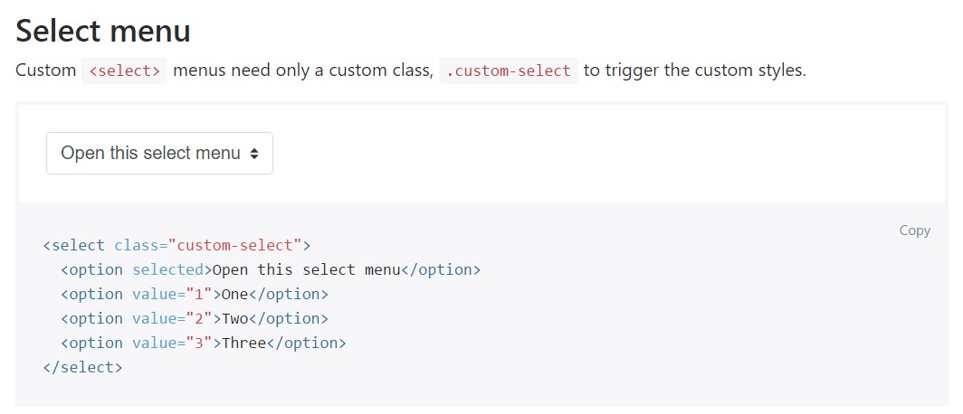
An example of the select menu

Select plugin difficulty

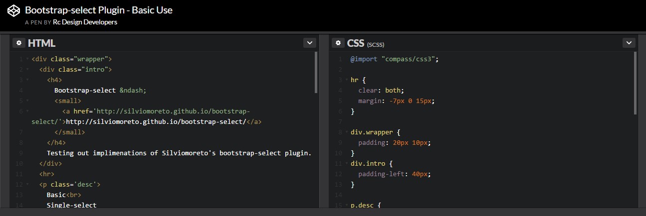
Practical utilization of the select plugin
