Bootstrap Media queries
Overview
As we talked before in the modern internet which gets browsed almost equally by mobile and desktop devices having your pages adjusting responsively to the screen they get displayed on is a must. That's why we have the powerful Bootstrap framework at our side in its latest fourth version – still in development up to alpha 6 released at this point.
But what is this thing under the hood which it actually uses to do the job – how the page's content gets reordered accordingly and what makes the columns caring the grid tier infixes like -sm- -md- and so on display inline down to a specific breakpoint and stack over below it? How the grid tiers actually work? This is what we're going to take a look at in this one.
Efficient ways to employ the Bootstrap media queries:
The responsive behavior of the most popular responsive framework in its latest fourth version gets to work thanks to the so called media queries. What they do is taking count of the width of the viewport – the screen of the device or the width of the browser window if the page gets displayed on desktop and applying different styling rules accordingly. So in common words they follow the simple logic – is the width above or below a certain value – and respectfully trigger on or off.
Each viewport size – like Small, Medium and so on has its own media query defined except for the Extra Small screen size which in the latest alpha 6 release has been applied universally and the -xs- infix – dropped so now instead of writing .col-xs-6 we just need to type .col-6 and get an element spreading half of the screen at any width.
The general syntax
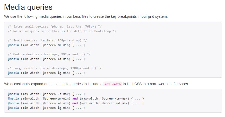
The general syntax of the media queries in the Bootstrap framework is @media (min-width: ~ breakpoint in pixels here ~) ~ some CSS rules to be applied ~ which narrows the CSS rules defined down to a specific viewport size but eventually the opposite query might be used like @media (max-width: ~ breakpoint in pixels here ~) ~ some CSS ~ which will apply up to reaching the specified breakpoint width and no further.
Another detail to bear in mind
Interesting thing to notice here is that the breakpoint values for the different screen sizes differ by a single pixel depending to the rule which has been used like:
Small screen sizes - ( min-width: 576px) and ( max-width: 575px),
Medium screen size - ( min-width: 768px) and ( max-width: 767px),
Large screen size - ( min-width: 992px) and ( max-width: 591px),
And Extra large screen sizes - ( min-width: 1200px) and ( max-width: 1199px),
Responsive media queries breakpoints
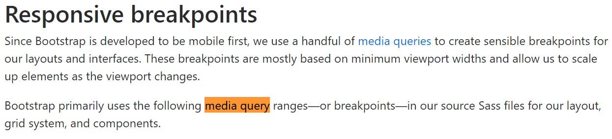
Due to the fact that Bootstrap is undoubtedly produced to become mobile first, we apply a small number of media queries to develop sensible breakpoints for user interfaces and layouts . These kinds of breakpoints are normally accordinged to minimal viewport widths as well as enable us to graduate up components when the viewport changes.
Bootstrap mainly makes use of the following media query ranges - or breakpoints - in source Sass documents for design, grid program, and elements.
// Extra small devices (portrait phones, less than 576px)
// No media query since this is the default in Bootstrap

// Small devices (landscape phones, 576px and up)
@media (min-width: 576px)  ...

// Medium devices (tablets, 768px and up)
@media (min-width: 768px)  ...

// Large devices (desktops, 992px and up)
@media (min-width: 992px)  ...

// Extra large devices (large desktops, 1200px and up)
@media (min-width: 1200px)  ...
Since we formulate source CSS in Sass, every media queries are really provided through Sass mixins:
@include media-breakpoint-up(xs)  ...
@include media-breakpoint-up(sm)  ...
@include media-breakpoint-up(md)  ...
@include media-breakpoint-up(lg)  ...
@include media-breakpoint-up(xl)  ...

// Example usage:
@include media-breakpoint-up(sm)
  .some-class
    display: block;
We periodically utilize media queries which work in the other direction (the given display dimension or smaller):
// Extra small devices (portrait phones, less than 576px)
@media (max-width: 575px)  ...

// Small devices (landscape phones, less than 768px)
@media (max-width: 767px)  ...

// Medium devices (tablets, less than 992px)
@media (max-width: 991px)  ...

// Large devices (desktops, less than 1200px)
@media (max-width: 1199px)  ...

// Extra large devices (large desktops)
// No media query since the extra-large breakpoint has no upper bound on its width
Again, such media queries are additionally attainable by means of Sass mixins:
@include media-breakpoint-down(xs)  ...
@include media-breakpoint-down(sm)  ...
@include media-breakpoint-down(md)  ...
@include media-breakpoint-down(lg)  ...
There are also media queries and mixins for targeting a single sector of screen dimensions employing the lowest and highest breakpoint widths.
// Extra small devices (portrait phones, less than 576px)
@media (max-width: 575px)  ...

// Small devices (landscape phones, 576px and up)
@media (min-width: 576px) and (max-width: 767px)  ...

// Medium devices (tablets, 768px and up)
@media (min-width: 768px) and (max-width: 991px)  ...

// Large devices (desktops, 992px and up)
@media (min-width: 992px) and (max-width: 1199px)  ...

// Extra large devices (large desktops, 1200px and up)
@media (min-width: 1200px)  ...
Such media queries are additionally readily available with Sass mixins:
@include media-breakpoint-only(xs)  ...
@include media-breakpoint-only(sm)  ...
@include media-breakpoint-only(md)  ...
@include media-breakpoint-only(lg)  ...
@include media-breakpoint-only(xl)  ...
Additionally, media queries may well cover numerous breakpoint sizes:
// Example
// Apply styles starting from medium devices and up to extra large devices
@media (min-width: 768px) and (max-width: 1199px)  ...
<code/>

The Sass mixin for aim at the similar screen dimension variety would be:

<code>
@include media-breakpoint-between(md, xl)  ...
Final thoughts
Do note once more – there is no -xs- infix and a @media query for the Extra small – less then 576px screen size – the rules for this one get universally applied and do trigger after the viewport gets narrower than this value and the wider viewport media queries go off.
This improvement is aiming to lighten up both the Bootstrap 4's style sheets and us as developers since it follows the natural logic of the way responsive content works stacking up after a certain point and with the dropping of the infix there will be less writing for us.
Take a look at a number of video clip tutorials regarding Bootstrap media queries:
Linked topics:
Media queries main information
Bootstrap 4: Responsive media queries breakpoints
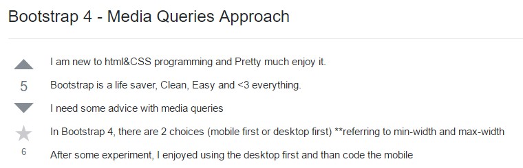
Bootstrap 4 - Media Queries Method