Bootstrap Modal Popup
Overview
Often, when we create our pages there is such content we don't want to take place on them until it's really needed by the visitors and when that time comes they should be able to just take a simple and intuitive action and get the needed info in a matter of minutes – fast, convenient and on any screen size. When this is the case the HTML5 has just the right element – the modal.
Critical things to keep in mind:
Before beginning with Bootstrap's modal element, ensure to check out the following for the reason that Bootstrap menu decisions have recently altered.
- Modals are constructed with HTML, CSS, and JavaScript. They are actually set up over everything else in the documentation and remove scroll from the <body> to ensure that modal content scrolls instead.
- Selecting the modal "backdrop" will instantly finalize the modal.
- Bootstrap typically supports one modal pane at once. Embedded modals usually aren't maintained while we consider them to remain poor user experiences.
- Modals usage position:fixed, which have the ability to sometimes be a bit specific regarding its rendering. When it is feasible, apply your modal HTML in a high-up setting to eliminate prospective intervention out of some other components. When nesting a.modal within another fixed element, you'll likely run into issues.
- One once more , due to position: fixed, certainly there are several cautions with putting into action modals on mobile products.
- In conclusion, the autofocus HTML attribute provides absolutely no impact within modals. Here's the ways you are able to achieve the exact same effect using custom JavaScript.
Keep viewing for demos and application suggestions.
- As a result of how HTML5 defines its own semantics, the autofocus HTML attribute comes with no effect in Bootstrap modals. To accomplish the very same effect, work with certain custom made JavaScript:
$('#myModal').on('shown.bs.modal', function ()
  $('#myInput').focus()
)
Tips on how to employ the Bootstrap Modal Popup:
Modals are fully supported in the latest fourth version of the most popular responsive framework – Bootstrap and can also be styled to display in different sizes according to designer's needs and vision but we'll get to this in just a minute. First let's see how to create one – step by step.
First of all we need a container to conveniently wrap our hidden content – to make one create a <div> element and assign the .modal and .fade classes to it. The second one is actually optional but recommended since it will add a subtle transition effect to the modal when it enters and leaves the scene. You need to add some attributes too – like an unique id=" ~the modal unique name ~ " and tabindex=" -1 " in order to take the modal element out of the switching focused elements hitting the Tab key game.
Inside a .modal-dialog element should take place and here is the place to select if you would want the modal to be rather large in size also assigning the .modal-lg class or you prefer it smaller with the .modal-sm class applied. This is purely optional and you can keep the modal's default size – somewhere in between.
Next we need a wrapper for the actual modal content carrying the .modal-content class – it's pretty much structured like the card element having a header with the .modal-header class and optionally – a close <button> with the class .close and data-dismiss="modal" property assigned to it. You should also wrap in a <span> inside this button a × element which will be standing for the actual X of the close button but will look a bit better.
Once the close button has all been set up next to it you could also add a heading for your pop-up content wrapped inside a <h1> - <h6> tag with the .modal-title class applied.
After adjusting the header it's time for creating a wrapper for the modal content – it should take place along with the header element and carry the .modal-body class. Inside of it you could just place some text or give your imagination some freedom with a bit more complicated markup – as long as you're using the Bootstrap framework classes and constructions any content you place inside of it will automatically adjust to fit modal's width.
Additionally you can create a .modal-footer element and place some more buttons in it – like calls to action or an extra close button – it should carry the data-dismiss="modal" property as the one from the header.
Now once the modal has been created it's time for setting up the element or elements which we are going to use to fire it up or in other words – make the modal appear in front of the viewers once they decide that they need the information carried inside it. This usually gets done with a <button> element carrying these two attributes - data-toggle = "modal" and data-target = " ~ the unique ID attribute of the modal element we need to fire ~ " It is very important the target attribute to match the ID if the modal we've just created else it will not fire upon clicking on the button.
Practices
.modal(options)
Triggers your content as a modal. Takes an alternative options object.
$('#myModal').modal(
  keyboard: false
)
.modal('toggle')
$('#myModal').modal('toggle').modal('show')
Manually opens a modal. Go back to the caller before the modal has actually been demonstrated (i.e. before the shown.bs.modal activity happens).
$('#myModal').modal('show').modal('hide')
Manually hides a modal. Returns to the caller right before the modal has really been covered (i.e. before the hidden.bs.modal event happens).
$('#myModal').modal('hide')Bootstrap modals activities
Bootstrap's modal class reveals a number of events for netting inside modal performance. All modal events are fired at the modal in itself (i.e. at the <div class="modal">).
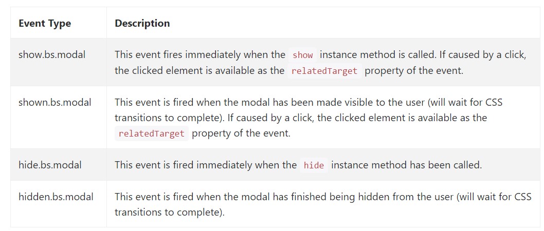
$('#myModal').on('hidden.bs.modal', function (e)
  // do something...
)
Conclusions
Basically that's all the essential points you should take care about when creating your pop-up modal element with the latest fourth version of the Bootstrap responsive framework – now go find something to hide inside it.
Examine a number of on-line video tutorials about Bootstrap Modal Popup:
Connected topics:
Bootstrap Modal Popup: formal documents
Bootstrap Modal Popup: guide short training
Another helpful article concerning Bootstrap Modal Popup