Bootstrap Pagination
Overview
An upward trend in the front-end world is the usage of CSS frameworks with base styles for our page. Instead of starting every project from scratch, creating every style in the hand, there are frameworks that already bring a whole built base from where we will start our application.
There are many options, but Bootstrap is perhaps the most famous. It was released as open source and the project has grown in maturity and importance in the market.
Bootstrap brings a number of features:
● Reset CSS
● Base visual style for most tags
● Icons
● Grids ready for use
● CSS Components
● JavaScript Plugins
● All responsive and mobile-first
As its name implies, it is a way to start the project soon with a basic design and features without wasting design time in the beginning.
Basic pagination concepts.
Whenever we have a page with many items to display, paging becomes necessary. We know that in the case of lists, such as displaying products in virtual stores or search results in systems, the need is not to display all items at once, but rather to organize them effectively, making them easier to access, faster and more usual pages.
Below are some good practices in the use of pagination, regardless of the technology used:
Pagination: an unneeded title.
When well designed, paging dispenses the title. That is, if you needed to write "Pagination" for the user, there is something wrong: consider redesigning it!
Good visibility and positioning
Paging is a complementary navigation and should have good positioning and good visibility. Use fonts with sizes and colors that follow the pattern of page usage, giving good visibility and positioning it right after the item listing ends.
Be simple.
Some paging tools offer advanced navigation features such as going straight to a specific page or advancing a certain number of pages at once. Although they are extra features, users are more accustomed to simple shapes and do better with conventional models.
Provide sorting options
A good and recommended feature is to provide sorting options to optimize their use.
Do not use subscript styles on the links
In paging tools, these features are unnecessary, since the links are obvious and the subscript style will just leave the visual loaded.
Provide good space for clickable areas
The larger the clickable area the more accessible the buttons become and therefore easier to use.
Give spaces between the links
Spacing from one button to another will make paging more comfortable and user-friendly, avoiding unwanted access.
Identify the current page and provide the basic navigation links
The paging function is to facilitate user navigation, so the tool should make it clear where the user is, where he has been and where he can go.
Provide basic navigation links such as "Previous Page" and "Next Page", always positioning them at the beginning and end.
Provide useful shortcuts and supplementary information
Links to the "first page" and "last page" are often useful, consider them if necessary!
Take advantage of a wrapping <nav> element to detect it as a navigation area to screen readers and various other assistive technologies.
In addition, as pages possibly have more than just one such navigation area, it's advisable to provide a detailed aria-label for the <nav> to demonstrate its purpose. If the pagination component is used to navigate between a set of search results, an appropriate label could be aria-label="Search results pages".
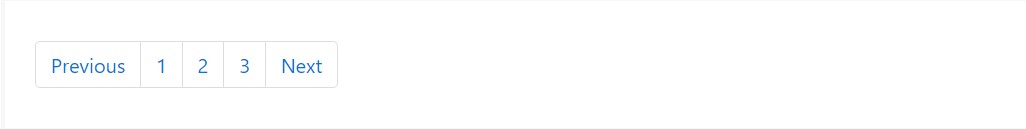
<nav aria-label="Page navigation example">
  <ul class="pagination">
    <li class="page-item"><a class="page-link" href="#">Previous</a></li>
    <li class="page-item"><a class="page-link" href="#">1</a></li>
    <li class="page-item"><a class="page-link" href="#">2</a></li>
    <li class="page-item"><a class="page-link" href="#">3</a></li>
    <li class="page-item"><a class="page-link" href="#">Next</a></li>
  </ul>
</nav>
Bootstrap Pagination
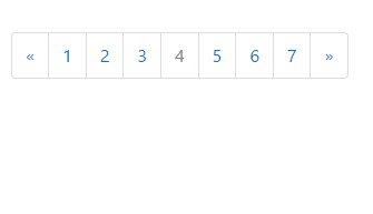
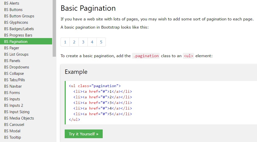
Basic Pagination
You may want to add some kind of pagination to each page if you have a site with many pages.
To create a basic pagination, add the .pagination class to an <ul> element.
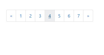
<nav>
<ul class="pagination">
<li class="page-item">
<a href="#" class="page-link" aria-label="Previous">
<span aria-hidden="true">«</span>
</a>
</li>
<li class="page-item"><a href="#" class="page-link">1</a></li>
<li class="page-item"><a href="#" class="page-link">2</a></li>
<li class="page-item"><a href="#" class="page-link">3</a></li>
<li class="page-item"><a href="#" class="page-link">4</a></li>
<li class="page-item"><a href="#" class="page-link">5</a></li>
<li class="page-item"><a href="#" class="page-link">6</a></li>
<li class="page-item"><a href="#" class="page-link">7</a></li>
<li class="page-item">
<a href="#" class="page-link" aria-label="Next">
<span aria-hidden="true">»</span>
</a>
</li>
</ul>
</nav>
Bootstrap 4 and Bootstrap 3 differences
Bootstrap 3 only requires the .pagination class.
Bootstrap 4, as well as the .pagination class, additionally demands the .page-item class to get put into each and every <li> element and .page-link to every <a> element.
Using icons
Trying to make use of an icon or symbol in place of content for a number of pagination links? Make sure to produce effective screen reader support with aria attributes and the .sr-only utility.
<nav aria-label="Page navigation example">
<ul class="pagination">
<li class="page-item">
<a class="page-link" href="#" aria-label="Previous">
<span aria-hidden="true">«</span>
<span class="sr-only">Previous</span>
</a>
</li>
<li class="page-item"><a class="page-link" href="#">1</a></li>
<li class="page-item"><a class="page-link" href="#">2</a></li>
<li class="page-item"><a class="page-link" href="#">3</a></li>
<li class="page-item">
<a class="page-link" href="#" aria-label="Next">
<span aria-hidden="true">»</span>
<span class="sr-only">Next</span>
</a>
</li>
</ul>
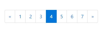
</nav>Active state
The active state shows what the current page is.
Add .active class so that the user knows which page he is.
<nav>
<ul class="pagination">
<li class="page-item">
<a href="#" class="page-link" aria-label="Previous">
<span aria-hidden="true">«</span>
</a>
</li>
<li class="page-item"><a href="#" class="page-link">1</a></li>
<li class="page-item"><a href="#" class="page-link">2</a></li>
<li class="page-item"><a href="#" class="page-link">3</a></li>
<li class="page-item active"><a href="#" class="page-link">4</a></li>
<li class="page-item"><a href="#" class="page-link">5</a></li>
<li class="page-item"><a href="#" class="page-link">6</a></li>
<li class="page-item"><a href="#" class="page-link">7</a></li>
<li class="page-item">
<a href="#" class="page-link" aria-label="Next">
<span aria-hidden="true">»</span>
</a>
</li>
</ul>
</nav>
Disabled State
A disabled link can not be clicked:
Add .disabled class if a link for some reason is disabled.
<nav>
<ul class="pagination">
<li class="page-item">
<a href="#" class="page-link" aria-label="Previous">
<span aria-hidden="true">«</span>
</a>
</li>
<li class="page-item"><a href="#" class="page-link">1</a></li>
<li class="page-item"><a href="#" class="page-link">2</a></li>
<li class="page-item"><a href="#" class="page-link">3</a></li>
<li class="page-item disabled"><a href="#" class="page-link">4</a></li>
<li class="page-item"><a href="#" class="page-link">5</a></li>
<li class="page-item"><a href="#" class="page-link">6</a></li>
<li class="page-item"><a href="#" class="page-link">7</a></li>
<li class="page-item">
<a href="#" class="page-link" aria-label="Next">
<span aria-hidden="true">»</span>
</a>
</li>
</ul>
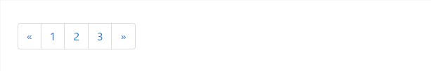
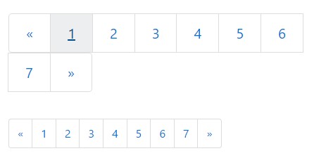
</nav>Pagination Sizing
Paging blocks can also be scaled to a larger or smaller size size.
Add .pagination-lg class to larger blocks or .pagination-sm to smaller blocks.
<nav>
<ul class="pagination pagination-lg">
<li class="page-item">
<a href="#" class="page-link" aria-label="Previous">
<span aria-hidden="true">«</span>
</a>
</li>
<li class="page-item"><a href="#" class="page-link">1</a></li>
<li class="page-item"><a href="#" class="page-link">2</a></li>
<li class="page-item"><a href="#" class="page-link">3</a></li>
<li class="page-item"><a href="#" class="page-link">4</a></li>
<li class="page-item"><a href="#" class="page-link">5</a></li>
<li class="page-item"><a href="#" class="page-link">6</a></li>
<li class="page-item"><a href="#" class="page-link">7</a></li>
<li class="page-item">
<a href="#" class="page-link" aria-label="Next">
<span aria-hidden="true">»</span>
</a>
</li>
</ul>
</nav>

<code>
<nav>
<ul class="pagination">
<li class="page-item">
<a href="#" class="page-link" aria-label="Previous">
<span aria-hidden="true">«</span>
</a>
</li>
<li class="page-item"><a href="#" class="page-link">1</a></li>
<li class="page-item"><a href="#" class="page-link">2</a></li>
<li class="page-item"><a href="#" class="page-link">3</a></li>
<li class="page-item"><a href="#" class="page-link">4</a></li>
<li class="page-item"><a href="#" class="page-link">5</a></li>
<li class="page-item"><a href="#" class="page-link">6</a></li>
<li class="page-item"><a href="#" class="page-link">7</a></li>
<li class="page-item">
<a href="#" class="page-link" aria-label="Next">
<span aria-hidden="true">»</span>
</a>
</li>
</ul>
</nav>
<nav>
<ul class="pagination pagination-sm">
<li class="page-item">
<a href="#" class="page-link" aria-label="Previous">
<span aria-hidden="true">«</span>
</a>
</li>
<li class="page-item"><a href="#" class="page-link">1</a></li>
<li class="page-item"><a href="#" class="page-link">2</a></li>
<li class="page-item"><a href="#" class="page-link">3</a></li>
<li class="page-item"><a href="#" class="page-link">4</a></li>
<li class="page-item"><a href="#" class="page-link">5</a></li>
<li class="page-item"><a href="#" class="page-link">6</a></li>
<li class="page-item"><a href="#" class="page-link">7</a></li>
<li class="page-item">
<a href="#" class="page-link" aria-label="Next">
<span aria-hidden="true">»</span>
</a>
</li>
</ul>
</nav>Switch the positioning of pagination parts using flexbox utilities.

<nav aria-label="Page navigation example">
  <ul class="pagination justify-content-center">
    <li class="page-item disabled">
      <a class="page-link" href="#" tabindex="-1">Previous</a>
    </li>
    <li class="page-item"><a class="page-link" href="#">1</a></li>
    <li class="page-item"><a class="page-link" href="#">2</a></li>
    <li class="page-item"><a class="page-link" href="#">3</a></li>
    <li class="page-item">
      <a class="page-link" href="#">Next</a>
    </li>
  </ul>
</nav>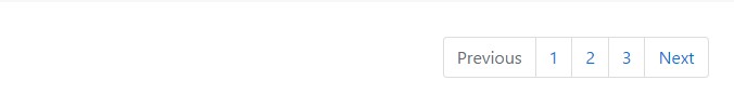
<nav aria-label="Page navigation example">
  <ul class="pagination justify-content-end">
    <li class="page-item disabled">
      <a class="page-link" href="#" tabindex="-1">Previous</a>
    </li>
    <li class="page-item"><a class="page-link" href="#">1</a></li>
    <li class="page-item"><a class="page-link" href="#">2</a></li>
    <li class="page-item"><a class="page-link" href="#">3</a></li>
    <li class="page-item">
      <a class="page-link" href="#">Next</a>
    </li>
  </ul>
</nav>
Review a number of online video short training relating to Bootstrap Pagination
Connected topics:
Bootstrap pagination: authoritative information
W3schools:Bootstrap pagination tutorial
Centering the pagination in Bootstrap