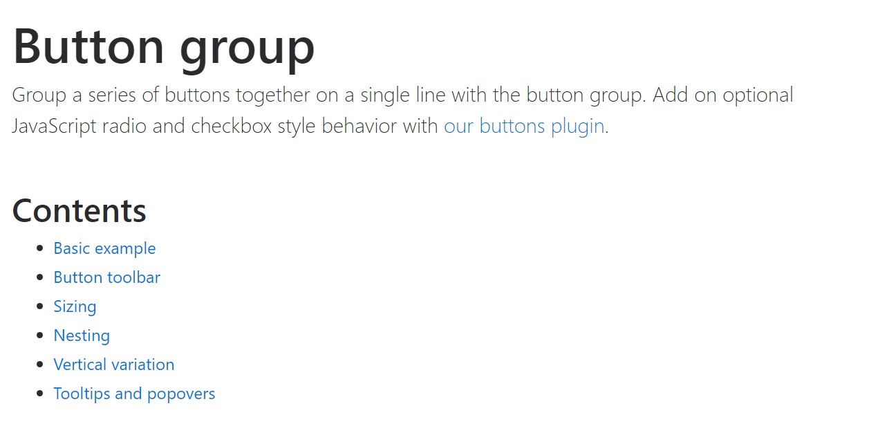
Bootstrap Button Group
Intro
In the webpages we create we often have a few possible options to present or a couple of actions which can be eventually taken concerning a particular item or a topic so it would be rather useful if they had an easy and convenient way styling the controls responsible for the user taking one path or another in a compact group with universal appearance and styling.
To take care of such cases the latest version of the Bootstrap framework – Bootstrap 4 has full support to the so called button groups which generally are exactly what the name states – groups of buttons wrapped as a single element with all the elements within looking pretty much the same so it's easy for the visitor to pick the right one and it's less bothering for the eye since there is no free space between the particular elements in the group – it appears as a single button bar with multiple options.
The ways to apply the Bootstrap button group:
Creating a button group is really simple – all you need is an element with the class .btn-group to wrap your buttons. This produces a horizontally aligned group of buttons – in case you're after a vertically stacked group use the .btn-group-vertical class instead.
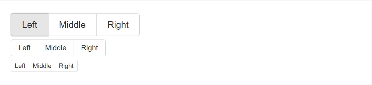
The size of the buttons within a group can be universally controlled so with assigning a single class to the whole group you can get either small or large buttons inside it – just add .btn-group-sm for small or .btn-group-lg class to the .btn-group element and all the buttons inside will take the defined sizing. Unlike the previous version you can't tell the buttons in the group to display extra small since the .btn-group-xs class in no longer supported by the Bootstrap 4 framework.
You can eventually combine a few button groups into a toolbar just wrapping them inside a .btn-toolbar element or nest a group inside another in order to insert a dropdown element inside the child button group.
Simple instance
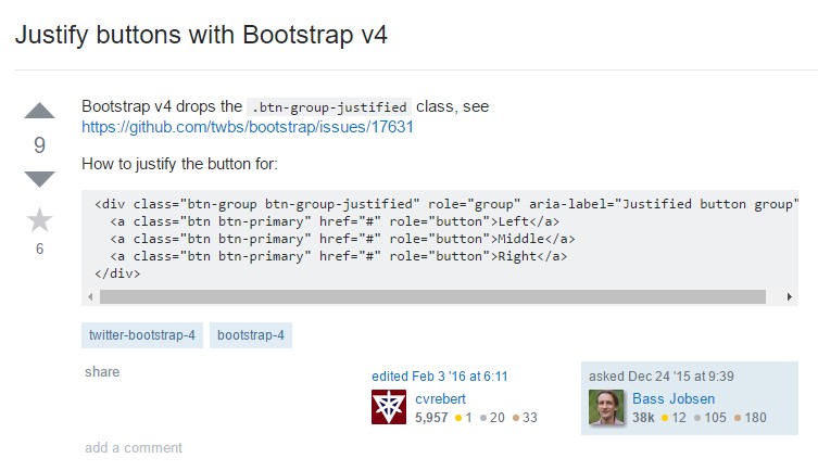
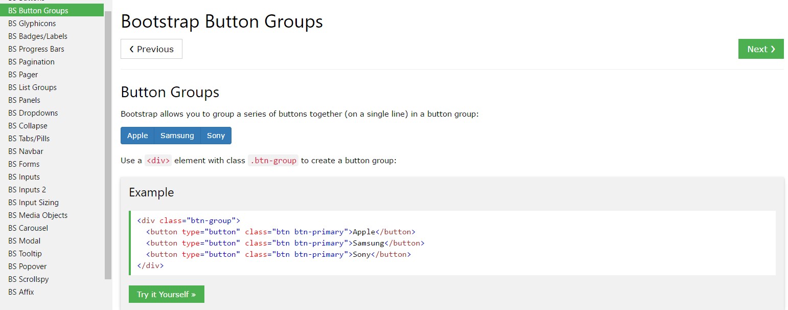
Wrap a group of buttons using .btn within .btn-group.
<div class="btn-group" role="group" aria-label="Basic example">
  <button type="button" class="btn btn-secondary">Left</button>
  <button type="button" class="btn btn-secondary">Middle</button>
  <button type="button" class="btn btn-secondary">Right</button>
</div>
Instance of the Button Toolbar
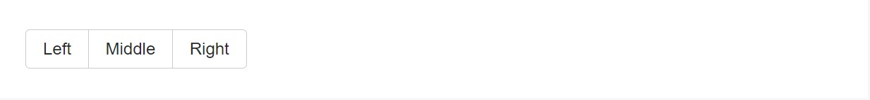
Integrate packs of button groups inside button toolbars for more complicated elements. Use utility classes functioning as demanded to space out groups, tabs, and even more.

<div class="btn-toolbar" role="toolbar" aria-label="Toolbar with button groups">
  <div class="btn-group mr-2" role="group" aria-label="First group">
    <button type="button" class="btn btn-secondary">1</button>
    <button type="button" class="btn btn-secondary">2</button>
    <button type="button" class="btn btn-secondary">3</button>
    <button type="button" class="btn btn-secondary">4</button>
  </div>
  <div class="btn-group mr-2" role="group" aria-label="Second group">
    <button type="button" class="btn btn-secondary">5</button>
    <button type="button" class="btn btn-secondary">6</button>
    <button type="button" class="btn btn-secondary">7</button>
  </div>
  <div class="btn-group" role="group" aria-label="Third group">
    <button type="button" class="btn btn-secondary">8</button>
  </div>
</div>
Feel free to mixture input groups with button groups in your toolbars. Much like the example aforementioned, you'll very likely demand some utilities though to space items correctly.
<div class="btn-toolbar mb-3" role="toolbar" aria-label="Toolbar with button groups">
  <div class="btn-group mr-2" role="group" aria-label="First group">
    <button type="button" class="btn btn-secondary">1</button>
    <button type="button" class="btn btn-secondary">2</button>
    <button type="button" class="btn btn-secondary">3</button>
    <button type="button" class="btn btn-secondary">4</button>
  </div>
  <div class="input-group">
    <span class="input-group-addon" id="btnGroupAddon">@</span>
    <input type="text" class="form-control" placeholder="Input group example" aria-describedby="btnGroupAddon">
  </div>
</div>

<div class="btn-toolbar justify-content-between" role="toolbar" aria-label="Toolbar with button groups">
  <div class="btn-group" role="group" aria-label="First group">
    <button type="button" class="btn btn-secondary">1</button>
    <button type="button" class="btn btn-secondary">2</button>
    <button type="button" class="btn btn-secondary">3</button>
    <button type="button" class="btn btn-secondary">4</button>
  </div>
  <div class="input-group">
    <span class="input-group-addon" id="btnGroupAddon2">@</span>
    <input type="text" class="form-control" placeholder="Input group example" aria-describedby="btnGroupAddon2">
  </div>
</div>
Measurements
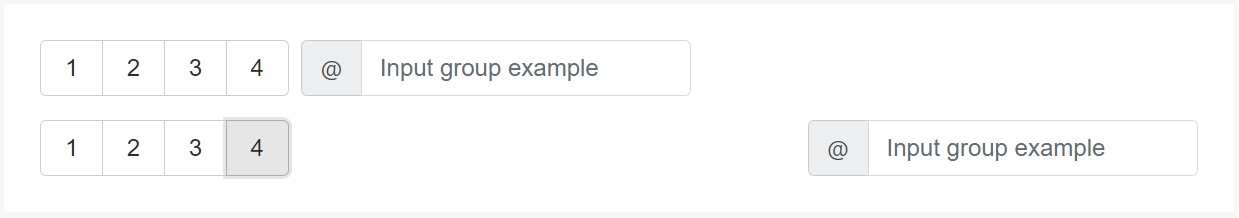
As opposed to applying button sizing classes to every button inside a group, simply just add .btn-group-* to each and every .btn-group, featuring every one when nesting numerous groups
<div class="btn-group btn-group-lg" role="group" aria-label="...">...</div>
<div class="btn-group" role="group" aria-label="...">...</div>
<div class="btn-group btn-group-sm" role="group" aria-label="...">...</div>
Nesting
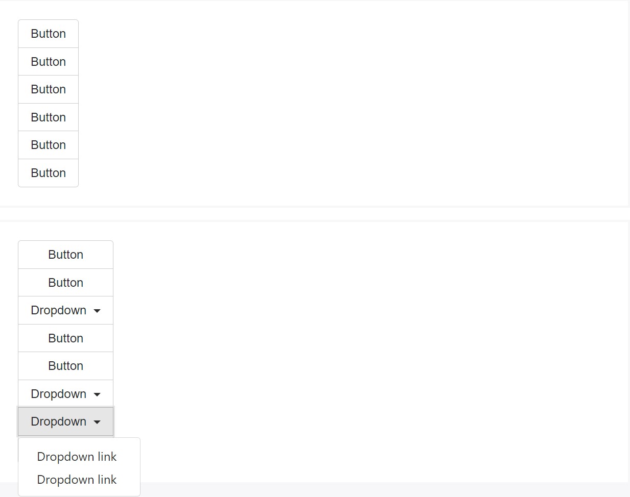
Install a .btn-group within an additional .btn-group once you wish dropdown menus combined with a series of buttons.
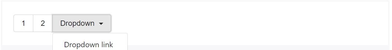
<div class="btn-group" role="group" aria-label="Button group with nested dropdown">
  <button type="button" class="btn btn-secondary">1</button>
  <button type="button" class="btn btn-secondary">2</button>

  <div class="btn-group" role="group">
    <button id="btnGroupDrop1" type="button" class="btn btn-secondary dropdown-toggle" data-toggle="dropdown" aria-haspopup="true" aria-expanded="false">
      Dropdown
    </button>
    <div class="dropdown-menu" aria-labelledby="btnGroupDrop1">
      <a class="dropdown-item" href="#">Dropdown link</a>
      <a class="dropdown-item" href="#">Dropdown link</a>
    </div>
  </div>
</div>
Vertical alternative
Develop a set of buttons show up upright loaded instead of horizontally. Split button dropdowns are not really maintained here.
<div class="btn-group-vertical">
  ...
</div>
Popovers and Tooltips
Due to the certain execution ( plus a few other components), a piece of unique casing is demanded for tooltips as well as popovers within button groups. You'll need to point out the option container: 'body' to keep away from unwanted secondary effects ( like the component expanding larger and/or losing its own round edges the moment the tooltip or else popover is caused).
Yet another thing to take note of
In order to get a dropdown button inside a .btn-group create another element carrying the same class inside it and wrap it around a <button> with the
.dropdown-toggle class, data-toggle="dropdown" and type="button" attributes. Next along with this <button> place a <div> with the class .dropdown-menu and create the links of your dropdown inside it making sure you have assigned the .dropdown-item class to each one of them. That's the easy and fast way creating a dropdown inside a button group. Optionally you can create a split dropdown following the same routine just placing one more regular button before the .dropdown-toggle element and clearing out the text inside of it so only the tiny triangle arrow remains.
Final thoughts
Basically that's the way the buttons groups get created with the help of the most popular mobile friendly framework in its latest version – Bootstrap 4. These can be quite useful not only showcasing a few possible options or a paths to take but also as a secondary navigation items taking place at particular places of your page having consistent appearance ad easing up the navigation and overall user appearance.
Look at a few youtube video tutorials relating to Bootstrap button groups:
Linked topics:
Bootstrap button group formal documents
Bootstrap button group short training
Establish buttons by Bootstrap v4