Bootstrap Breakpoints
Intro
Taking in consideration all the possible screen widths in which our web pages could eventually display it is essential to compose them in a way granting universal clear and powerful appearance – usually using the help of a powerful responsive framework like the most popular one – the Bootstrap framework which latest version is now 4 alpha 6. But what it actually does to help the pages appear great on any screen – let's take a look and see.
The main principle in Bootstrap in general is putting some order in the endless possible device screen widths (or viewports ) placing them into a few ranges and styling/rearranging the content accordingly. These are also called grid tiers or screen sizes and have evolved quite a bit through the various versions of the most popular lately responsive framework around – Bootstrap 4.
The ways to utilize the Bootstrap breakpoints:
Generally the media queries get defined with the following syntax @media ( ~screen size condition ~) ~ styling rules to get applied if the condition is met ~ The conditions can limit one end of the interval like min-width: 768px of both of them like @media (min-width: 768px) and (min-width: 991px) ~ some styling here ~ - while the viewport width in within or equal to the values in the conditions the rule applies.
Since media queries are part of the CSS language there can be more than one query for a single viewport width – if so the one being read by the browser last has the word – just like regular CSS rules.
Contrasts of Bootstrap versions
In Bootstrap 4 unlike its predecessor there are 5 screen widths but since the latest alpha 6 build – only 4 media query groups – we'll get back to this in just a sec. As you probably know a .row in bootstrap contains column elements holding the actual page content which can span up to 12/12's of the visible width available – this is oversimplifying but it's another thing we're talking about here. Each column element get defined by one of the column classes consisting of .col - for column, screen size infixes defining down to which screen size the content will remain inline and will span the whole horizontal width below and a number showing how many columns will the element span when in its screen size or above.
Screen proportions
The screen sizes in Bootstrap generally utilize the min-width condition and come as follows:
Extra small – widths under 576px –This screen actually doesn't have a media query but the styling for it rather gets applied as a common rules getting overwritten by the queries for the widths above. What's also new in Bootstrap 4 alpha 6 is it actually doesn't use any size infix – so the column layout classes for this screen size get defined like col-6 - such element for example will span half width no matter the viewport.
Small screens – uses @media (min-width: 576px) ... and the -sm- infix. For example element having .col-sm-6 class will span half width on viewports 576px and wider and full width below.
Medium screens – uses @media (min-width: 768px) ... and the -md- infix. For example element having .col-md-6 class will span half width on viewports 768px and wider and full width below – you've probably got the drill already.
Large screens - uses @media (min-width: 992px) ... and the -lg- infix.
And finally – extra-large screens - @media (min-width: 1200px) ... – the infix here is -xl-
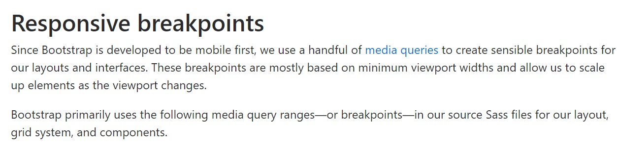
Responsive breakpoints
Given that Bootstrap is certainly built to get mobile first, we utilize a small number of media queries to generate sensible breakpoints for layouts and user interfaces . These types of breakpoints are typically depended on minimum viewport sizes and allow us to size up elements when the viewport changes.
Bootstrap mostly makes use of the following media query extends-- or breakpoints-- in source Sass documents for style, grid structure, and elements.
// Extra small devices (portrait phones, less than 576px)
// No media query since this is the default in Bootstrap

// Small devices (landscape phones, 576px and up)
@media (min-width: 576px)  ...

// Medium devices (tablets, 768px and up)
@media (min-width: 768px)  ...

// Large devices (desktops, 992px and up)
@media (min-width: 992px)  ...

// Extra large devices (large desktops, 1200px and up)
@media (min-width: 1200px)  ...
Since we compose source CSS in Sass, all of media queries are simply accessible by means of Sass mixins:
@include media-breakpoint-up(xs)  ...
@include media-breakpoint-up(sm)  ...
@include media-breakpoint-up(md)  ...
@include media-breakpoint-up(lg)  ...
@include media-breakpoint-up(xl)  ...

// Example usage:
@include media-breakpoint-up(sm)
  .some-class
    display: block;
We in some cases operate media queries that go the other path (the offered display scale or smaller sized):
// Extra small devices (portrait phones, less than 576px)
@media (max-width: 575px)  ...

// Small devices (landscape phones, less than 768px)
@media (max-width: 767px)  ...

// Medium devices (tablets, less than 992px)
@media (max-width: 991px)  ...

// Large devices (desktops, less than 1200px)
@media (max-width: 1199px)  ...

// Extra large devices (large desktops)
// No media query since the extra-large breakpoint has no upper bound on its width
Once again, these particular media queries are as well accessible with Sass mixins:
@include media-breakpoint-down(xs)  ...
@include media-breakpoint-down(sm)  ...
@include media-breakpoint-down(md)  ...
@include media-breakpoint-down(lg)  ...
There are likewise media queries and mixins to aim a specific sector of display sizes applying the minimum and maximum breakpoint widths.
// Extra small devices (portrait phones, less than 576px)
@media (max-width: 575px)  ...

// Small devices (landscape phones, 576px and up)
@media (min-width: 576px) and (max-width: 767px)  ...

// Medium devices (tablets, 768px and up)
@media (min-width: 768px) and (max-width: 991px)  ...

// Large devices (desktops, 992px and up)
@media (min-width: 992px) and (max-width: 1199px)  ...

// Extra large devices (large desktops, 1200px and up)
@media (min-width: 1200px)  ...
These kinds of media queries are also readily available with Sass mixins:
@include media-breakpoint-only(xs)  ...
@include media-breakpoint-only(sm)  ...
@include media-breakpoint-only(md)  ...
@include media-breakpoint-only(lg)  ...
@include media-breakpoint-only(xl)  ...
Similarly, media queries may cover various breakpoint sizes:
// Example
// Apply styles starting from medium devices and up to extra large devices
@media (min-width: 768px) and (max-width: 1199px)...
The Sass mixin for aim at the exact same display size selection would be:
@include media-breakpoint-between(md, xl)...Conclusions
Along with defining the width of the page's elements the media queries take place all around the Bootstrap framework generally getting defined by it - ~screen size ~ infixes. Whatever this class is doing it's doing it down to the screen width they are referring.
Check out several online video short training relating to Bootstrap breakpoints:
Related topics:
Bootstrap breakpoints authoritative information"
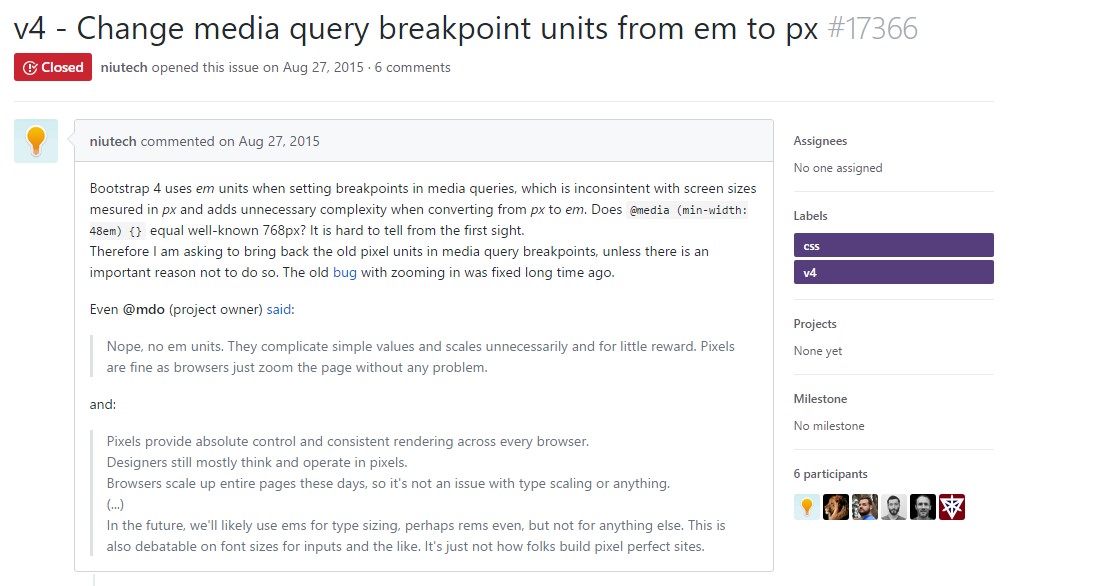
Bootstrap Breakpoints difficulty
Transform media query breakpoint units from em to px