Bootstrap Sidebar
Overview
In most of the pages we recently see the content spreads from edge to edge in width with a convenient navigation bar above and just easily gets resized once the defined viewport is reached so more or less the showcased content fluently utilizes the whole width of the page available. However at a certain occasions the desired purpose the pages need to serve require along with the fluently resizing content area another part of the available screen width to get assigned to a still vertical element with some links and content inside it – in other words – the well-known from the past sidebar element is needed.
Steps to make use of the Bootstrap sidebar:
This is rather outdated approach but if you really need to – you can create a sidebar element with the Bootstrap 4 framework which along with its flexible grid system also provide a few classes designed especially for creating a secondary level navigation menus being docked along the page.
But let’s start it simple – by just nesting some rows and columns – It is supposed this might be the easiest way. And by nesting It means you can gave a .row element placed inside a column one – it generally acts the very same way except for the available columns in a single line limitation – if you nest a row inside a column you can have up to the column’s width spanning inner columns inside it before they wrap to a new line.
So let’s say we need a right aligned sidebar with some content inside it and a main page to the left of it. We need to set the grid tier down to which we want to keep this alignment before the sidebar and the main content stack over each other – let’s say – medium and up. So a possible way achieving this might be this:
First we need a container element to hold the rows and columns and since we’re designing something a bit more complex the .container-fluid class might be the right one to assign it to – this way it will always spread over the whole visible width available. Next we need a .row to wrap the main structure into which in our case would be a wide column for the content and a smaller – for the sidebar – let’s say we’ll separate the width in 9 by 3 columns in width. So the first column element should carry .col-md-9 and the second one - .col-md-3 class applied.
Next inside these columns we can just create some extra .row elements and fill them up with some content creating first the main page and after it – the contents of the sidebar just like two smaller pages laid out side by side.
A few additional tips
Additionally in case you need to create a sidebar navigation menu along with the desired .col-* class you can assign it the .sidebar class and wrap the page’s main content into a <main> element applying it the rest width with a .col-* class and appropriate offset equal to the sidebar’s width to make the nicely display side by side.
Look at a few youtube video training about Bootstrap sidebar
Related topics:
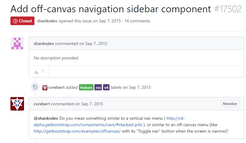
Add in off-canvas navigation sidebar element
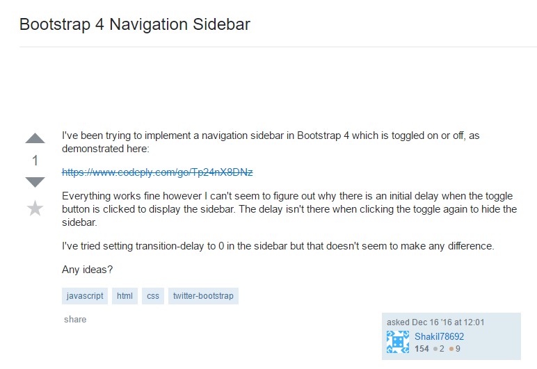
Stackoverflow: Bootstrap 4 Navigation Sidebar
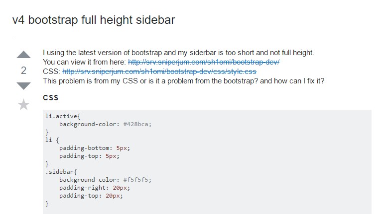
V4 Bootstrap entire height sidebar