Bootstrap Panel
Overview
Often we need to separate a few short ( or not so much ) parts of information in order to make them stand up and get the visitor’s attention – like listing some useful features, presenting a list of articles with a short abstract and a single powerful image and so on and on. So we need convenient tool to beautifully wrap our content in a beautiful and responsive way to have it nice and tidy presented on our pages. In the last version of the most popular responsive framework – Bootstrap 3 we used mostly the panel, thumbnail and well elements providing us box containers with a subtle border, slightly rounded corners and eventually – a light 3d effect. In the latest Bootstrap 4 framework these are no more. They get got replaced altogether by the card element claiming to be capable of nearly everything the veterans could do but only better. So it’s time to get to know it better.
Ways to apply the Bootstrap Panel:
The cards are lightly styled containers capable of carrying practically any HTML content within also having a lot of predefined styling option for properly showcasing its content. It also optionally could have a header and a footer.
In order to create a card we first need a .card element to wrap the whole thing up. Inside it separate wrappers for the header .card-header, the actual card content .card-block and the footer .card-footer should take place and while the header and footer are rather optional and can be omitted if you don’t need them the .card-block is the essential part – it nicely wraps your content providing some subtle padding around.
Inside the .card-block element you could have a title carrying the class .card-title which can be assigned to theh1–h6 elements as well as to a regular <div> and of course – come text wrapped in a paragraph with the .card-text class. If you decide to insert some links along – assign them the .card-link class to have them nicely separated for better user interaction.
The contextual color classes can be used to further style your whole card elements easily – just assign a .card- ~one of the contextual colors here like primary, success, info or danger here ~ to the main .card wrapper and if the background gets a bit too dark for the text to be legible enough – also add the .card-inverse class to invert the text color. You can also style only the border color using the contextual palette – this gets done by assigning the .card-outline- ~the needed color~ class again to the main .card element.
As mentioned above the .card-block comes to wrap the content leaving a pretty padding around it. But when it comes to images this might want to avoid this and have the image spread the whole width of the element. To get hits appearance just place the <div class="img"><img></div> tag outside the .card-block so you avoid the paddings eventually adding style=” width:100%; ” to make sure it will resize properly always filling in its container. There are a few quite useful alignment classes as well like .card-img-top and .card-img-bottom aligning the image at the top or the bottom of the card. And if you want to place it somewhere in between the text just break the .card-block, insert the image and start a new .card-block to insert the content you need placed after the image – multiple card blocks are supported. Eventually you might also want to add some text over the image – wrap it inside a <div> carrying the .img-overlay class.
A few words about the layout – cards will fill the whole horizontal space available by default so it’s a good idea limiting this by placing them inside some grid elements. This way you can obtain their predictable behavior.
Some example
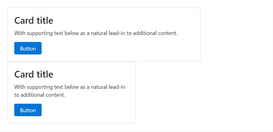
Cards are built with as little markup and styles as possible, but still handle to present a lot of management and modification. Designed with flexbox, they present easy alignment and mix properly with other Bootstrap parts.
Beneath is an illustration of a fundamental card with combined content and a specified width. Cards have no certain width to start, so they'll naturally complete the whole width of its parent element. This is smoothly modified with many sizing possibilities.
<div class="card" style="width: 20rem;">
  <div class="img"><img class="card-img-top" src="..." alt="Card picture caption"></div>
  <div class="card-block">
    <h4 class="card-title">Card caption</h4>
    <p class="card-text">Some fast sample message to build on the card title as well as compose the bulk of the card's material.</p>
    <a href="#" class="btn btn-primary">Go somewhere</a>
  </div>
</div>
Web content kinds
Cards maintain a large selection of content, involving pics, text message, list groups, hyperlinks, and more. Listed below are samples of what's supported.
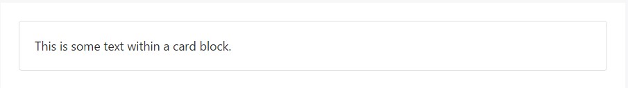
Blocks
The building block of a card is the .card-block. Use it whenever you demand a padded section in a card.
<div class="card">
  <div class="card-block">
    This is some message in a card block.
  </div>
</div>
Names, message, and links
Subtitles are used by putting a .card-subtitle to a <h*> tag. If the .card-title and the .card-subtitle items are inserted in a .card-block item, the card title and subtitle are aligned well.
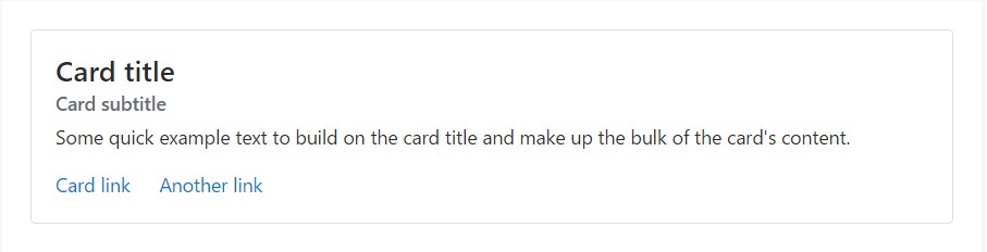
<div class="card">
  <div class="card-block">
    <h4 class="card-title">Card title</h4>
    <h6 class="card-subtitle mb-2 text-muted">Card subtitle</h6>
    <p class="card-text">Some fast example message to improve the card title and compose the mass of the card's content.</p>
    <a href="#" class="card-link">Card link</a>
    <a href="#" class="card-link">Another link</a>
  </div>
</div>
Illustrations
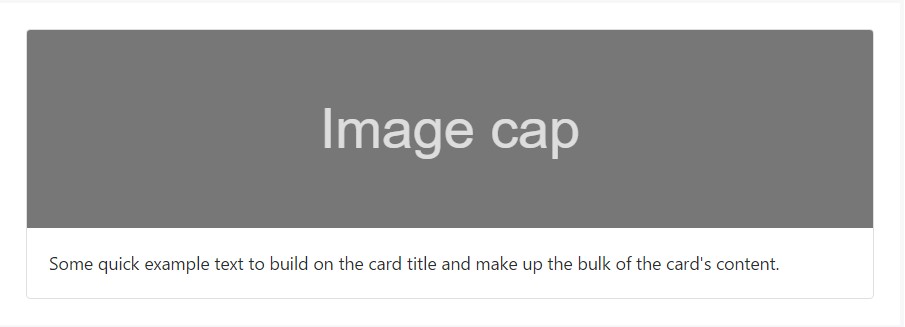
.card-img-top spots a pic to the top of the card. With .card-text, text is put on the card. Text within .card-text may also be styled with the standard HTML tags.
<div class="card">
  <div class="img"><img class="card-img-top" src="..." alt="Card picture cap"></div>
  <div class="card-block">
    <p class="card-text">Some fast example message to build on the card title and also compose the bulk of the card's web content.</p>
  </div>
</div>
Listing groups
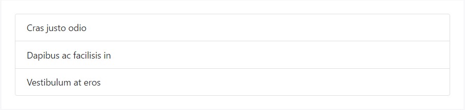
Generate lists of the content in a card by a flush list group.
<div class="card">
<ul class="list-group list-group-flush">
<li class="list-group-item">Cras justo odio</li>
<li class="list-group-item">Dapibus ac facilisis in</li>
<li class="list-group-item">Vestibulum at eros</li>
</ul>
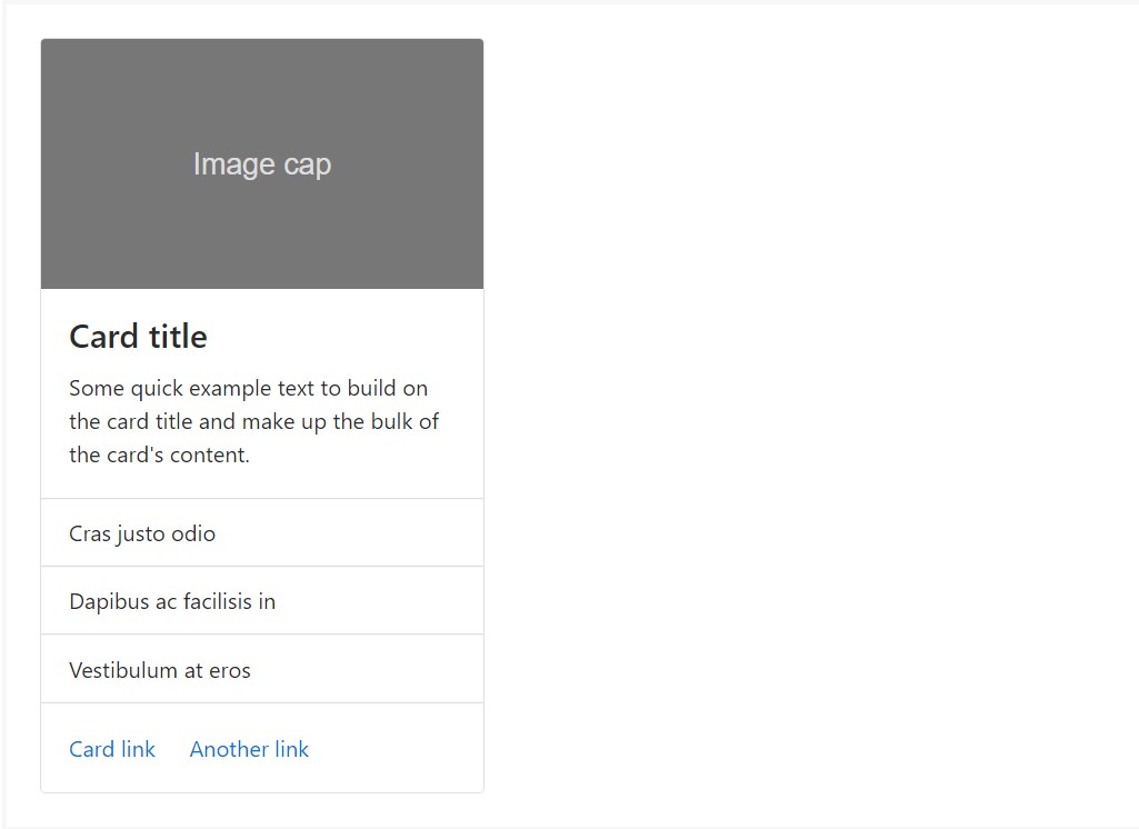
</div>Mix up and match various content kinds to generate the card you wish, or toss everything in there. Displayed here are picture formats, blocks, message styles, and a list group - all wrapped in a fixed-width card.
<div class="card" style="width: 20rem;">
  <div class="img"><img class="card-img-top" src="..." alt="Card image cap"></div>
  <div class="card-block">
    <h4 class="card-title">Card title</h4>
    <p class="card-text">Some quick example text to build on the card title and make up the bulk of the card's content.</p>
  </div>
  <ul class="list-group list-group-flush">
    <li class="list-group-item">Cras justo odio</li>
    <li class="list-group-item">Dapibus ac facilisis in</li>
    <li class="list-group-item">Vestibulum at eros</li>
  </ul>
  <div class="card-block">
    <a href="#" class="card-link">Card link</a>
    <a href="#" class="card-link">Another link</a>
  </div>
</div>
Header and footer
Add an optional header and/or footer inside a card.
<div class="card">
<div class="card-header">
Featured
</div>
<div class="card-block">
<h4 class="card-title">Unique title therapy</h4>
<p class="card-text">With supporting message below as an all-natural lead-in to extra content.</p>
<a href="#" class="btn btn-primary">Go someplace</a>
</div>
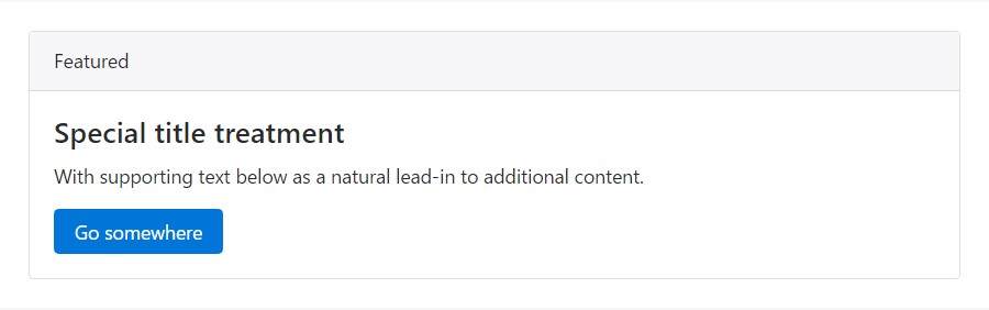
</div>Card headers can be styled by including .card-header to <h*> sections.
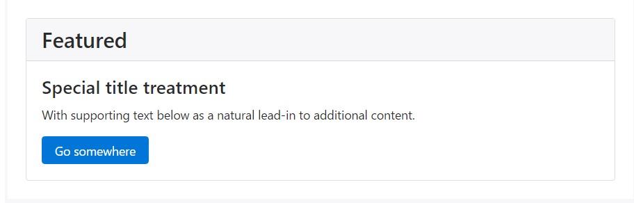
<div class="card">
  <h3 class="card-header">Featured</h3>
  <div class="card-block">
    <h4 class="card-title">Special title treatment</h4>
    <p class="card-text">With supporting message below as a natural lead-in to extra content.</p>
    <a href="#" class="btn btn-primary">Go someplace</a>
  </div>
</div>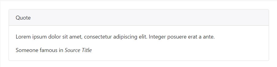
<div class="card">
  <div class="card-header">
    Quote
  </div>
  <div class="card-block">
    <blockquote class="card-blockquote">
      <p>Lorem ipsum dolor sit amet, consectetur adipiscing elit. Integer posuere erat a ante.</p>
      <footer>Someone famous in <cite title="Source Title">Source Title</cite></footer>
    </blockquote>
  </div>
</div>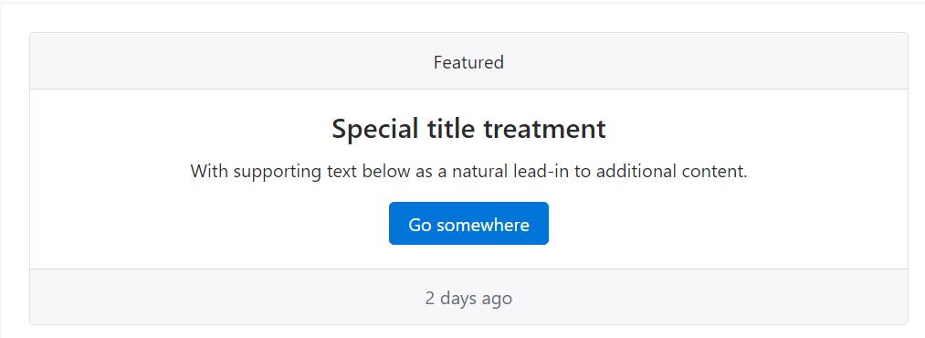
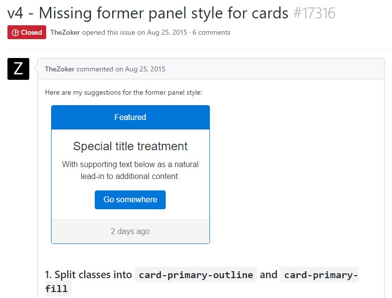
<div class="card text-center">
<div class="card-header">
Featured
</div>
<div class="card-block">
<h4 class="card-title">Special title treatment</h4>
<p class="card-text">With supporting text below as an all-natural lead-in to extra material.</p>
<a href="#" class="btn btn-primary">Go someplace</a>
</div>
<div class="card-footer text-muted">
2 days ago
</div>
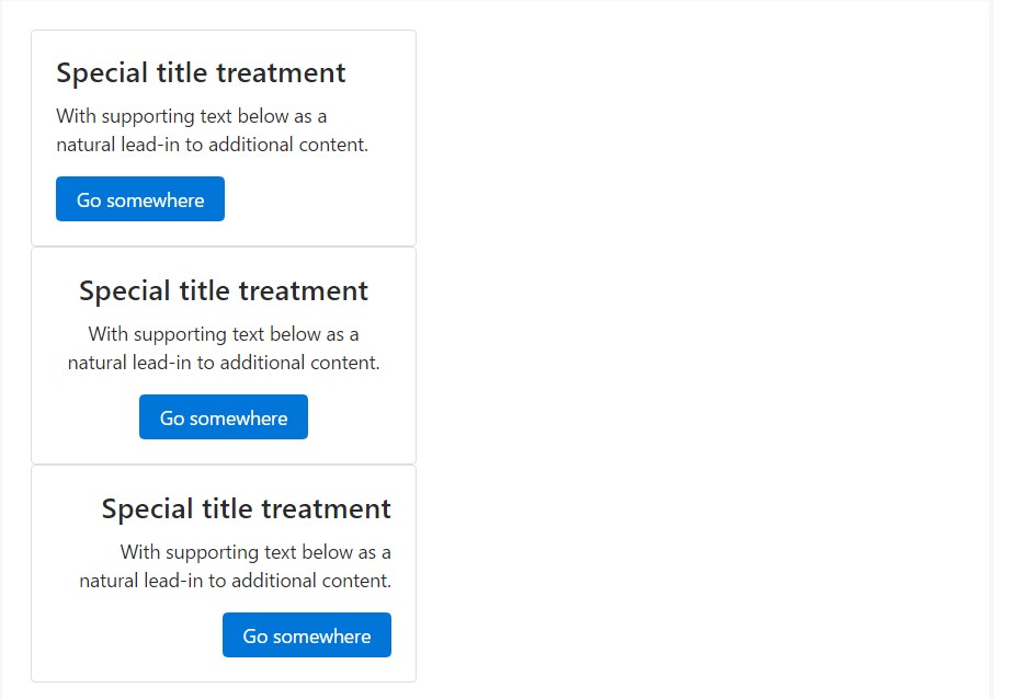
</div>Sizing
Cards have no definite width to start, so they'll be 100% large except something else stated. You can alter this as wanted with a custom CSS, grid classes, grid Sass mixins, or utilities.
Using grid markup
Using the grid, wrap cards in columns and rows as needed.
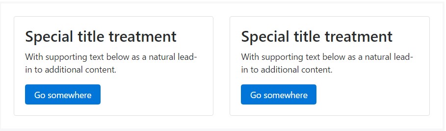
<div class="row">
  <div class="col-sm-6">
    <div class="card">
      <div class="card-block">
        <h3 class="card-title">Special title treatment</h3>
        <p class="card-text">With supporting text below as a natural lead-in to additional content.</p>
        <a href="#" class="btn btn-primary">Go somewhere</a>
      </div>
    </div>
  </div>
</div>
Making use of utilities
Use handful of available sizing utilities to promptly establish a card's size.
<div class="card w-75">
  <div class="card-block">
    <h3 class="card-title">Card title</h3>
    <p class="card-text">With supporting text below as a natural lead-in to additional content.</p>
    <a href="#" class="btn btn-primary">Button</a>
  </div>
</div>

<div class="card w-50">
  <div class="card-block">
    <h3 class="card-title">Card title</h3>
    <p class="card-text">With sustaining message listed below as an all-natural lead-in to extra web content.</p>
    <a href="#" class="btn btn-primary">Button</a>
  </div>
</div>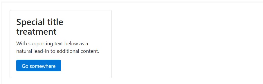
<div class="card" style="width: 20rem;">
  <div class="card-block">
    <h3 class="card-title">Special title treatment</h3>
    <p class="card-text">With supporting text below as a natural lead-in to added material.</p>
    <a href="#" class="btn btn-primary">Go somewhere</a>
  </div>
</div>
Message placement
You could swiftly alter the message positioning of any kind of card - in its whole or particular components - with text align classes.
<div class="card" style="width: 20rem;">
  <div class="card-block">
    <h4 class="card-title">Special title treatment</h4>
    <p class="card-text">With supporting text below as a natural lead-in to additional content.</p>
    <a href="#" class="btn btn-primary">Go somewhere</a>
  </div>
</div>

<div class="card text-center" style="width: 20rem;">
  <div class="card-block">
    <h4 class="card-title">Special title treatment</h4>
    <p class="card-text">With supporting text below as a natural lead-in to additional content.</p>
    <a href="#" class="btn btn-primary">Go somewhere</a>
  </div>
</div>

<div class="card text-right" style="width: 20rem;">
  <div class="card-block">
    <h4 class="card-title">Special title treatment</h4>
    <p class="card-text">With supporting text below as a natural lead-in to additional content.</p>
    <a href="#" class="btn btn-primary">Go somewhere</a>
  </div>
</div>
Site navigation
Add some navigation to a card's header (or block) with Bootstrap's nav elements.
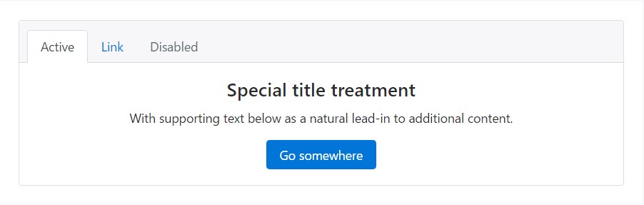
<div class="card text-center">
  <div class="card-header">
    <ul class="nav nav-tabs card-header-tabs">
      <li class="nav-item">
        <a class="nav-link active" href="#">Active</a>
      </li>
      <li class="nav-item">
        <a class="nav-link" href="#">Link</a>
      </li>
      <li class="nav-item">
        <a class="nav-link disabled" href="#">Disabled</a>
      </li>
    </ul>
  </div>
  <div class="card-block">
    <h4 class="card-title">Special title treatment</h4>
    <p class="card-text">With supporting text below as a natural lead-in to additional content.</p>
    <a href="#" class="btn btn-primary">Go somewhere</a>
  </div>
</div>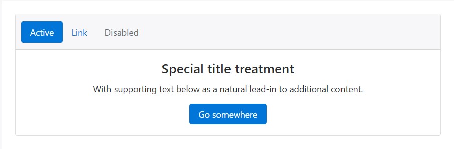
<div class="card text-center">
<div class="card-header">
<ul class="nav nav-pills card-header-pills">
<li class="nav-item">
<a class="nav-link active" href="#">Active</a>
</li>
<li class="nav-item">
<a class="nav-link" href="#">Link</a>
</li>
<li class="nav-item">
<a class="nav-link disabled" href="#">Disabled</a>
</li>
</ul>
</div>
<div class="card-block">
<h4 class="card-title">Special title treatment</h4>
<p class="card-text">With supporting text below as a natural lead-in to additional content.</p>
<a href="#" class="btn btn-primary">Go somewhere</a>
</div>
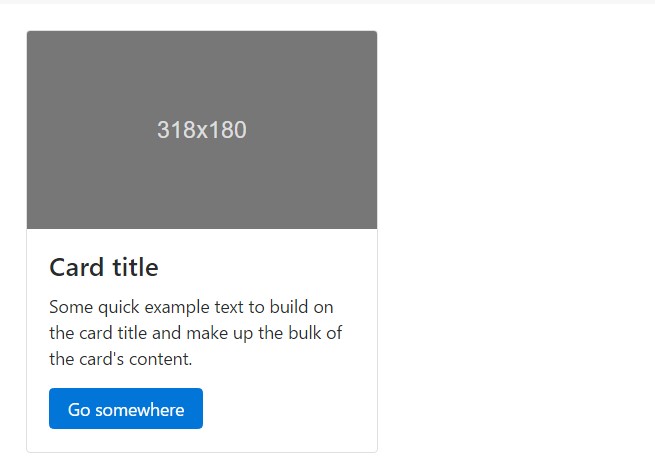
</div>Pictures
Cards include a few options for working using images. Pick from appending "image caps" at possibly end of a card, covering pics with card content, or simply embedding the image in a card.
Image caps
Just like footers and headers, cards may feature top and bottom "image caps" - images at the top or bottom of a card.
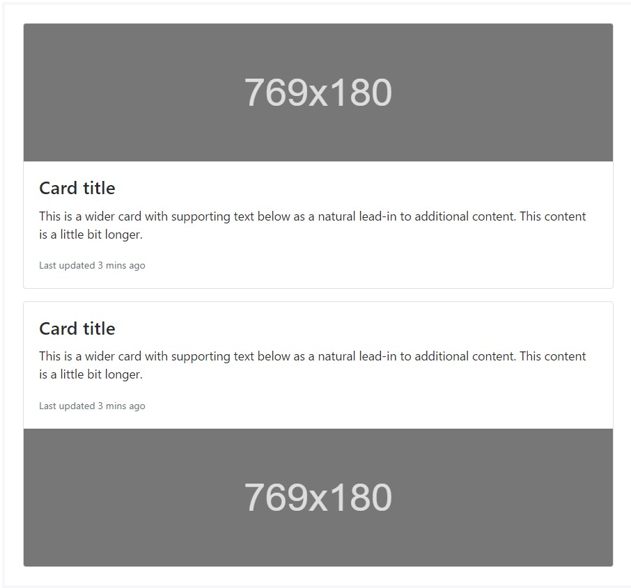
<div class="card mb-3">
  <div class="img"><img class="card-img-top" src="..." alt="Card image cap"></div>
  <div class="card-block">
    <h4 class="card-title">Card title</h4>
    <p class="card-text">This is a wider card with supporting text below as a natural lead-in to additional content. This content is a little bit longer.</p>
    <p class="card-text"><small class="text-muted">Last updated 3 mins ago</small></p>
  </div>
</div>
<div class="card">
  <div class="card-block">
    <h4 class="card-title">Card title</h4>
    <p class="card-text">This is a wider card with supporting text below as a natural lead-in to additional content. This content is a little bit longer.</p>
    <p class="card-text"><small class="text-muted">Last updated 3 mins ago</small></p>
  </div>
  <div class="img"><img class="card-img-bottom" src="..." alt="Card image cap"></div>
</div>
Illustration cover
Turn an illustration into a card background and overlay your card's text. Basing on the pic, you may or may not require .card-inverse (see below).
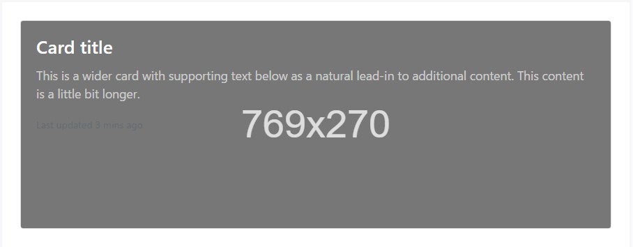
<div class="card card-inverse">
  <div class="img"><img class="card-img" src="..." alt="Card image"></div>
  <div class="card-img-overlay">
    <h4 class="card-title">Card title</h4>
    <p class="card-text">This is a wider card with supporting text below as a natural lead-in to additional content. This content is a little bit longer.</p>
    <p class="card-text"><small class="text-muted">Last updated 3 mins ago</small></p>
  </div>
</div>
Card varieties
Cards involve various opportunities for personalizing their backgrounds, borders, and color.
Inverted text
By default, cards use dark text and suppose a light background. You can change that by toggling the color of text within, in addition to that of the card's subcomponents, with .card-inverse. Then, specify a dark background-color and border-color to go with it.
You can also use .card-inverse having the contextual backgrounds versions.
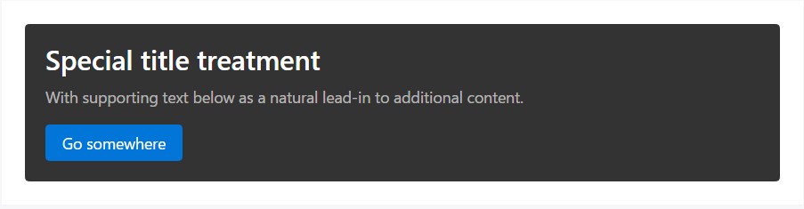
<div class="card card-inverse" style="background-color: #333; border-color: #333;">
  <div class="card-block">
    <h3 class="card-title">Special title treatment</h3>
    <p class="card-text">With supporting text below as a natural lead-in to additional content.</p>
    <a href="#" class="btn btn-primary">Go somewhere</a>
  </div>
</div>
Background variants
Cards include their own variant classes for quickly changing the background-color and border-color of a card. Darker colors demand the use of .card-inverse.
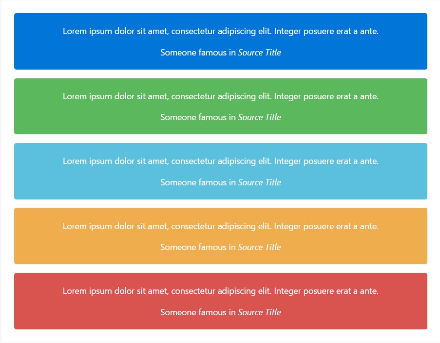
<div class="card card-inverse card-primary mb-3 text-center">
  <div class="card-block">
    <blockquote class="card-blockquote">
      <p>Lorem ipsum dolor sit amet, consectetur adipiscing elit. Integer posuere erat a ante.</p>
      <footer>Someone famous in <cite title="Source Title">Source Title</cite></footer>
    </blockquote>
  </div>
</div>
<div class="card card-inverse card-success mb-3 text-center">
  <div class="card-block">
    <blockquote class="card-blockquote">
      <p>Lorem ipsum dolor sit amet, consectetur adipiscing elit. Integer posuere erat a ante.</p>
      <footer>Someone famous in <cite title="Source Title">Source Title</cite></footer>
    </blockquote>
  </div>
</div>
<div class="card card-inverse card-info mb-3 text-center">
  <div class="card-block">
    <blockquote class="card-blockquote">
      <p>Lorem ipsum dolor sit amet, consectetur adipiscing elit. Integer posuere erat a ante.</p>
      <footer>Someone famous in <cite title="Source Title">Source Title</cite></footer>
    </blockquote>
  </div>
</div>
<div class="card card-inverse card-warning mb-3 text-center">
  <div class="card-block">
    <blockquote class="card-blockquote">
      <p>Lorem ipsum dolor sit amet, consectetur adipiscing elit. Integer posuere erat a ante.</p>
      <footer>Someone famous in <cite title="Source Title">Source Title</cite></footer>
    </blockquote>
  </div>
</div>
<div class="card card-inverse card-danger text-center">
  <div class="card-block">
    <blockquote class="card-blockquote">
      <p>Lorem ipsum dolor sit amet, consectetur adipiscing elit. Integer posuere erat a ante.</p>
      <footer>Someone famous in <cite title="Source Title">Source Title</cite></footer>
    </blockquote>
  </div>
</div>
Conveying meaning to assistive modern technologies
Employing a color to include meaning only supplies a visual indication, which will not be shared to users of the assistive technologies - for example, screen readers. Make sure that information signified by the color is either obvious from the material itself (e.g. the visible text), or is featured through alternative means, including additional message hidden with the .sr-only class.
Outline cards
Looking for a colored card, but not the significant background colors they deliver? Replace the default modifier classes with the .card-outline-* ones to style just the border-color of a card.
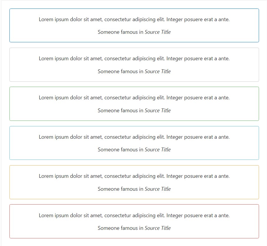
<div class="card card-outline-primary mb-3 text-center">
  <div class="card-block">
    <blockquote class="card-blockquote">
      <p>Lorem ipsum dolor sit amet, consectetur adipiscing elit. Integer posuere erat a ante.</p>
      <footer>Someone famous in <cite title="Source Title">Source Title</cite></footer>
    </blockquote>
  </div>
</div>
<div class="card card-outline-secondary mb-3 text-center">
  <div class="card-block">
    <blockquote class="card-blockquote">
      <p>Lorem ipsum dolor sit amet, consectetur adipiscing elit. Integer posuere erat a ante.</p>
      <footer>Someone famous in <cite title="Source Title">Source Title</cite></footer>
    </blockquote>
  </div>
</div>
<div class="card card-outline-success mb-3 text-center">
  <div class="card-block">
    <blockquote class="card-blockquote">
      <p>Lorem ipsum dolor sit amet, consectetur adipiscing elit. Integer posuere erat a ante.</p>
      <footer>Someone famous in <cite title="Source Title">Source Title</cite></footer>
    </blockquote>
  </div>
</div>
<div class="card card-outline-info mb-3 text-center">
  <div class="card-block">
    <blockquote class="card-blockquote">
      <p>Lorem ipsum dolor sit amet, consectetur adipiscing elit. Integer posuere erat a ante.</p>
      <footer>Someone famous in <cite title="Source Title">Source Title</cite></footer>
    </blockquote>
  </div>
</div>
<div class="card card-outline-warning mb-3 text-center">
  <div class="card-block">
    <blockquote class="card-blockquote">
      <p>Lorem ipsum dolor sit amet, consectetur adipiscing elit. Integer posuere erat a ante.</p>
      <footer>Someone famous in <cite title="Source Title">Source Title</cite></footer>
    </blockquote>
  </div>
</div>
<div class="card card-outline-danger text-center">
  <div class="card-block">
    <blockquote class="card-blockquote">
      <p>Lorem ipsum dolor sit amet, consectetur adipiscing elit. Integer posuere erat a ante.</p>
      <footer>Someone famous in <cite title="Source Title">Source Title</cite></footer>
    </blockquote>
  </div>
</div>
Card arrangement
Along with styling the content within a cards, Bootstrap contains a number of the alternatives for laying out collection of cards. For the present being, such layout options are not yet responsive.
Card groups
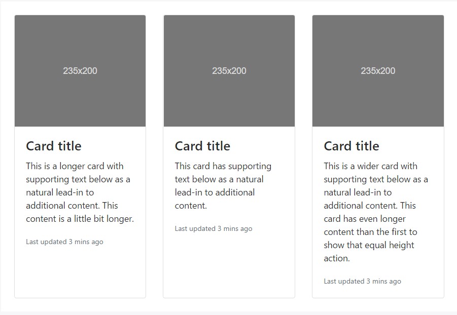
Use card groups to render cards as a single, connected element with equal width and height columns. Card groups work with display: flex; to accomplish their uniform sizing.
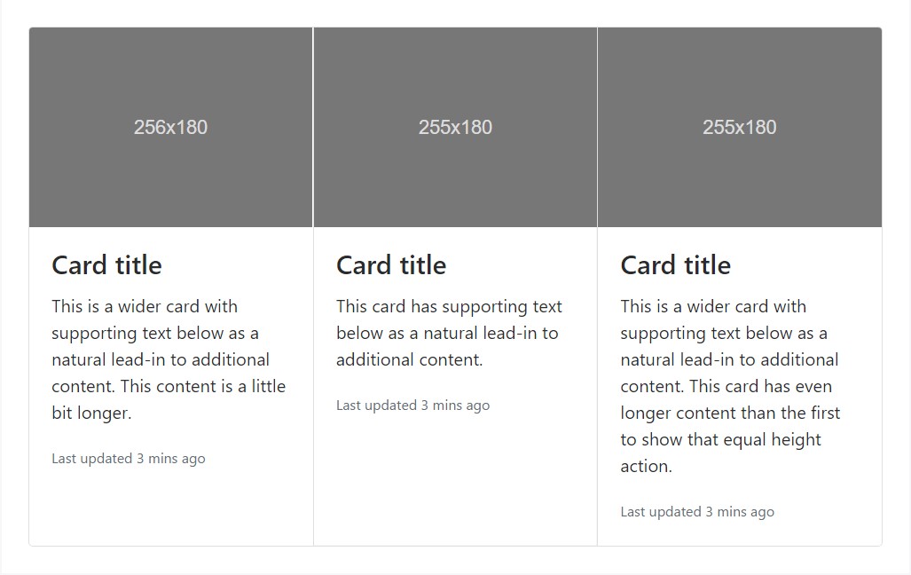
<div class="card-group">
  <div class="card">
    <div class="img"><img class="card-img-top" src="..." alt="Card image cap"></div>
    <div class="card-block">
      <h4 class="card-title">Card title</h4>
      <p class="card-text">This is a wider card with supporting text below as a natural lead-in to additional content. This content is a little bit longer.</p>
      <p class="card-text"><small class="text-muted">Last updated 3 mins ago</small></p>
    </div>
  </div>
  <div class="card">
    <div class="img"><img class="card-img-top" src="..." alt="Card image cap"></div>
    <div class="card-block">
      <h4 class="card-title">Card title</h4>
      <p class="card-text">This card has supporting text below as a natural lead-in to additional content.</p>
      <p class="card-text"><small class="text-muted">Last updated 3 mins ago</small></p>
    </div>
  </div>
  <div class="card">
    <div class="img"><img class="card-img-top" src="..." alt="Card image cap"></div>
    <div class="card-block">
      <h4 class="card-title">Card title</h4>
      <p class="card-text">This is a wider card with supporting text below as a natural lead-in to additional content. This card has even longer content than the first to show that equal height action.</p>
      <p class="card-text"><small class="text-muted">Last updated 3 mins ago</small></p>
    </div>
  </div>
</div>
When using a card groups with footers, their content is going to automatically line up.
<div class="card-group">
<div class="card">
<div class="img"><img class="card-img-top" src="..." alt="Card image cap"></div>
<div class="card-block">
<h4 class="card-title">Card title</h4>
<p class="card-text">This is a wider card with supporting text below as a natural lead-in to additional content. This content is a little bit longer.</p>
</div>
<div class="card-footer">
<small class="text-muted">Last updated 3 mins ago</small>
</div>
</div>
<div class="card">
<div class="img"><img class="card-img-top" src="..." alt="Card image cap"></div>
<div class="card-block">
<h4 class="card-title">Card title</h4>
<p class="card-text">This card has supporting text below as a natural lead-in to additional content.</p>
</div>
<div class="card-footer">
<small class="text-muted">Last updated 3 mins ago</small>
</div>
</div>
<div class="card">
<div class="img"><img class="card-img-top" src="..." alt="Card image cap"></div>
<div class="card-block">
<h4 class="card-title">Card title</h4>
<p class="card-text">This is a wider card with supporting text below as a natural lead-in to additional content. This card has even longer content than the first to show that equal height action.</p>
</div>
<div class="card-footer">
<small class="text-muted">Last updated 3 mins ago</small>
</div>
</div>
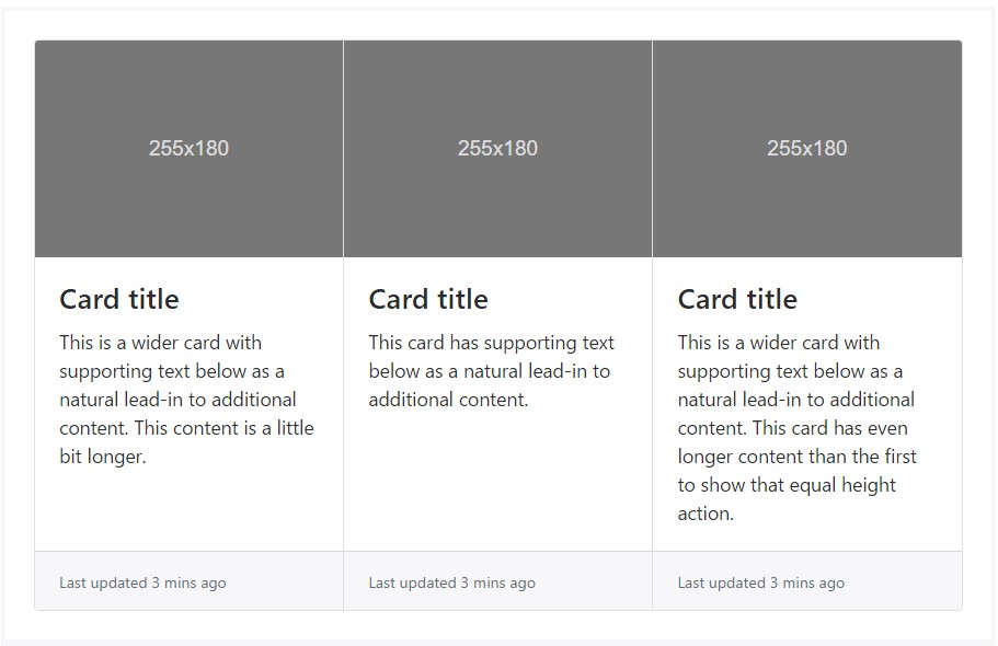
</div>Card decks
Need a set of equivalent width as well as height cards that typically aren't affixed to one another? Use the card decks.
<div class="card-deck">
  <div class="card">
    <div class="img"><img class="card-img-top" src="..." alt="Card image cap"></div>
    <div class="card-block">
      <h4 class="card-title">Card title</h4>
      <p class="card-text">This is a longer card with supporting text below as a natural lead-in to additional content. This content is a little bit longer.</p>
      <p class="card-text"><small class="text-muted">Last updated 3 mins ago</small></p>
    </div>
  </div>
  <div class="card">
    <div class="img"><img class="card-img-top" src="..." alt="Card image cap"></div>
    <div class="card-block">
      <h4 class="card-title">Card title</h4>
      <p class="card-text">This card has supporting text below as a natural lead-in to additional content.</p>
      <p class="card-text"><small class="text-muted">Last updated 3 mins ago</small></p>
    </div>
  </div>
  <div class="card">
    <div class="img"><img class="card-img-top" src="..." alt="Card image cap"></div>
    <div class="card-block">
      <h4 class="card-title">Card title</h4>
      <p class="card-text">This is a wider card with supporting text below as a natural lead-in to additional content. This card has even longer content than the first to show that equal height action.</p>
      <p class="card-text"><small class="text-muted">Last updated 3 mins ago</small></p>
    </div>
  </div>
</div>
Just like with the card groups, card footers in the decks will automatically line up.
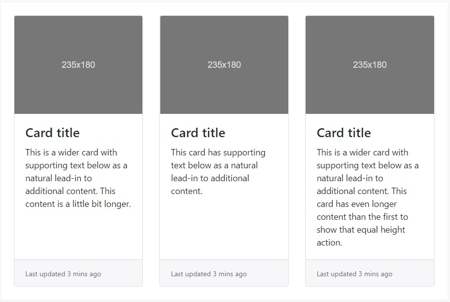
<div class="card-deck">
  <div class="card">
    <div class="img"><img class="card-img-top" src="..." alt="Card image cap"></div>
    <div class="card-block">
      <h4 class="card-title">Card title</h4>
      <p class="card-text">This is a wider card with supporting text below as a natural lead-in to additional content. This content is a little bit longer.</p>
    </div>
    <div class="card-footer">
      <small class="text-muted">Last updated 3 mins ago</small>
    </div>
  </div>
  <div class="card">
    <div class="img"><img class="card-img-top" src="..." alt="Card image cap"></div>
    <div class="card-block">
      <h4 class="card-title">Card title</h4>
      <p class="card-text">This card has supporting text below as a natural lead-in to additional content.</p>
    </div>
    <div class="card-footer">
      <small class="text-muted">Last updated 3 mins ago</small>
    </div>
  </div>
  <div class="card">
    <div class="img"><img class="card-img-top" src="..." alt="Card image cap"></div>
    <div class="card-block">
      <h4 class="card-title">Card title</h4>
      <p class="card-text">This is a wider card with supporting text below as a natural lead-in to additional content. This card has even longer content than the first to show that equal height action.</p>
    </div>
    <div class="card-footer">
      <small class="text-muted">Last updated 3 mins ago</small>
    </div>
  </div>
</div>
Card columns
Cards can be arranged into Masonry-like columns along with just CSS by wrapping them in .card-columns. Cards are constructed with CSS column properties instead of flexbox for easier positioning. Cards are ordered from top to bottom and left to right.
Attention! Your distance with the card columns may vary. To avoid cards breaking across the columns, set them to display: inline-block as column-break-inside: avoid isn't a bulletproof solution yet.
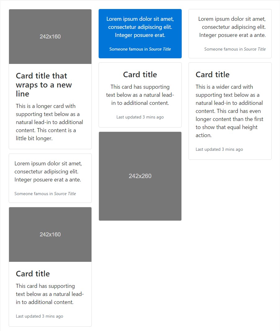
<div class="card-columns">
  <div class="card">
    <div class="img"><img class="card-img-top img-fluid" src="..." alt="Card image cap"></div>
    <div class="card-block">
      <h4 class="card-title">Card title that wraps to a new line</h4>
      <p class="card-text">This is a longer card with supporting text below as a natural lead-in to additional content. This content is a little bit longer.</p>
    </div>
  </div>
  <div class="card p-3">
    <blockquote class="card-block card-blockquote">
      <p>Lorem ipsum dolor sit amet, consectetur adipiscing elit. Integer posuere erat a ante.</p>
      <footer>
        <small class="text-muted">
          Someone famous in <cite title="Source Title">Source Title</cite>
        </small>
      </footer>
    </blockquote>
  </div>
  <div class="card">
    <div class="img"><img class="card-img-top img-fluid" src="..." alt="Card image cap"></div>
    <div class="card-block">
      <h4 class="card-title">Card title</h4>
      <p class="card-text">This card has supporting text below as a natural lead-in to additional content.</p>
      <p class="card-text"><small class="text-muted">Last updated 3 mins ago</small></p>
    </div>
  </div>
  <div class="card card-inverse card-primary p-3 text-center">
    <blockquote class="card-blockquote">
      <p>Lorem ipsum dolor sit amet, consectetur adipiscing elit. Integer posuere erat.</p>
      <footer>
        <small>
          Someone famous in <cite title="Source Title">Source Title</cite>
        </small>
      </footer>
    </blockquote>
  </div>
  <div class="card text-center">
    <div class="card-block">
      <h4 class="card-title">Card title</h4>
      <p class="card-text">This card has supporting text below as a natural lead-in to additional content.</p>
      <p class="card-text"><small class="text-muted">Last updated 3 mins ago</small></p>
    </div>
  </div>
  <div class="card">
    <div class="img"><img class="card-img img-fluid" src="..." alt="Card image"></div>
  </div>
  <div class="card p-3 text-right">
    <blockquote class="card-blockquote">
      <p>Lorem ipsum dolor sit amet, consectetur adipiscing elit. Integer posuere erat a ante.</p>
      <footer>
        <small class="text-muted">
          Someone famous in <cite title="Source Title">Source Title</cite>
        </small>
      </footer>
    </blockquote>
  </div>
  <div class="card">
    <div class="card-block">
      <h4 class="card-title">Card title</h4>
      <p class="card-text">This is a wider card with supporting text below as a natural lead-in to additional content. This card has even longer content than the first to show that equal height action.</p>
      <p class="card-text"><small class="text-muted">Last updated 3 mins ago</small></p>
    </div>
  </div>
</div>
Card columns can additionally be expanded and personalized with some extra code. Shown listed below is an extension of the .card-columns course making use of the exact same CSS - CSS columns - to generate a set of responsive tiers for altering the variety of columns.
.card-columns
  @include media-breakpoint-only(lg)
    column-count: 4;

  @include media-breakpoint-only(xl)
    column-count: 5;
Final thoughts
So basically this is the way the bright new to Bootstrap 4 card element gets easily set up. As always aiming for ease and simplicity the new framework version combines the functionality of a few elements into a single and powerful one. Now you need to pick up the feature s you need outlined in some cards.
Take a look at a number of video short training relating to Bootstrap Panel:
Connected topics:
Bootstrap Panel-Cards: approved documents
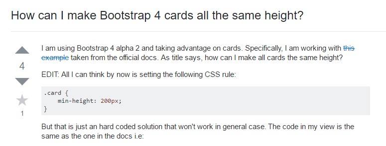
Insights on how can we form Bootstrap 4 cards just the same tallness?
Lacking past panel look for cards