Bootstrap Checkbox
Intro
Sometimes the simplest things might get quite essential – especially when you get to need them. For example how do your visitors communicate with the pages you create stating a simple Boolean action – just yes or no regarding some of the questions you need to ask, how they do agree to the terms and conditions or line up a few of the possible preferences they might have. We usually get past this without paying much of an attention to the element responsible for such actions but the checkbox is actually a quite significant element – one our forms can’t actually do without.
In the latest fourth version of the Bootstrap framework we are provided with the .form-check and .form-check-label classes in order to display the good old default checkbox element and in case you would need them stacked just make sure you have wrapped them in an additional <div> with the .form-check class assigned to it. In order your checkboxes to display correctly in Bootstrap 4 you should also assign the .form-check-label class to the <label> element and the <input> tag itself should carry the .form-check-input class.
Effective ways to put into action the Bootstrap checkbox:
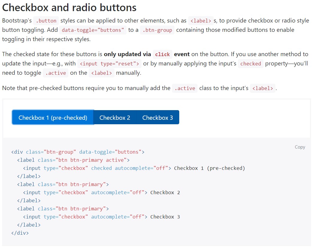
The checked state for these buttons is only updated via click event on the button.
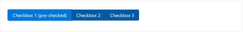
<div class="btn-group" data-toggle="buttons">
  <label class="btn btn-primary active">
    <input type="checkbox" checked autocomplete="off"> Checkbox 1 (pre-checked)
  </label>
  <label class="btn btn-primary">
    <input type="checkbox" autocomplete="off"> Checkbox 2
  </label>
  <label class="btn btn-primary">
    <input type="checkbox" autocomplete="off"> Checkbox 3
  </label>
</div>
Sometimes we need the checkboxes to take place in our forms without the user actually being able to take any action clicking on them – that’s where the disabled option comes in. In order to disable properly a checkbox in Bootstrap 4 using the standard HTML attribute disabled attribute along with just adding it you could also style the cursor when the visitor hovers over the disabled element transforming it to a “not allowed” icon making your forms more intuitive and easy to work with. If you like the idea and actually want to do this you should assign the .disabled class to the parent .form-check element in order the effect to display best while the whole element has been hovered – this will make it quite more obvious this is a “no-go” for the moment.
Some other scenario
Anytime you are employing checkboxes, wrap all of them in a <label> element with the Bootstrap 4 .custom-control as well as .custom-checkbox classes used.
Operate .custom-control-input to the concrete <input> element.
In addition work with two <span> elements: one with the .custom-control-indicator class added, and the other with .custom-control-description (and put the original label within this element).
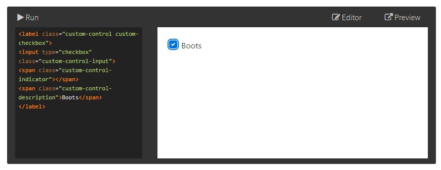
<label class="custom-control custom-checkbox">
<input type="checkbox" class="custom-control-input">
<span class="custom-control-indicator"></span>
<span class="custom-control-description">Boots</span>
</label>
Checkbox forms
Default checkboxes and radios are upgraded upon with the aid of .form-check, a single class for each input types that upgrades the layout and action of their HTML components. Checkboxes are for selecting one or a several options in a selection, as long as radios are for selecting one capability from many.
Disabled checkboxes and radios are provided, however, to deliver a not-allowed pointer on hover of the parent <label>, you'll have to put in the .disabled class to the parent .form-check. The disabled class is going to in addition make lighter the text colour to help reveal the input's state.
A new thing for the Bootstrap version 4 framework is the introduction of the so called custom form elements. These are the very same elements we are used to in functionality but styled much more appealing and in the Bootstrap way. With them you can add some spice and personality to your content by just assigning a few extra classes to the controls you include in your forms.
In order to use custom checkboxes wrap them in a <label> element assigning to it the .custom-control and .custom-checkbox classes. When creating the <input> element make sure you have also added the .custom-control-input to it. You should also use two <span> elements - one with .custom-control-indicator class applied and another carrying the .custom-control-description class along with the actual description you would need to assign to the label of your checkbox.
Conclusions
That’s pretty much everything you need to do in order to insert a checkbox element in your Bootstrap 4 powered web pages and add some custom flavor to it adding it a stylish looks. Now all you need to do is repeat the drill until you’ve checked all the checkboxes needed are already on the page.
Review some video clip guide relating to Bootstrap checkbox
Connected topics:
Bootstrap checkbox authoritative records
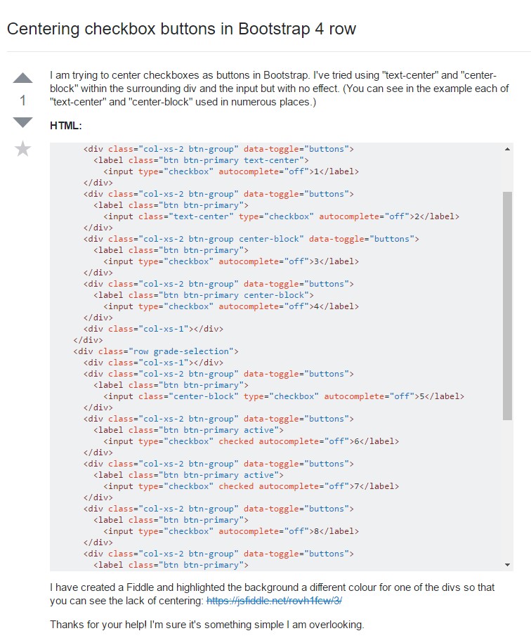
Centering checkbox buttons in Bootstrap 4 row
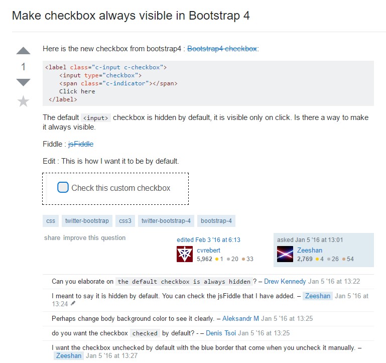
Make checkbox always visible in Bootstrap 4