Bootstrap Offset
Overview
It’s great when the content of our pages just fluently spreads over the whole width available and conveniently changes size and order when the width of the display changes but sometimes we need letting the elements some space around to breath with no extra elements around them since the balance is the key of getting light and friendly appearance easily relaying our content to the ones visiting the page. This free space along with the responsive behavior of our pages is an essential element of the design of our pages.
In the latest version of the most popular mobile friendly framework – Bootstrap 4 there is a special set of tools dedicated to placing our elements exactly where we need them and changing this placement and appearance according to the width of the screen page gets displayed. – These are the so called offset and push / pull classes. They work really easy and in intuitive manner being combined with the grid tier infixes like -sm- , -md- and so on.
Tips on how to work with the Bootstrap Offset plugin:
The general syntax of these is pretty simple – you have the action you need to be taken – like .offset for example , the smallest grid size you need it to apply from and above – like -md and a value for the needed action in number of columns – like -3 for example. This whole thing put together results .offset-md-3 which will offset the desired column element with 3 columns to the right from its default position on medium screen sizes and above. .offset classes always shifts its content to the right.
Some example
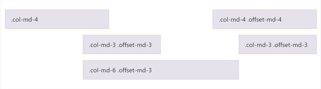
Carry columns to the right utilizing .offset-md-* classes. These particular classes improve the left margin of a column by * columns. As an example,.offset-md-4 operate .col-md-4 above four columns.
<div class="row">
  <div class="col-md-4">.col-md-4</div>
  <div class="col-md-4 offset-md-4">.col-md-4 .offset-md-4</div>
</div>
<div class="row">
  <div class="col-md-3 offset-md-3">.col-md-3 .offset-md-3</div>
  <div class="col-md-3 offset-md-3">.col-md-3 .offset-md-3</div>
</div>
<div class="row">
  <div class="col-md-6 offset-md-3">.col-md-6 .offset-md-3</div>
</div>
Serious factor
Important thing to note here is up from Bootstrap 4 alpha 6 the -xs infix has been dropped so for the smallest screen sizes – under 34em or 554 px the grid size infix is omitted – the offsetting tools classes get followed by the desired number of columns. So the example from above will become something like .offset-3 and will work on all screen sizes unless a rule for a wider viewport is defined – you can do that by just assigning the appropriate .offset- ~ some viewport size here ~ - ~ some number of columns ~ classes to the very same element.
This approach works in case you need to style a single element. If you however for some kind of reason want to displace an element according to the ones surrounding it you can use the .push - and .pull classes which generally do the same thing but filling the free space left behind with the next element if possible. So for example if you have two column elements – the first one 4 columns wide and the next one – 8 columns wide (they both fill the entire row) applying .push-sm-8 to the first element and .pull-md-4 to the second will actually reverse the order in which they get displayed on small viewports and above. Omitting the –xs- infix for the smallest screen sizes counts here too.
And finally – since Bootstrap 4 alpha 6 introduces the flexbox utilities for placing content you can also use these for reordering your content applying classes like .flex-first and .flex-last to place an element in the beginning or at the end of its row.
Conclusions
So generally that’s the way the most essential elements of the Bootstrap 4’s grid system – the columns get assigned the desired offset and ordered exactly as you need them regardless the way they take place in code. Nevertheless the reordering utilities are quite powerful, what should be displayed first should also be defined first – this will also make it a lot easier for the guys reading your code to get around. But of course it all depends on the particular case and the goals you’re aiming to achieve.
Check some youtube video tutorials regarding Bootstrap Offset:
Linked topics:
Bootstrap offset official information
What does offset do in Bootstrap 4?
Bootstrap Offset:question on GitHub