Bootstrap Toggle
Intro
Nevertheless the appealing images great functionality and smashing effects at the bottom line the web pages we create purpose narrows down to relaying some content to the visitor and therefore we may call the web the new type of document container since more and more info gets published and accessed online instead as files on our local computers or the classical way – printed on a hard copy media. It all narrows down to content but in the environment where the visitor attention gets drawn from almost everywhere just publishing what we have to share is not far enough – it must be structured and presented this way that even a large amounts of dry informative plain text find a way keeping the visitor's attention and be easy for browsing and finding just the needed part easily and fast – if not the visitor might get bored or even frustrated and browse away nevertheless somewhere out there in the text's body get hidden some precious gems.
So we need an element which takes less space possible – long plain text areas push the visitor away – and eventually some movement and interactivity would be also greatly appreciated since the audience got quite used to clicking buttons around.
Well the Bootstrap 4 framework has exactly that – convenient collapsible panels capable of holding large amount of data displaying just a heading line to help us better get around and expanding to show what's needed upon clicking on the header. These are the accordion and toggle panels which work pretty much the same with a single difference – as the name suggests in the accordion panel expanding a particular collapsible item collapses all the rest while in the toggle element you can have as many expanded areas as you need to – it all depends on the particular content of the large text hidden inside the collapsible panels and the way you're imagining the user will eventually use it.
Effective ways to employ the Bootstrap toggle:
The actual implement of a toggle block is quite easy in the latest version of the Bootstrap framework – it utilizes the newly introduced .card element and quite simple and straightforward construction. To create a toggle or an accordion panel we need to wrap the whole thing up in a parent element which might carry some layout styling – like in case you would want to place a few of them side by side and an unique id = " ~element's unique name ~ " attribute which you'll get used in case you would want only one panel expanded – if you need more of them the ID can actually be omitted unless you don't have something else in mind – like linking a part of your page's navigation to the block we're about to create for example.
Next, it's a time for creating the particular toggle element – we'll use the bright new for Bootstrap 4 .card class and apply it to this one. Inside of it we'll need an .card-header element with some <h1>–<h6> wrapped around an <a> element with href = " ~ the collapsed element ID here ~ " attribute pointing to the ID of the collapsed element holding the content which will get displayed when the user clicks on the link. The difference between the toggle and accordion panels comes in the attributes of this particular <a> element – if you want to have a single collapsible expanded at a time you need to also assign data-parent = " ~ the main wrapper ID ~ " attribute here – this way if another element gets expanded within this parent element this one will also collapse. But we're creating a toggle here so this attribute should actually be omitted.
Now when the trigger has been created it's time for creating the collapsing part – to start create a <div> element with the .collapsed class assigned and a unique id = " ~should match trigger's from above href ~ " attribute and eventually – the class .show if you would want it initially expanded upon page load. This last one is a bit tricky part – up to Bootstrap 4 alpha 5 the class expanding the panel on load was called .in being replaced by .show in alpha 6 so take note which version you're using.
Lastly inside of the collapsing element we should place a container for our content carrying the .card-block class providing us with some eye pleasing paddings around the text itself.
Example of toggle states
Bring in data-toggle=" button" to toggle a button's active state. In case you're pre-toggling a button, you will need to manually put in the active class and aria-pressed="true" to the <button>

<button type="button" class="btn btn-primary" data-toggle="button" aria-pressed="false" autocomplete="off">
  Single toggle
</button>
Conclusions
Basically that's how a single collapsible element gets created in Bootstrap 4. In order to create the whole panel you need to repeat the steps from above creating as many .card elements as needed for presenting your concept.
If you're planning the user to be comparing some parts from the texts it also might be a good idea taking advantage of bootstrap's grid system placing two toggle panels side by side on wider viewports to hopefully making the process easier – that's entirely up to you to decide.
Inspect a few online video guide about Bootstrap toggle:
Linked topics:
Bootstrap toggle formal information
Bootstrap toggle difficulty
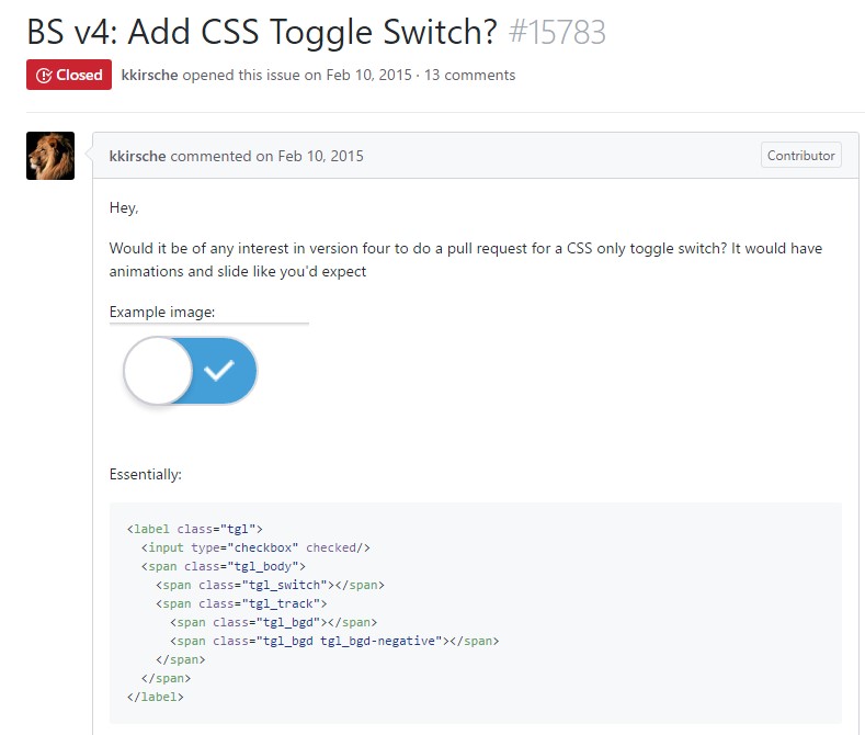
Exactly how to provide CSS toggle switch?