Bootstrap Collapse
Overview
As you already know, Bootstrap automatically makes your site responsive, using its elements as a reference for positioning, size, etc.
Knowing this, if we are to create a menu using Bootstrap for front-end, we will have to follow some of the standards and standards set by Bootstrap to make it automatically structure the elements of the page to leave responsive correctly.
One of the most interesting possibilities of using this framework is the creation of menus displayed on demand, according to the actions of the users.
A great solution for using menus on small screens is to join the options in a kind of dropdown that only opens when it is activated. That is, create a button to activate the menu on demand. It's quite simple to do this with Bootstrap, the functionality is all ready.
The Bootstrap collapse plugin allows you to toggle information within your pages using a few classes because of some helpful JavaScript.
Tips on how to employ the Bootstrap collapse plugin:
To make the menu collapse into a small screens, simply add 2 classes in the <ul>: collapse and navbar-collapse.
<Ul class = "nav navbar-nav collapse navbar-collapse">With this, you can make the menu disappear on the smaller screens.
Inside the navbar-header, just below <a>, create an activation button. The button is just the text "menu" but it has the navbar-toggle class. In addition, two other parameters configure their operation with the collapse, as can be seen below:
<Button class = "navbar-toggle" type = "button"
    Data-target = ". Navbar-collapse" data-toggle = "collapse">
  menu
</ Button>
Everything within this element will be rendered within the context of the menu. By reducing the computer screen, it compacts the internal elements and hides, being visible only by clicking on the button class="navbar-toggle" button to expand the menu.
This way the menu will appear but will not work when clicked. It's because this functionality in Bootstrap is implemented with JavaScript. The good news is that we do not need to write a JS code line at all, but for everything to work we need to add Bootstrap JavaScript.
At the bottom of the page, just before closing </body>, call the Bootstrap and jQuery file:
<Script src = "js / jquery.js"> </ script>
<Script src = "js / bootstrap.js"> </ script>
As an examples
Select the switches shown below to present and cover up some other element by using class improvements:
- .collapse conceal information
- .collapsing is utilized while transitions
- .collapse.show reveals web content
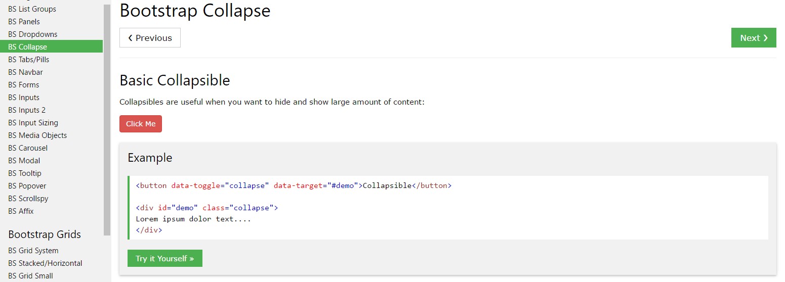
You have the ability to put to use a url along with the href attribute, or a button with the data-target attribute. In both cases, the data-toggle="collapse" is required.


<p>
<a class="btn btn-primary" data-toggle="collapse" href="#collapseExample" aria-expanded="false" aria-controls="collapseExample">
Link with href
</a>
<button class="btn btn-primary" type="button" data-toggle="collapse" data-target="#collapseExample" aria-expanded="false" aria-controls="collapseExample">
Button with data-target
</button>
</p>
<div class="collapse" id="collapseExample">
<div class="card card-block">
Anim pariatur cliche reprehenderit, enim eiusmod high life accusamus terry richardson ad squid. Nihil anim keffiyeh helvetica, craft beer labore wes anderson cred nesciunt sapiente ea proident.
</div>
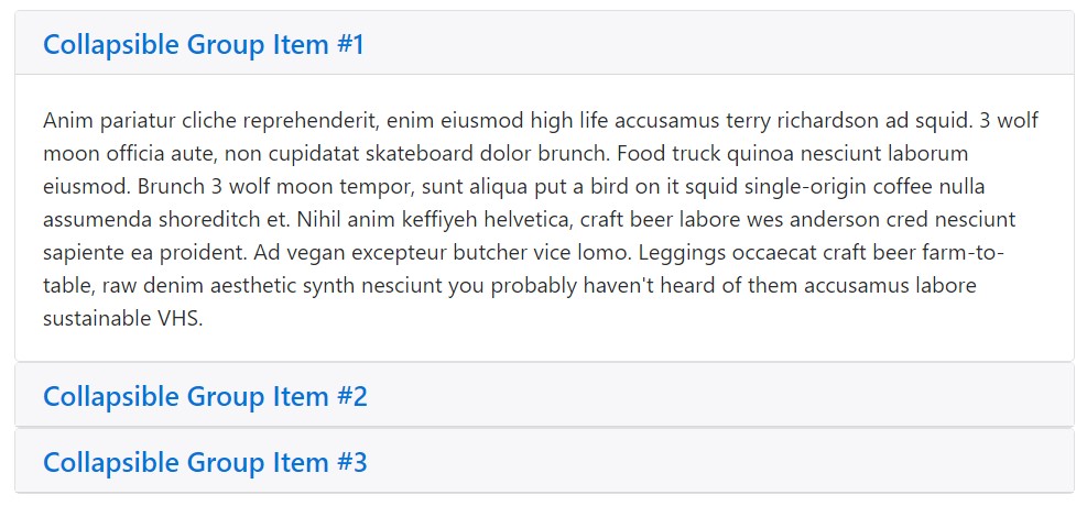
</div>Accordion example
Enhance the default collapse activity to generate an accordion.
<div id="accordion" role="tablist" aria-multiselectable="true">
  <div class="card">
    <div class="card-header" role="tab" id="headingOne">
      <h5 class="mb-0">
        <a data-toggle="collapse" data-parent="#accordion" href="#collapseOne" aria-expanded="true" aria-controls="collapseOne">
          Collapsible Group Item #1
        </a>
      </h5>
    </div>

    <div id="collapseOne" class="collapse show" role="tabpanel" aria-labelledby="headingOne">
      <div class="card-block">
        Anim pariatur cliche reprehenderit, enim eiusmod high life accusamus terry richardson ad squid. 3 wolf moon officia aute, non cupidatat skateboard dolor brunch. Food truck quinoa nesciunt laborum eiusmod. Brunch 3 wolf moon tempor, sunt aliqua put a bird on it squid single-origin coffee nulla assumenda shoreditch et. Nihil anim keffiyeh helvetica, craft beer labore wes anderson cred nesciunt sapiente ea proident. Ad vegan excepteur butcher vice lomo. Leggings occaecat craft beer farm-to-table, raw denim aesthetic synth nesciunt you probably haven't heard of them accusamus labore sustainable VHS.
      </div>
    </div>
  </div>
  <div class="card">
    <div class="card-header" role="tab" id="headingTwo">
      <h5 class="mb-0">
        <a class="collapsed" data-toggle="collapse" data-parent="#accordion" href="#collapseTwo" aria-expanded="false" aria-controls="collapseTwo">
          Collapsible Group Item #2
        </a>
      </h5>
    </div>
    <div id="collapseTwo" class="collapse" role="tabpanel" aria-labelledby="headingTwo">
      <div class="card-block">
        Anim pariatur cliche reprehenderit, enim eiusmod high life accusamus terry richardson ad squid. 3 wolf moon officia aute, non cupidatat skateboard dolor brunch. Food truck quinoa nesciunt laborum eiusmod. Brunch 3 wolf moon tempor, sunt aliqua put a bird on it squid single-origin coffee nulla assumenda shoreditch et. Nihil anim keffiyeh helvetica, craft beer labore wes anderson cred nesciunt sapiente ea proident. Ad vegan excepteur butcher vice lomo. Leggings occaecat craft beer farm-to-table, raw denim aesthetic synth nesciunt you probably haven't heard of them accusamus labore sustainable VHS.
      </div>
    </div>
  </div>
  <div class="card">
    <div class="card-header" role="tab" id="headingThree">
      <h5 class="mb-0">
        <a class="collapsed" data-toggle="collapse" data-parent="#accordion" href="#collapseThree" aria-expanded="false" aria-controls="collapseThree">
          Collapsible Group Item #3
        </a>
      </h5>
    </div>
    <div id="collapseThree" class="collapse" role="tabpanel" aria-labelledby="headingThree">
      <div class="card-block">
        Anim pariatur cliche reprehenderit, enim eiusmod high life accusamus terry richardson ad squid. 3 wolf moon officia aute, non cupidatat skateboard dolor brunch. Food truck quinoa nesciunt laborum eiusmod. Brunch 3 wolf moon tempor, sunt aliqua put a bird on it squid single-origin coffee nulla assumenda shoreditch et. Nihil anim keffiyeh helvetica, craft beer labore wes anderson cred nesciunt sapiente ea proident. Ad vegan excepteur butcher vice lomo. Leggings occaecat craft beer farm-to-table, raw denim aesthetic synth nesciunt you probably haven't heard of them accusamus labore sustainable VHS.
      </div>
    </div>
  </div>
</div>
Availableness
Make sure to provide aria-expanded to the control component. This attribute explicitly defines the current status of the collapsible feature to screen readers along with a similar assistive technologies . If the collapsible feature is closed by default, it needs to have a value of aria-expanded="false". In case that you have actually put the collapsible feature to become accessible simply by default applying the show class, set aria-expanded="true" on the control as a substitute. The plugin will automatically toggle this attribute based upon regardless if the collapsible feature has been launched or shut down.
In addition, if your control feature is targeting a single collapsible component - i.e. the data-target attribute is leading to an id selector - you can incorporate an added aria-controls attribute to the control component, having the id of the collapsible element . Present-day screen readers and related assistive systems utilise this specific attribute in order to give users with more shortcuts to find your way directly to the collapsible feature itself.
Handling
The collapse plugin implements a number of classes to manage the heavy lifting:
- .collapse disguise material
- .collapse.show reveals web content
- .collapsing is provided the moment the transition begins , and cleared away when it finishes
All of these classes may be seen in _transitions.scss.
By information attributes
Simply put in data-toggle="collapse" as well as a data-target to the element to instantly delegate control of a collapsible feature. The data-target attribute takes on a CSS selector to add the collapse to. Don't forget to incorporate the class collapse to the collapsible element. In the event that you would probably wish it to default open, put in the additional class show.
To bring in accordion-like group management to a collapsible control, add the data attribute data-parent="#selector". Refer to the demo to see this at work.
By using JavaScript
Make it possible by hand by using:
$('.collapse').collapse()Possibilities
Selections are able to be passed through data attributes or JavaScript. For data attributes, attach the selection name to data-, as in data-parent="".
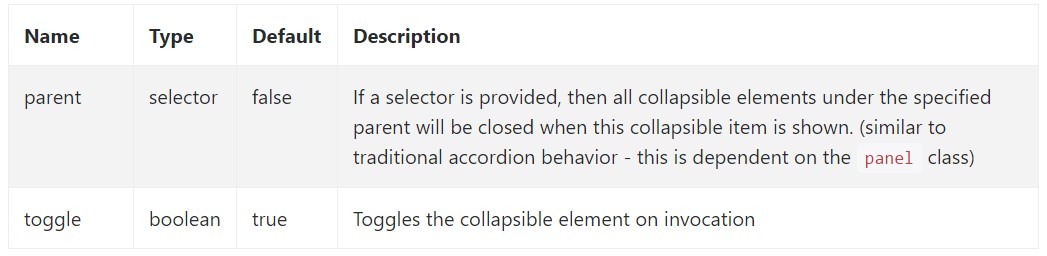
Approaches
.collapse(options)
Triggers your web content as a collapsible feature. Accepts an optionally available alternatives object.
$('#myCollapsible').collapse(
  toggle: false
)
.collapse('toggle')
Toggles a collapsible element to presented or else hidden.
.collapse('show')
Indicates a collapsible feature.
.collapse('hide')
Hides a collapsible component.
Occasions
Bootstrap's collapse class presents a handful of events for fixing within collapse functionality.
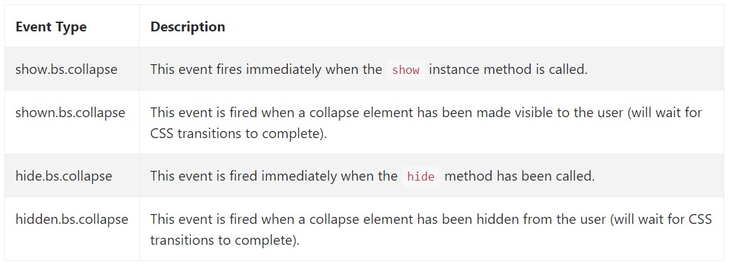
$('#myCollapsible').on('hidden.bs.collapse', function ()
  // do something…
)
Final thoughts
We use Bootstrap JavaScript implicitly, for a practical and fast result, without great programming effort we will have a great result.
However, it is not only useful for creating menus, but also any other features for displaying or hiding on-screen components, according to the actions and demands of users.
In general these features are also useful for hiding or displaying large amounts of information, enabling more dynamism to the site and also leaving the layout cleaner.
Look at some youtube video information about Bootstrap collapse
Related topics:
Bootstrap collapse approved documentation
Bootstrap collapse short training
Bootstrap collapse problem