Bootstrap Form
Intro
Bootstrap delivers various form control styles, layout features, plus custom made components for setting up a variety of forms.
Bootstrap forms provide the perfect solution for getting some feedback from the visitors of our pages. Nevertheless if it’s a simple contact or subscription form with just a few fields or a sophisticated and well thought inquiry the Bootstrap 4 framework got everything that’s needed to complete the task and obtain great responsive appearence.
There are quite a few differences between the ways the forms get implemented in the new fourth version of the Bootstrap framework. The theme is rather vast so we’ll try marking up all the important stuff.
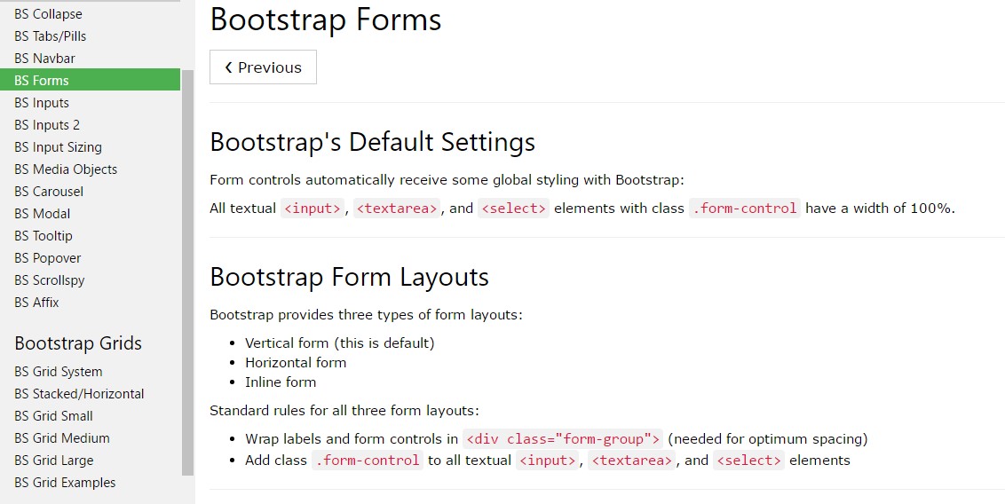
By default in the Bootstrap framework the form elements are styled to span the whole width of its parent element – this gets achieved by assigning the .form-control class. The lebels and controls should be wrapped inside a parent element with the .form-group class for optimal spacing.
Form controls
Bootstrap's form controls grow with regards to our rebooted form appearances along with classes.
Work with these kinds of classes to opt in their modified screens for a much more steady rendering all-around gadgets and browsers . The representation form shown below displays basic HTML form elements which obtain modified designs directly from Bootstrap plus additional classes.
Take note, considering Bootstrap employs the HTML5 doctype, all types of inputs need to feature a type attribute.
<form>
<div class="form-group">
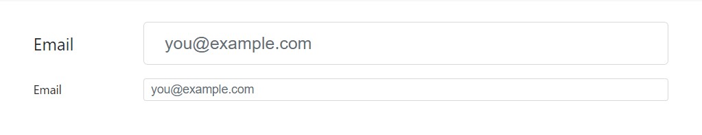
<label for="exampleInputEmail1">Email address</label>
<input type="email" class="form-control" id="exampleInputEmail1" aria-describedby="emailHelp" placeholder="Enter email">
<small id="emailHelp" class="form-text text-muted">We'll never share your email with anyone else.</small>
</div>
<div class="form-group">
<label for="exampleInputPassword1">Password</label>
<input type="password" class="form-control" id="exampleInputPassword1" placeholder="Password">
</div>
<div class="form-group">
<label for="exampleSelect1">Example select</label>
<select class="form-control" id="exampleSelect1">
<option>1</option>
<option>2</option>
<option>3</option>
<option>4</option>
<option>5</option>
</select>
</div>
<div class="form-group">
<label for="exampleSelect2">Example multiple select</label>
<select multiple class="form-control" id="exampleSelect2">
<option>1</option>
<option>2</option>
<option>3</option>
<option>4</option>
<option>5</option>
</select>
</div>
<div class="form-group">
<label for="exampleTextarea">Example textarea</label>
<textarea class="form-control" id="exampleTextarea" rows="3"></textarea>
</div>
<div class="form-group">
<label for="exampleInputFile">File input</label>
<input type="file" class="form-control-file" id="exampleInputFile" aria-describedby="fileHelp">
<small id="fileHelp" class="form-text text-muted">This is some placeholder block-level help text for the above input. It's a bit lighter and easily wraps to a new line.</small>
</div>
<fieldset class="form-group">
<legend>Radio buttons</legend>
<div class="form-check">
<label class="form-check-label">
<input type="radio" class="form-check-input" name="optionsRadios" id="optionsRadios1" value="option1" checked>
Option one is this and that—be sure to include why it's great
</label>
</div>
<div class="form-check">
<label class="form-check-label">
<input type="radio" class="form-check-input" name="optionsRadios" id="optionsRadios2" value="option2">
Option two can be something else and selecting it will deselect option one
</label>
</div>
<div class="form-check disabled">
<label class="form-check-label">
<input type="radio" class="form-check-input" name="optionsRadios" id="optionsRadios3" value="option3" disabled>
Option three is disabled
</label>
</div>
</fieldset>
<div class="form-check">
<label class="form-check-label">
<input type="checkbox" class="form-check-input">
Check me out
</label>
</div>
<button type="submit" class="btn btn-primary">Submit</button>
</form>Below is a complete catalog of the specific form regulations upheld by Bootstrap and the classes that individualize them. Added documents is offered for each group.
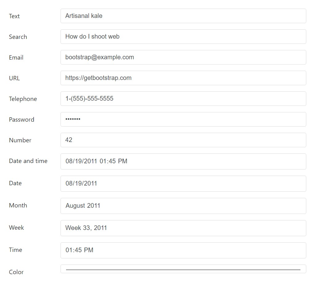
Textual inputs
Below are the illustrations of .form-control applied to each textual HTML5 <input> type.
<div class="form-group row">
  <label for="example-text-input" class="col-2 col-form-label">Text</label>
  <div class="col-10">
    <input class="form-control" type="text" value="Artisanal kale" id="example-text-input">
  </div>
</div>
<div class="form-group row">
  <label for="example-search-input" class="col-2 col-form-label">Search</label>
  <div class="col-10">
    <input class="form-control" type="search" value="How do I shoot web" id="example-search-input">
  </div>
</div>
<div class="form-group row">
  <label for="example-email-input" class="col-2 col-form-label">Email</label>
  <div class="col-10">
    <input class="form-control" type="email" value="[email protected]" id="example-email-input">
  </div>
</div>
<div class="form-group row">
  <label for="example-url-input" class="col-2 col-form-label">URL</label>
  <div class="col-10">
    <input class="form-control" type="url" value="https://getbootstrap.com" id="example-url-input">
  </div>
</div>
<div class="form-group row">
  <label for="example-tel-input" class="col-2 col-form-label">Telephone</label>
  <div class="col-10">
    <input class="form-control" type="tel" value="1-(555)-555-5555" id="example-tel-input">
  </div>
</div>
<div class="form-group row">
  <label for="example-password-input" class="col-2 col-form-label">Password</label>
  <div class="col-10">
    <input class="form-control" type="password" value="hunter2" id="example-password-input">
  </div>
</div>
<div class="form-group row">
  <label for="example-number-input" class="col-2 col-form-label">Number</label>
  <div class="col-10">
    <input class="form-control" type="number" value="42" id="example-number-input">
  </div>
</div>
<div class="form-group row">
  <label for="example-datetime-local-input" class="col-2 col-form-label">Date and time</label>
  <div class="col-10">
    <input class="form-control" type="datetime-local" value="2011-08-19T13:45:00" id="example-datetime-local-input">
  </div>
</div>
<div class="form-group row">
  <label for="example-date-input" class="col-2 col-form-label">Date</label>
  <div class="col-10">
    <input class="form-control" type="date" value="2011-08-19" id="example-date-input">
  </div>
</div>
<div class="form-group row">
  <label for="example-month-input" class="col-2 col-form-label">Month</label>
  <div class="col-10">
    <input class="form-control" type="month" value="2011-08" id="example-month-input">
  </div>
</div>
<div class="form-group row">
  <label for="example-week-input" class="col-2 col-form-label">Week</label>
  <div class="col-10">
    <input class="form-control" type="week" value="2011-W33" id="example-week-input">
  </div>
</div>
<div class="form-group row">
  <label for="example-time-input" class="col-2 col-form-label">Time</label>
  <div class="col-10">
    <input class="form-control" type="time" value="13:45:00" id="example-time-input">
  </div>
</div>
<div class="form-group row">
  <label for="example-color-input" class="col-2 col-form-label">Color</label>
  <div class="col-10">
    <input class="form-control" type="color" value="#563d7c" id="example-color-input">
  </div>
</div>
Form layouts
Given that Bootstrap applies display:block and width :100% to almost all our form controls, forms will by default stack vertically. Alternative classes may possibly be chosen to differ this layout on a per-form basis.
Form categories
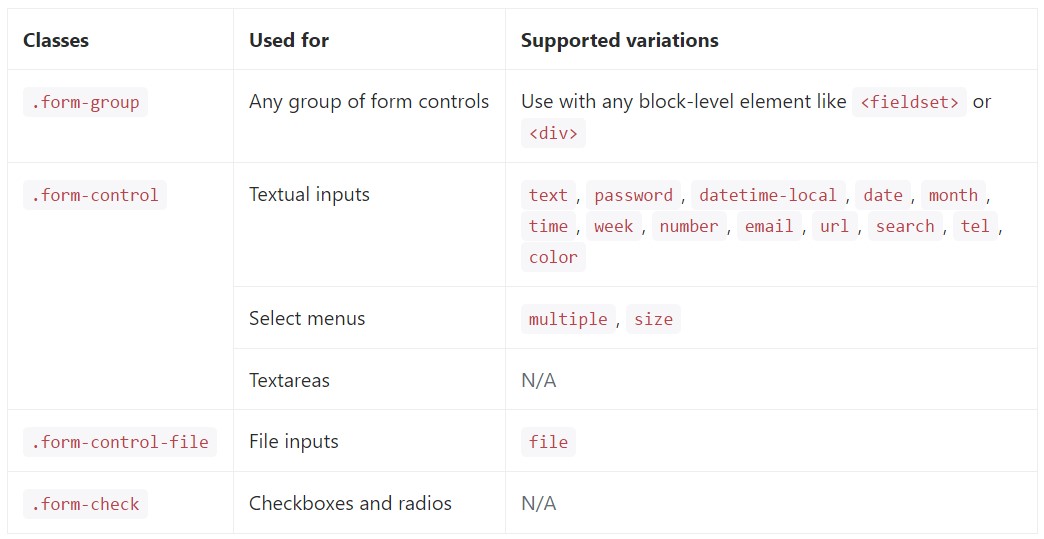
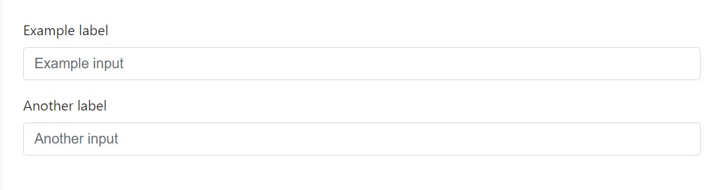
The .form-group class is the best procedure to provide some design to forms. Its only possible objective is to present margin-bottom around a label and command pairing. Just as a bonus, due to the fact that it's a class you have the ability to apply it through <fieldset>-s, <div>-s, or nearly most other element.
<form>
  <div class="form-group">
    <label for="formGroupExampleInput">Example label</label>
    <input type="text" class="form-control" id="formGroupExampleInput" placeholder="Example input">
  </div>
  <div class="form-group">
    <label for="formGroupExampleInput2">Another label</label>
    <input type="text" class="form-control" id="formGroupExampleInput2" placeholder="Another input">
  </div>
</form>
Inline forms
When it comes to inline forms ( utilizing the .form-inline class ), where the controls should align next to each other, the new version requires wrapping them in additional .row element. Also the .form-horizontal class is no longer needed. When grids are used for creating the form layout the old .control-label class gets replaced by .col-form-label.
Use the .form-inline class to present a number of labels, form regulations , and buttons regarding a solitary horizontal row. Form controls within inline forms vary slightly against their default states.
- Controls are display:flex, breaking all HTML white-colored area and enabling you to deliver arrangement regulation having spacing and flexbox utilities.
- Controls plus input groups get width:auto to defeat the Bootstrap default width:100%.
- Controls exclusively appear inline inside of the viewports that are at least 576px big to represent thin viewports on mobile devices.
You may perhaps ought to manually deal with the size and alignment of individual form controls with spacing utilities (as presented here) And finally, be sure to constantly feature a <label> along with every form control, even if you need to cover it directly from non-screenreader visitors with a code.

<form class="form-inline">
  <label class="sr-only" for="inlineFormInput">Name</label>
  <input type="text" class="form-control mb-2 mr-sm-2 mb-sm-0" id="inlineFormInput" placeholder="Jane Doe">

  <label class="sr-only" for="inlineFormInputGroup">Username</label>
  <div class="input-group mb-2 mr-sm-2 mb-sm-0">
    <div class="input-group-addon">@</div>
    <input type="text" class="form-control" id="inlineFormInputGroup" placeholder="Username">
  </div>

  <div class="form-check mb-2 mr-sm-2 mb-sm-0">
    <label class="form-check-label">
      <input class="form-check-input" type="checkbox"> Remember me
    </label>
  </div>

  <button type="submit" class="btn btn-primary">Submit</button>
</form>
Customized form controls plus picks are likewise maintained.
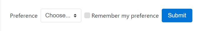
<form class="form-inline">
  <label class="mr-sm-2" for="inlineFormCustomSelect">Preference</label>
  <select class="custom-select mb-2 mr-sm-2 mb-sm-0" id="inlineFormCustomSelect">
    <option selected>Choose...</option>
    <option value="1">One</option>
    <option value="2">Two</option>
    <option value="3">Three</option>
  </select>

  <label class="custom-control custom-checkbox mb-2 mr-sm-2 mb-sm-0">
    <input type="checkbox" class="custom-control-input">
    <span class="custom-control-indicator"></span>
    <span class="custom-control-description">Remember my preference</span>
  </label>

  <button type="submit" class="btn btn-primary">Submit</button>
</form>
Alternatives to hidden labels
Assistive modern technologies for example, screen readers will likely have issue by using your forms if you do not provide a label for each input. For these inline forms, you have the ability to cover up the labels working with the .sr-only class. There are actually supplementary different methods of delivering a label for assistive technological innovations, such as the aria-label, aria-labelledby or title attribute. If not any of these exist, assistive technologies may perhaps invoke applying the placeholder attribute, in the case that present, still, take note that usage of placeholder as a replacement for various other labelling methods is not really recommended.
Operating the Grid
For extra organised form layouts that are in addition responsive, you can surely implement Bootstrap's predefined grid classes alternatively mixins to make horizontal forms. Include the .row class to form groups and employ the .col-*-* classes to define the width of your controls and labels.
Be sure to add .col-form-label to your <label>-s as well so they’re vertically centered with their associated form controls. For <legend> elements, you can use .col-form-legend to make them appear similar to regular <label> elements.
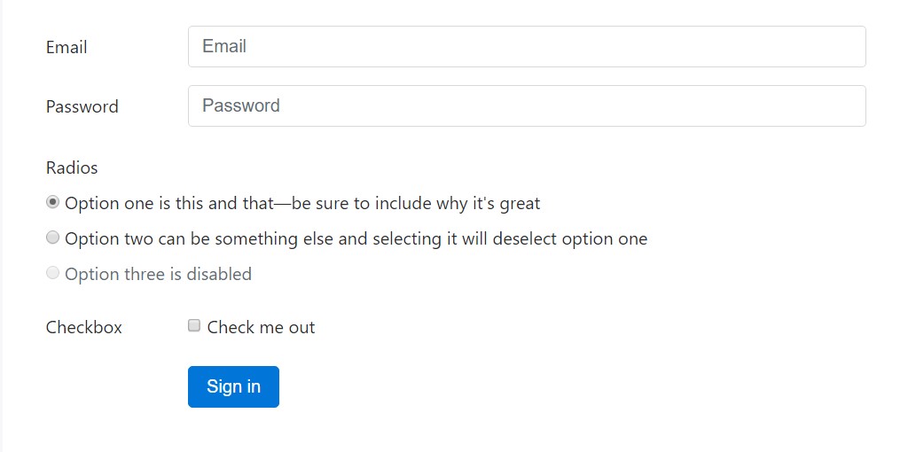
<div class="container">
  <form>
    <div class="form-group row">
      <label for="inputEmail3" class="col-sm-2 col-form-label">Email</label>
      <div class="col-sm-10">
        <input type="email" class="form-control" id="inputEmail3" placeholder="Email">
      </div>
    </div>
    <div class="form-group row">
      <label for="inputPassword3" class="col-sm-2 col-form-label">Password</label>
      <div class="col-sm-10">
        <input type="password" class="form-control" id="inputPassword3" placeholder="Password">
      </div>
    </div>
    <fieldset class="form-group row">
      <legend class="col-form-legend col-sm-2">Radios</legend>
      <div class="col-sm-10">
        <div class="form-check">
          <label class="form-check-label">
            <input class="form-check-input" type="radio" name="gridRadios" id="gridRadios1" value="option1" checked>
            Option one is this and that—be sure to include why it's great
          </label>
        </div>
        <div class="form-check">
          <label class="form-check-label">
            <input class="form-check-input" type="radio" name="gridRadios" id="gridRadios2" value="option2">
            Option two can be something else and selecting it will deselect option one
          </label>
        </div>
        <div class="form-check disabled">
          <label class="form-check-label">
            <input class="form-check-input" type="radio" name="gridRadios" id="gridRadios3" value="option3" disabled>
            Option three is disabled
          </label>
        </div>
      </div>
    </fieldset>
    <div class="form-group row">
      <label class="col-sm-2">Checkbox</label>
      <div class="col-sm-10">
        <div class="form-check">
          <label class="form-check-label">
            <input class="form-check-input" type="checkbox"> Check me out
          </label>
        </div>
      </div>
    </div>
    <div class="form-group row">
      <div class="offset-sm-2 col-sm-10">
        <button type="submit" class="btn btn-primary">Sign in</button>
      </div>
    </div>
  </form>
</div>
Grid-based form designs also sustain large and small inputs.
<div class="container">
  <form>
    <div class="form-group row">
      <label for="lgFormGroupInput" class="col-sm-2 col-form-label col-form-label-lg">Email</label>
      <div class="col-sm-10">
        <input type="email" class="form-control form-control-lg" id="lgFormGroupInput" placeholder="[email protected]">
      </div>
    </div>
    <div class="form-group row">
      <label for="smFormGroupInput" class="col-sm-2 col-form-label col-form-label-sm">Email</label>
      <div class="col-sm-10">
        <input type="email" class="form-control form-control-sm" id="smFormGroupInput" placeholder="[email protected]">
      </div>
    </div>
  </form>
</div>
Checkboxes and radios
Default radios and checkboxes are developed upon with the assistance of .form-check, a specific class for each input types that upgrades the layout and behavior of their HTML elements. Checkboxes are for selecting one or a handful of selections in a list, as long as radios are for picking just one option from many.
Disabled checkboxes and radios are assisted, but to provide a not-allowed cursor on hover of the parent <label>, you'll ought to incorporate the .disabled class to the parent .form-check. The disabled class is going to also make lighter the message color to help reveal the input's state.
Each and every checkbox and radio is wrapped inside a <label> for three causes:
- It provides a greater hit areas for checking the control.
- It delivers a semantic and practical wrapper in order to help us replace the default <input>-s.
- It produces the state of the <input> instantly, indicating no JavaScript is needed.
We cover the default <input> along with opacity and utilize the .custom-control-indicator to set up a new custom made form sign in its place. Sorry to say we can't build a customized one because of just the <input> due to the fact that CSS's content does not function on that component..
We utilize the relative selector (~) for all our <input> states - such as :checked - to appropriately style our custom form indication . While mixed with the .custom-control-description class, we are able to likewise format the text message for each item formed on the <input>-s state.
In the checked states, we use base64 embedded SVG icons from Open Iconic. This provides us the best control for styling and positioning across browsers and devices.
Checkboxes

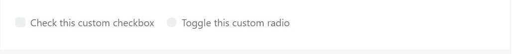
<label class="custom-control custom-checkbox">
  <input type="checkbox" class="custom-control-input">
  <span class="custom-control-indicator"></span>
  <span class="custom-control-description">Check this custom checkbox</span>
</label>
Customized checkboxes can additionally apply the :indeterminate pseudo class when manually fixed via JavaScript (there is really no obtainable HTML attribute for defining it).

If you are actually using jQuery, something such as this should really be enough:
$('.your-checkbox').prop('indeterminate', true)Radios

<label class="custom-control custom-radio">
  <input id="radio1" name="radio" type="radio" class="custom-control-input">
  <span class="custom-control-indicator"></span>
  <span class="custom-control-description">Toggle this custom radio</span>
</label>
<label class="custom-control custom-radio">
  <input id="radio2" name="radio" type="radio" class="custom-control-input">
  <span class="custom-control-indicator"></span>
  <span class="custom-control-description">Or toggle this other custom radio</span>
</label>
Default (stacked)
By default, any quantity of checkboxes and radios that are certainly immediate sibling will be vertically loaded plus appropriately spaced by using .form-check.

<div class="form-check">
  <label class="form-check-label">
    <input class="form-check-input" type="checkbox" value="">
    Option one is this and that—be sure to include why it's great
  </label>
</div>
<div class="form-check disabled">
  <label class="form-check-label">
    <input class="form-check-input" type="checkbox" value="" disabled>
    Option two is disabled
  </label>
</div>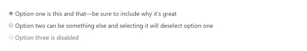
<div class="form-check">
  <label class="form-check-label">
    <input class="form-check-input" type="radio" name="exampleRadios" id="exampleRadios1" value="option1" checked>
    Option one is this and that—be sure to include why it's great
  </label>
</div>
<div class="form-check">
  <label class="form-check-label">
    <input class="form-check-input" type="radio" name="exampleRadios" id="exampleRadios2" value="option2">
    Option two can be something else and selecting it will deselect option one
  </label>
</div>
<div class="form-check disabled">
  <label class="form-check-label">
    <input class="form-check-input" type="radio" name="exampleRadios" id="exampleRadios3" value="option3" disabled>
    Option three is disabled
  </label>
</div>
Inline
Group checkboxes as well as radios on the identical horizontal row simply by incorporating .form-check-inline to every .form-check.

<div class="form-check form-check-inline">
  <label class="form-check-label">
    <input class="form-check-input" type="checkbox" id="inlineCheckbox1" value="option1"> 1
  </label>
</div>
<div class="form-check form-check-inline">
  <label class="form-check-label">
    <input class="form-check-input" type="checkbox" id="inlineCheckbox2" value="option2"> 2
  </label>
</div>
<div class="form-check form-check-inline disabled">
  <label class="form-check-label">
    <input class="form-check-input" type="checkbox" id="inlineCheckbox3" value="option3" disabled> 3
  </label>
</div>
<div class="form-check form-check-inline">
  <label class="form-check-label">
    <input class="form-check-input" type="radio" name="inlineRadioOptions" id="inlineRadio1" value="option1"> 1
  </label>
</div>
<div class="form-check form-check-inline">
  <label class="form-check-label">
    <input class="form-check-input" type="radio" name="inlineRadioOptions" id="inlineRadio2" value="option2"> 2
  </label>
</div>
<div class="form-check form-check-inline disabled">
  <label class="form-check-label">
    <input class="form-check-input" type="radio" name="inlineRadioOptions" id="inlineRadio3" value="option3" disabled> 3
  </label>
</div>
With no labels
You really should not provide a text inside the <label>, the input is located as you 'd want. Currently exclusively works on non-inline checkboxes and radios. Keep in mind to currently provide some sort of label for assistive modern technologies ( as an example, applying aria-label).

<div class="form-check">
  <label class="form-check-label">
    <input class="form-check-input" type="checkbox" id="blankCheckbox" value="option1" aria-label="...">
  </label>
</div>
<div class="form-check">
  <label class="form-check-label">
    <input class="form-check-input" type="radio" name="blankRadio" id="blankRadio1" value="option1" aria-label="...">
  </label>
</div>
Static controls
In case you want to place plain words near a form label in a form, make use of the .form-control-static class on an element of your choice.
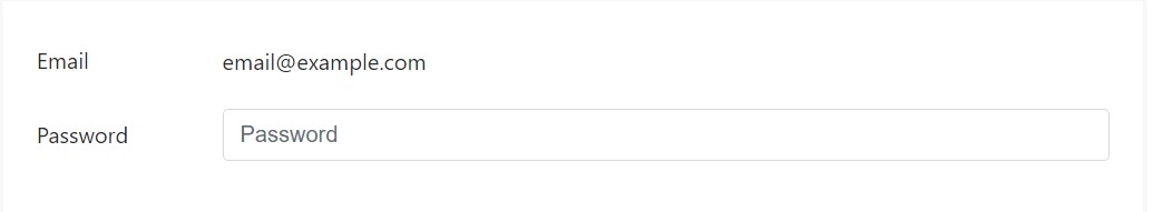
<form>
  <div class="form-group row">
    <label class="col-sm-2 col-form-label">Email</label>
    <div class="col-sm-10">
      <p class="form-control-static">[email protected]</p>
    </div>
  </div>
  <div class="form-group row">
    <label for="inputPassword" class="col-sm-2 col-form-label">Password</label>
    <div class="col-sm-10">
      <input type="password" class="form-control" id="inputPassword" placeholder="Password">
    </div>
  </div>
</form>
<form class="form-inline">
  <div class="form-group">
    <label class="sr-only">Email</label>
    <p class="form-control-static">[email protected]</p>
  </div>
  <div class="form-group mx-sm-3">
    <label for="inputPassword2" class="sr-only">Password</label>
    <input type="password" class="form-control" id="inputPassword2" placeholder="Password">
  </div>
  <button type="submit" class="btn btn-primary">Confirm identity</button>
</form>
Disabled status
Provide the disabled boolean attribute on an input to avoid user interactions. Disabled inputs look lighter and provide a not-allowed pointer.
<input class="form-control" id="disabledInput" type="text" placeholder="Disabled input here..." disabled>Add in the disabled attribute to a <fieldset> to disable all the controls within.
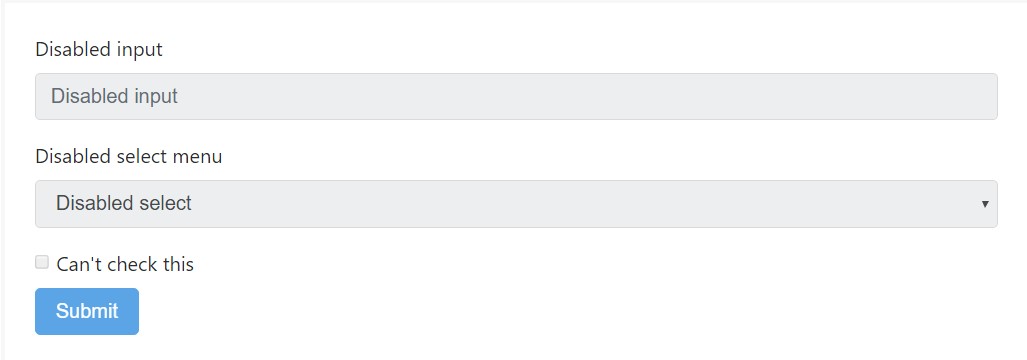
<form>
  <fieldset disabled>
    <div class="form-group">
      <label for="disabledTextInput">Disabled input</label>
      <input type="text" id="disabledTextInput" class="form-control" placeholder="Disabled input">
    </div>
    <div class="form-group">
      <label for="disabledSelect">Disabled select menu</label>
      <select id="disabledSelect" class="form-control">
        <option>Disabled select</option>
      </select>
    </div>
    <div class="checkbox">
      <label>
        <input type="checkbox"> Can't check this
      </label>
    </div>
    <button type="submit" class="btn btn-primary">Submit</button>
  </fieldset>
</form>
Caution concerning web link capabilities of <a>
By default, the internet browsers will certainly handle all of the original form controls (<input>, <select> plus <button> elements) inside a <fieldset disabled> as disabled, preventing both the keyboard and computer mouse interactions on them. Nevertheless, when your form also involves <a ... class="btn btn-*"> components, these will just be offered a design of pointer-events:none. Like considered inside the part about disabled state for buttons (and specifically in the sub-section for anchor features ), this specific CSS property is not really yet standartized and also isn't entirely promoted in Opera 18 and below, as well as in Internet Explorer 11, and will not prevent keyboard users from being able to focus or turn on these particular web links. And so to be protected, work with custom-made JavaScript to disable this kind of links.
Cross-browser consonance
As long as Bootstrap will add these kinds of formats within all of the web browsers, Internet Explorer 11 and below don't completely sustain the disabled attribute on a <fieldset>.Use custom JavaScript to turn off the fieldset in these browsers.
Read-only inputs
Incorporate the readonly boolean attribute on an input to prevent changes of the input's value. Read-only inputs look lighter ( the same as disabled inputs), but maintain the regular pointer.
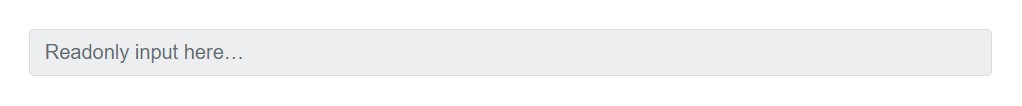
<input class="form-control" type="text" placeholder="Readonly input here…" readonly>Command proportions
The way the controls are being sized is a bit changed too – the Bootstrap 3 form control size classes .input-sm and .input-lg are replaced by the new Bootstrap 4 classes .form-control-sm and .form-control-lg.
Establish heights utilizing classes like .form-control-lg, plus set widths employing grid column classes just like .col-lg-*.
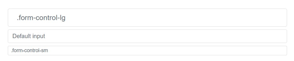
<input class="form-control form-control-lg" type="text" placeholder=".form-control-lg">
<input class="form-control" type="text" placeholder="Default input">
<input class="form-control form-control-sm" type="text" placeholder=".form-control-sm">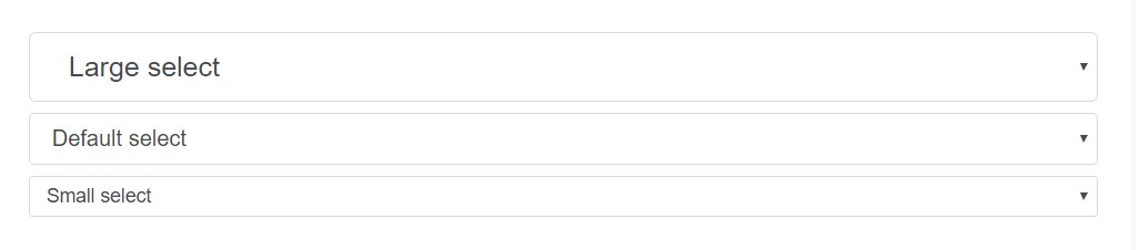
<select class="form-control form-control-lg">
  <option>Large select</option>
</select>
<select class="form-control">
  <option>Default select</option>
</select>
<select class="form-control form-control-sm">
  <option>Small select</option>
</select>
Column size
Wrap inputs within a grid columns, or else any sort of custom-made parent element, in order to efficiently implement the desired widths.
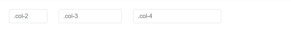
<div class="row">
  <div class="col-2">
    <input type="text" class="form-control" placeholder=".col-2">
  </div>
  <div class="col-3">
    <input type="text" class="form-control" placeholder=".col-3">
  </div>
  <div class="col-4">
    <input type="text" class="form-control" placeholder=".col-4">
  </div>
</div>
Help text
The .help-block class is dropped in the new version. If you need to place some extra text to help your visitors to better get around - use the .form-text class instead.
Bootstrap 4 has some built in validation styles for the form controls being used. In this version the .has-feedback class has been dropped – it’s no longer needed with the introduction of the
.form-control-danger , .form-control-warning and .form-control-success classes adding a small information icon right inside of the input fields.
Affiliating help content with form controls
Support text needs to be clearly associated with the form control it associates with employing the aria-describedby attribute. This are going to guarantee that the assistive technologies - such as screen readers - will announce this support message if the user focuses or else gets in the control.
Block level
Block support content - for below inputs as well as for a lot longer lines of the guidance content - can be simply achieved utilizing .form-text. This particular class includes display:block and also brings in some top margin for an easy spacing from the inputs mentioned above.
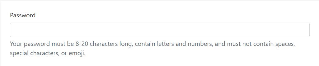
<label for="inputPassword5">Password</label>
<input type="password" id="inputPassword5" class="form-control" aria-describedby="passwordHelpBlock">
<p id="passwordHelpBlock" class="form-text text-muted">
  Your password must be 8-20 characters long, contain letters and numbers, and must not contain spaces, special characters, or emoji.
</p>
Inline
Inline content are able to use any sort of usual inline HTML element (be it a <small>, <span>, or another thing).
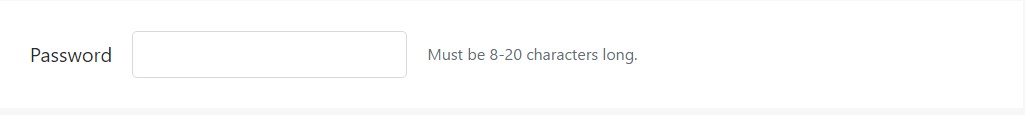
<form class="form-inline">
  <div class="form-group">
    <label for="inputPassword4">Password</label>
    <input type="password" id="inputPassword4" class="form-control mx-sm-3" aria-describedby="passwordHelpInline">
    <small id="passwordHelpInline" class="text-muted">
      Must be 8-20 characters long.
    </small>
  </div>
</form>
Validation
Bootstrap consists of validation varieties for danger, success, and warning states on most form controls.
Tips on how to operate
Here's a explanation of exactly how they do work:
- To employ, put in .has-warning, .has-danger, or .has-success to the parent element. Any kind of .col-form-label, . form-control, as well as the custom form element will be given the validation varieties.
- Contextual validation text message, in addition to your common form area assistance text, may be incorporated together with the use of .form-control-feedback. This specific message is going to adapt to the parent .has-* class. By default it only provides a bit of margin for spacing and also a transformed color for each and every state.
- Validation icons are url()-s constructed by means of Sass variables which are related to background-image declarations for each state.
- You may use your personal base64 PNGs or even SVGs with improving the Sass variables as well as recompiling.
- Icons can easily as well be disabled totally simply by setting the variables to none or commenting out the source Sass.
Describing states
Commonly stating, you'll need to use a certain state for a particular kinds of responses:
- Danger is great for when there's a blocking or possibly requested field. A user ought to notify this specific field the proper way to submit the form.
- Warning performs successfully for input values which are in progression, just like the parole strength, or else soft validation just before a user tries to submit a form.
- And finally, success is fitting for cases each time you have per-field validation through a form and also would like to urge a user throughout the remaining fields.
Examples
Here are some examples of the aforementioned classes in action. First up is your regular left-aligned fields together with the labels, guide message, and validation texting.
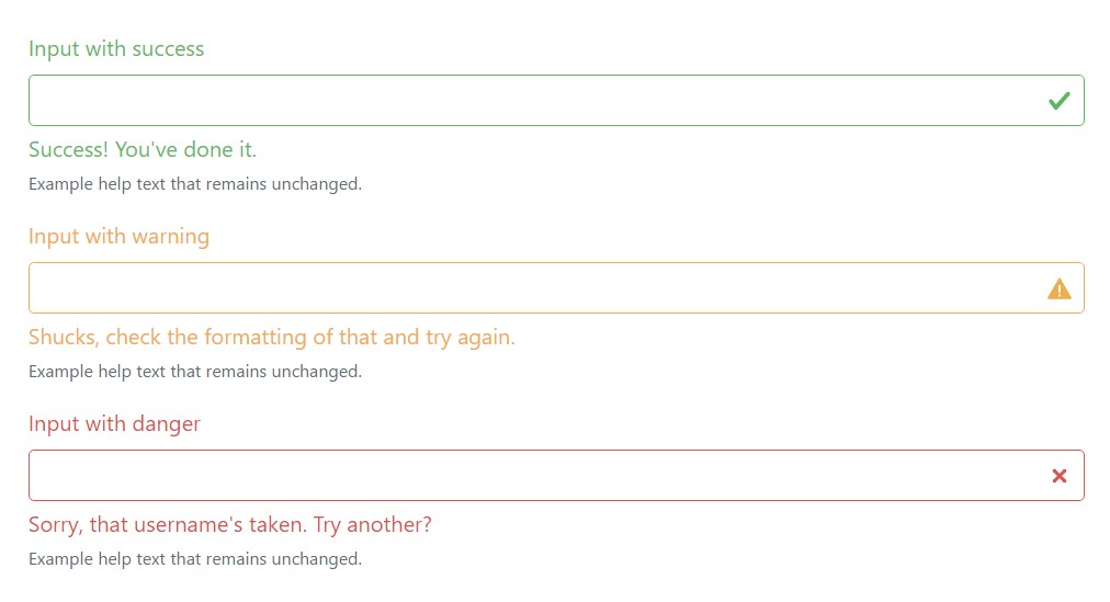
<div class="form-group has-success">
  <label class="form-control-label" for="inputSuccess1">Input with success</label>
  <input type="text" class="form-control form-control-success" id="inputSuccess1">
  <div class="form-control-feedback">Success! You've done it.</div>
  <small class="form-text text-muted">Example help text that remains unchanged.</small>
</div>
<div class="form-group has-warning">
  <label class="form-control-label" for="inputWarning1">Input with warning</label>
  <input type="text" class="form-control form-control-warning" id="inputWarning1">
  <div class="form-control-feedback">Shucks, check the formatting of that and try again.</div>
  <small class="form-text text-muted">Example help text that remains unchanged.</small>
</div>
<div class="form-group has-danger">
  <label class="form-control-label" for="inputDanger1">Input with danger</label>
  <input type="text" class="form-control form-control-danger" id="inputDanger1">
  <div class="form-control-feedback">Sorry, that username's taken. Try another?</div>
  <small class="form-text text-muted">Example help text that remains unchanged.</small>
</div>
All those similar states may also be utilized along with horizontal forms.
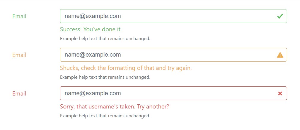
<div class="container">
  <form>
    <div class="form-group row has-success">
      <label for="inputHorizontalSuccess" class="col-sm-2 col-form-label">Email</label>
      <div class="col-sm-10">
        <input type="email" class="form-control form-control-success" id="inputHorizontalSuccess" placeholder="[email protected]">
        <div class="form-control-feedback">Success! You've done it.</div>
        <small class="form-text text-muted">Example help text that remains unchanged.</small>
      </div>
    </div>
    <div class="form-group row has-warning">
      <label for="inputHorizontalWarning" class="col-sm-2 col-form-label">Email</label>
      <div class="col-sm-10">
        <input type="email" class="form-control form-control-warning" id="inputHorizontalWarning" placeholder="[email protected]">
        <div class="form-control-feedback">Shucks, check the formatting of that and try again.</div>
        <small class="form-text text-muted">Example help text that remains unchanged.</small>
      </div>
    </div>
    <div class="form-group row has-danger">
      <label for="inputHorizontalDnger" class="col-sm-2 col-form-label">Email</label>
      <div class="col-sm-10">
        <input type="email" class="form-control form-control-danger" id="inputHorizontalDnger" placeholder="[email protected]">
        <div class="form-control-feedback">Sorry, that username's taken. Try another?</div>
        <small class="form-text text-muted">Example help text that remains unchanged.</small>
      </div>
    </div>
  </form>
</div>
Checkboxes and radios are likewise assisted.
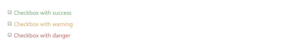
<div class="form-check has-success">
  <label class="form-check-label">
    <input type="checkbox" class="form-check-input" id="checkboxSuccess" value="option1">
    Checkbox with success
  </label>
</div>
<div class="form-check has-warning">
  <label class="form-check-label">
    <input type="checkbox" class="form-check-input" id="checkboxWarning" value="option1">
    Checkbox with warning
  </label>
</div>
<div class="form-check has-danger">
  <label class="form-check-label">
    <input type="checkbox" class="form-check-input" id="checkboxDanger" value="option1">
    Checkbox with danger
  </label>
</div>
Custom forms
For much more customization and cross internet browser likeness, work with Bootstrap entirely custom-made form features to substitute the internet browser defaults. They're built on top of accessible and semantic markup, in this way they are definitely stable replacements for any type of default form control.
Disabled
Customized checkboxes and radios are able to additionally be disabled . Incorporate the disabled boolean attribute to the <input> plus the custom indicator plus label explanation will be instantly styled.
<label class="custom-control custom-checkbox">
  <input type="checkbox" class="custom-control-input" disabled>
  <span class="custom-control-indicator"></span>
  <span class="custom-control-description">Check this custom checkbox</span>
</label>

<label class="custom-control custom-radio">
  <input id="radio3" name="radioDisabled" type="radio" class="custom-control-input" disabled>
  <span class="custom-control-indicator"></span>
  <span class="custom-control-description">Toggle this custom radio</span>
</label>
Validation conditions
Bring in the other states to your custom-made forms with Bootstrap validation classes.
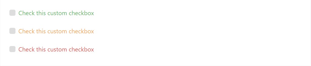
<div class="form-group has-success">
  <label class="custom-control custom-checkbox">
    <input type="checkbox" class="custom-control-input">
    <span class="custom-control-indicator"></span>
    <span class="custom-control-description">Check this custom checkbox</span>
  </label>
</div>
<div class="form-group has-warning">
  <label class="custom-control custom-checkbox">
    <input type="checkbox" class="custom-control-input">
    <span class="custom-control-indicator"></span>
    <span class="custom-control-description">Check this custom checkbox</span>
  </label>
</div>
<div class="form-group has-danger mb-0">
  <label class="custom-control custom-checkbox">
    <input type="checkbox" class="custom-control-input">
    <span class="custom-control-indicator"></span>
    <span class="custom-control-description">Check this custom checkbox</span>
  </label>
</div>
Stacked
Custom radios and checkboxes are inline to start. Provide a parent together with class .custom-controls-stacked to make sure that each form control is on different lines.
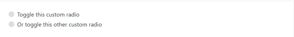
<div class="custom-controls-stacked">
  <label class="custom-control custom-radio">
    <input id="radioStacked1" name="radio-stacked" type="radio" class="custom-control-input">
    <span class="custom-control-indicator"></span>
    <span class="custom-control-description">Toggle this custom radio</span>
  </label>
  <label class="custom-control custom-radio">
    <input id="radioStacked2" name="radio-stacked" type="radio" class="custom-control-input">
    <span class="custom-control-indicator"></span>
    <span class="custom-control-description">Or toggle this other custom radio</span>
  </label>
</div>
Select menu
Custom <select> menus really need only a custom-made class, .custom-select to trigger the custom-made styles.
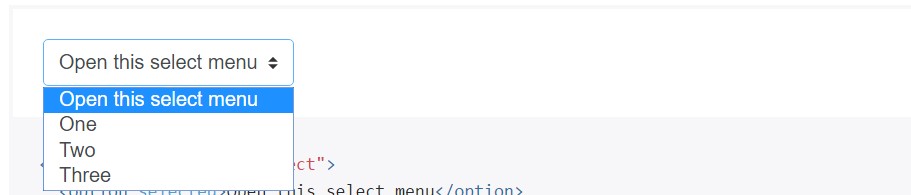
<select class="custom-select">
  <option selected>Open this select menu</option>
  <option value="1">One</option>
  <option value="2">Two</option>
  <option value="3">Three</option>
</select>
File web browser
The file input is the most finest of the pack and require additional JavaScript in the case that you wish to catch all of them up with an effective Choose file ... and selected file name text.
<label class="custom-file">
  <input type="file" id="file" class="custom-file-input">
  <span class="custom-file-control"></span>
</label>
Here’s The ways to use:
- We wrap the <input> in a <label> with the purpose that the custom made control efficiently activates the file internet browser.
- We hide the default file <input> with opacity.
- We utilize :after to develop a custom-made background and directive (Choose file ...).
- We apply :before to develop and position the Internet browser button.
- We state a height upon the <input> for a proper spacing for surrounding material .
Puts simply, it is simply an absolutely customized feature, purely produced using CSS.
Interpreting as well as altering the sequences
The :lang() pseudo-class is utilized to allow simple translation of the "Browse" together with "Choose file ..." text in to different languages. Just simply override or put in gates to the $ custom-file-text SCSS variable with the related language tag plus localized strings. The English strings can be customized the same way. For example, here's how one might possibly put in a Spanish adaptation (Spanish's language code is es)
$custom-file-text: (
  placeholder: (
    en: "Choose file...",
    es: "Seleccionar archivo..."
  ),
  button-label: (
    en: "Browse",
    es: "Navegar"
  )
);
You'll ought to specify the language of your file (or subtree thereof) properly in order for the suitable text to be displayed. This may possibly be performed employing the lang attribute or else the Content-Language HTTP header, amongst additional solutions.
Conclusions
Basically these are the new features to the form elements introduced in the latest fourth version of the Bootstrap framework. The overall impression is the classes got more explicit and intuitive therefore – much easier to use and with the custom control elements we can now obtain much more predictable appearance of the elements we include in the web pages we create. Now all that’s left for us is figure out the right information we would require from our potential users to fill in.
Efficient ways to utilize the Bootstrap forms:
Connected topics:
Bootstrap forms approved information
Bootstrap forms article
Support for Bootstrap Forms
Let us check out AMP project and AMP-form feature?