Bootstrap Menu
Intro
Even the simplest, not mentioning the more complicated pages do need some kind of an index for the visitors to easily get around and find what they are looking for in the first few seconds after their arrival over the page. We should always have in mind a user might be in a hurry, browsing multiple pages briefly scrolling over them trying to find something or make a decision. In these cases the clear and well stated navigational menu might make the difference between one new customer and the page being clicked away. So the structure and behavior of the page navigation are essential indeed. Furthermore our web sites get more and more views from mobiles so not having a page and a navigation on smaller screens practically equals not having a page at all and even worse.
Luckily the new fourth version of the Bootstrap framework provides us with a powerful tool to take care of the situation – the so called navbar element or the menu bar we got used seeing on the top of most pages. It is a simple yet powerful tool for wrapping our brand’s identity information, the pages structure and even a search form or a few call to action buttons. Let’s see how this whole thing gets done within Bootstrap 4.
The way to apply the Bootstrap menu:
First we need a <nav> element to wrap the things up. It should also carry the .navbar class and additionally some styling classes assigning it one of the predefined in Bootstrap 4 appearances – like .navbar-light combined with .bg-faded or bg-inverse with .navbar-inverse. You can also use one of the contextual classes like .bg-primary , .bg-warning and so on which all come with the new version of the framework. Another bright new feature introduced in the alpha 6 of Bootstrap 4 framework is you should also assign the breakpoint at which the navbar should collapse to get displayed once the menu button gets pressed. To do this add a .navbar-toggleable- ~the desired viewport size ~ to the <nav> element.
Next move
Next we need to create the so called Menu button which will appear in the place of the collapsed menu and the users will use to bring it back on. To do this create a <button> element with the .navbar-toggler class and some attributes, like data-toggle =“collapse” and data-target =“ ~ the ID of the collapse element we will create below ~ ” . The default alignment of the navbar toggle button is left, so if you want it right aligned – also apply the .navbar-toggler-right class – also a bright new Bootstrap 4 feature.
Assisted information
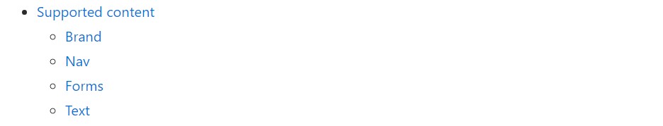
Navbars taken place having integrated support for a fistful of sub-components. Pick from the following as demanded :
.navbar-brand for your project, company, or product title.
.navbar-nav for a full-height and lightweight navigating ( involving help for dropdowns).
.navbar-toggler usage with Bootstrap collapse plugin and other navigation toggling behaviors.
.form-inline for each and every form regulations and acts.
.navbar-text for putting in vertically structured strings of content.
.collapse.navbar-collapse for arranging and concealing navbar elements through a parent breakpoint.
Here is simply an example of all the sub-components involved in a responsive light-themed navbar that instantly collapses at the md (medium) breakpoint.
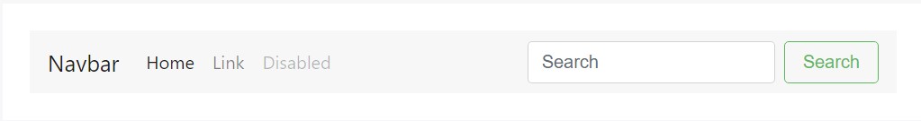
<nav class="navbar navbar-toggleable-md navbar-light bg-faded">
  <button class="navbar-toggler navbar-toggler-right" type="button" data-toggle="collapse" data-target="#navbarSupportedContent" aria-controls="navbarSupportedContent" aria-expanded="false" aria-label="Toggle navigation">
    <span class="navbar-toggler-icon"></span>
  </button>
  <a class="navbar-brand" href="#">Navbar</a>

  <div class="collapse navbar-collapse" id="navbarSupportedContent">
    <ul class="navbar-nav mr-auto">
      <li class="nav-item active">
        <a class="nav-link" href="#">Home <span class="sr-only">(current)</span></a>
      </li>
      <li class="nav-item">
        <a class="nav-link" href="#">Link</a>
      </li>
      <li class="nav-item">
        <a class="nav-link disabled" href="#">Disabled</a>
      </li>
    </ul>
    <form class="form-inline my-2 my-lg-0">
      <input class="form-control mr-sm-2" type="text" placeholder="Search">
      <button class="btn btn-outline-success my-2 my-sm-0" type="submit">Search</button>
    </form>
  </div>
</nav>
Brand
The .navbar-brand can certainly be added to a large number of elements, but an anchor does the job better considering that certain elements might probably require utility classes or customized styles.
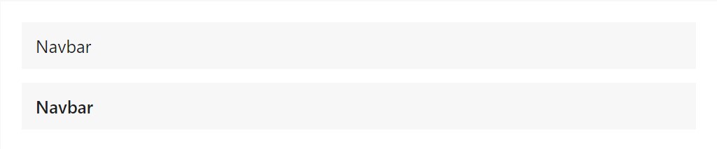
<!-- As a link -->
<nav class="navbar navbar-light bg-faded">
  <a class="navbar-brand" href="#">Navbar</a>
</nav>

<!-- As a heading -->
<nav class="navbar navbar-light bg-faded">
  <h1 class="navbar-brand mb-0">Navbar</h1>
</nav>
Nav
Navbar site navigation web links founded on Bootstrap .nav selections along with their individual modifier class and need the usage of toggler classes for appropriate responsive styling. Navigating in navbars will as well expand to possess as much horizontal area as possible to keep your navbar materials safely aligned.
Active conditions-- with .active-- to signify the recent page can possibly be applied right to .nav-links or else their immediate parent .nav-items.
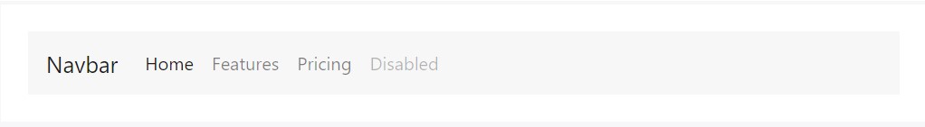
<nav class="navbar navbar-toggleable-md navbar-light bg-faded">
  <button class="navbar-toggler navbar-toggler-right" type="button" data-toggle="collapse" data-target="#navbarNav" aria-controls="navbarNav" aria-expanded="false" aria-label="Toggle navigation">
    <span class="navbar-toggler-icon"></span>
  </button>
  <a class="navbar-brand" href="#">Navbar</a>
  <div class="collapse navbar-collapse" id="navbarNav">
    <ul class="navbar-nav">
      <li class="nav-item active">
        <a class="nav-link" href="#">Home <span class="sr-only">(current)</span></a>
      </li>
      <li class="nav-item">
        <a class="nav-link" href="#">Features</a>
      </li>
      <li class="nav-item">
        <a class="nav-link" href="#">Pricing</a>
      </li>
      <li class="nav-item">
        <a class="nav-link disabled" href="#">Disabled</a>
      </li>
    </ul>
  </div>
</nav>
Forms
Put several form controls and elements inside of a navbar by using .form-inline.
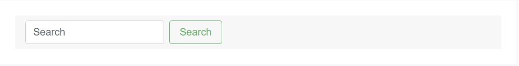
<nav class="navbar navbar-light bg-faded">
  <form class="form-inline">
    <input class="form-control mr-sm-2" type="text" placeholder="Search">
    <button class="btn btn-outline-success my-2 my-sm-0" type="submit">Search</button>
  </form>
</nav>
Text
Navbars can incorporate bits of content with .navbar-text. This class calibrates vertical positioning and horizontal spacing for strings of message.
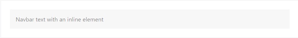
<nav class="navbar navbar-light bg-faded">
  <span class="navbar-text">
    Navbar text with an inline element
  </span>
</nav>
Yet another function
Another bright new feature – inside the .navbar-toggler you should place a <span> with the .navbar-toggler-icon to actually create the icon inside it.
You can also place an element with the .navbar-brand here and show a bit about you and your organization – like its name and logo. Optionally you might decide wrapping the whole thing into a link.
Next we need to create the container for our menu – it will expand it in a bar with inline items over the defined breakpoint and collapse it in a mobile view below it. To do this create an element with the classes .collapse and .navbar-collapse. If you have taken a look at Bootstrap 3 and Bootstrap 4 up to alpha 5 classes structure you will probably notice the breakpoint has been assigned only once – to the parent element but not to the .navbar-toggler and the .collapse element itself. This is the new way the navbar will be from Bootstrap 4 alpha 6 so take note which version you are currently using in order to structure things properly.
Finishing part
Finally it’s time for the actual navigation menu – wrap it inside an <ul> element with the .navbar-nav class – the .nav class is no longer required. The particular menu items should be wrapped inside <li> elements carrying the .nav-item class and the actual links inside them should have .nav-link applied.
Conclusions
So generally this is the structure a navigational menu in Bootstrap 4 should carry – it’s rather simple and intuitive – now all that’s left for you is thinking out the right structure and appealing captions for your content.
Check a couple of youtube video training relating to Bootstrap Menu
Related topics:
Bootstrap menu approved records
Mobirise Bootstrap menu
Bootstrap Menu on the right side