Bootstrap Accordion
Overview
Web pages are the greatest place to showcase a powerful ideas and appealing content in easy and relatively cheap way and have them available for the whole world to see and get familiar with. Will the content you’ve shared get audience’s interest and attention – this we can never know until you actually bring it live on the server. We can however guess with a relatively big chance of being right the effect of some elements over the visitor – judging either from our own experience and the good practices described over the net.
One thing is certain though – big areas of plain text are very probable to bore the user and push the visitor away – so what to do when we just need to place such bigger amount of a text – like terms and conditions, frequently asked questions, technical specifications of a product or a service which need to be detailed and exact and so on. Well that’s what the design process itself narrows down at the end – finding working solutions – and we should find a way figuring this one out – showcasing the content needed in interesting and appealing way nevertheless it might be 3 pages plain text long.
A cool approach is wrapping the text into the so called accordion element – it provides us a powerful way to have just the captions of our text clickable and present on page so generally the whole content is accessible at all times in a compact space – often a single screen so the user can easily click on what’s important and have it expanded to get familiar with the detailed content. This approach is also intuitive and have web style since small actions need to be taken to continue working with the page and so we keep the visitor evolved – sort of “push the button and see the light flashing” thing.
Efficient ways to employ the Bootstrap Accordion:
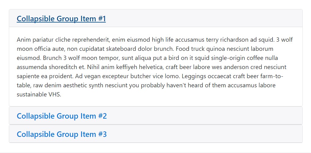
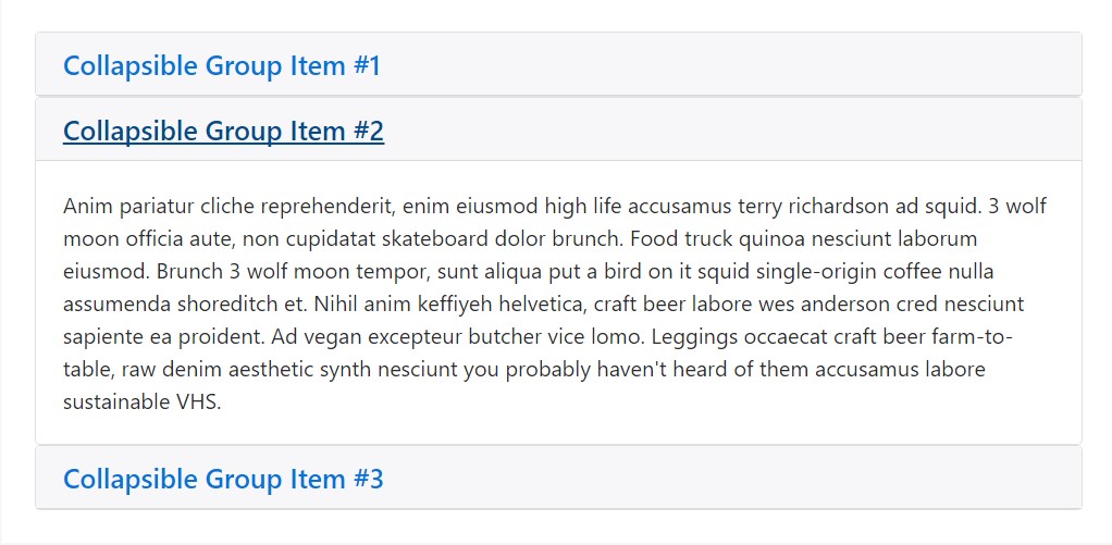
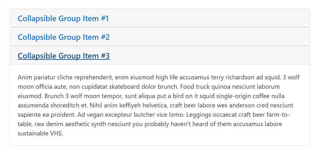
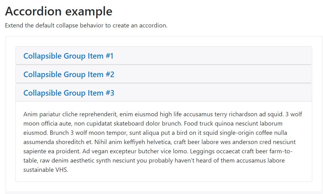
Accordion example
Prolong the default collapse behavior to develop an accordion.
<div id="accordion" role="tablist" aria-multiselectable="true">
  <div class="card">
    <div class="card-header" role="tab" id="headingOne">
      <h5 class="mb-0">
        <a data-toggle="collapse" data-parent="#accordion" href="#collapseOne" aria-expanded="true" aria-controls="collapseOne">
          Collapsible Group Item #1
        </a>
      </h5>
    </div>

    <div id="collapseOne" class="collapse show" role="tabpanel" aria-labelledby="headingOne">
      <div class="card-block">
        Anim pariatur cliche reprehenderit, enim eiusmod high life accusamus terry richardson ad squid. 3 wolf moon officia aute, non cupidatat skateboard dolor brunch. Food truck quinoa nesciunt laborum eiusmod. Brunch 3 wolf moon tempor, sunt aliqua put a bird on it squid single-origin coffee nulla assumenda shoreditch et. Nihil anim keffiyeh helvetica, craft beer labore wes anderson cred nesciunt sapiente ea proident. Ad vegan excepteur butcher vice lomo. Leggings occaecat craft beer farm-to-table, raw denim aesthetic synth nesciunt you probably haven't heard of them accusamus labore sustainable VHS.
      </div>
    </div>
  </div>
  <div class="card">
    <div class="card-header" role="tab" id="headingTwo">
      <h5 class="mb-0">
        <a class="collapsed" data-toggle="collapse" data-parent="#accordion" href="#collapseTwo" aria-expanded="false" aria-controls="collapseTwo">
          Collapsible Group Item #2
        </a>
      </h5>
    </div>
    <div id="collapseTwo" class="collapse" role="tabpanel" aria-labelledby="headingTwo">
      <div class="card-block">
        Anim pariatur cliche reprehenderit, enim eiusmod high life accusamus terry richardson ad squid. 3 wolf moon officia aute, non cupidatat skateboard dolor brunch. Food truck quinoa nesciunt laborum eiusmod. Brunch 3 wolf moon tempor, sunt aliqua put a bird on it squid single-origin coffee nulla assumenda shoreditch et. Nihil anim keffiyeh helvetica, craft beer labore wes anderson cred nesciunt sapiente ea proident. Ad vegan excepteur butcher vice lomo. Leggings occaecat craft beer farm-to-table, raw denim aesthetic synth nesciunt you probably haven't heard of them accusamus labore sustainable VHS.
      </div>
    </div>
  </div>
  <div class="card">
    <div class="card-header" role="tab" id="headingThree">
      <h5 class="mb-0">
        <a class="collapsed" data-toggle="collapse" data-parent="#accordion" href="#collapseThree" aria-expanded="false" aria-controls="collapseThree">
          Collapsible Group Item #3
        </a>
      </h5>
    </div>
    <div id="collapseThree" class="collapse" role="tabpanel" aria-labelledby="headingThree">
      <div class="card-block">
        Anim pariatur cliche reprehenderit, enim eiusmod high life accusamus terry richardson ad squid. 3 wolf moon officia aute, non cupidatat skateboard dolor brunch. Food truck quinoa nesciunt laborum eiusmod. Brunch 3 wolf moon tempor, sunt aliqua put a bird on it squid single-origin coffee nulla assumenda shoreditch et. Nihil anim keffiyeh helvetica, craft beer labore wes anderson cred nesciunt sapiente ea proident. Ad vegan excepteur butcher vice lomo. Leggings occaecat craft beer farm-to-table, raw denim aesthetic synth nesciunt you probably haven't heard of them accusamus labore sustainable VHS.
      </div>
    </div>
  </div>
</div>
In Bootstrap 4 we have the perfect tools for creating an accordion easy and fast utilizing the newly presented cards elements an adding just a few extra wrapper elements. Here is how:
To start creating an accordion we first need an element to wrap the whole thing into – create a <div> element and assign it an ID – something like id=”MyAccordionWrapper” or so attribute.
Next it’s time to create the accordion panels – add a .card element, inside it – a .card-header to form the accordion title. Inside the header – add an actual heading like h1 – h6 with the .card-title class assigned and within this heading wrap an <a> element to actually carry the heading of the panel. In order to control the collapsing panel we’re about to create it should have data-toggle = “collapse” attribute, its target should be the ID of the collapsing element we’ll create in a minute like data-target = “long-text-1” for example and finally – to make sure only one accordion element stays expanded at a time we should also add a data-parent attribute pointing to the master wrapper for the accordion in our example it should be data-parent = “MyAccordionWrapper”
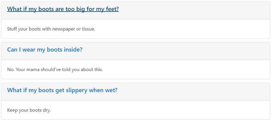
Another example
<!DOCTYPE html>
<title>My Example</title>

<!-- Bootstrap 4 alpha CSS -->
<link rel="stylesheet" href="https://maxcdn.bootstrapcdn.com/bootstrap/4.0.0-alpha.4/css/bootstrap.min.css" integrity="sha384-2hfp1SzUoho7/TsGGGDaFdsuuDL0LX2hnUp6VkX3CUQ2K4K+xjboZdsXyp4oUHZj" crossorigin="anonymous">
<style>
body
padding-top: 1em;

</style>
<div class="container-fluid">

<div id="faq" role="tablist" aria-multiselectable="true">

<div class="card">
<div class="card-header" role="tab" id="questionOne">
<h5 class="card-title">
<a data-toggle="collapse" data-parent="#faq" href="#answerOne" aria-expanded="false" aria-controls="answerOne">
What if my boots are too big for my feet?
</a>
</h5>
</div>
<div id="answerOne" class="collapse" role="tabcard" aria-labelledby="questionOne">
<div class="card-block">
Stuff your boots with newspaper or tissue.
</div>
</div>
</div>

<div class="card">
<div class="card-header" role="tab" id="questionTwo">
<h5 class="card-title">
<a class="collapsed" data-toggle="collapse" data-parent="#faq" href="#answerTwo" aria-expanded="false" aria-controls="answerTwo">
Can I wear my boots inside?
</a>
</h5>
</div>
<div id="answerTwo" class="collapse" role="tabcard" aria-labelledby="questionTwo">
<div class="card-block">
No. Your mama should've told you about this.
</div>
</div>
</div>

<div class="card">
<div class="card-header" role="tab" id="questionThree">
<h5 class="card-title">
<a class="collapsed" data-toggle="collapse" data-parent="#faq" href="#answerThree" aria-expanded="true" aria-controls="answerThree">
What if my boots get slippery when wet?
</a>
</h5>
</div>
<div id="answerThree" class="collapse in" role="tabcard" aria-labelledby="questionThree">
<div class="card-block">
Keep your boots dry.
</div>
</div>
</div>

</div>

</div>

<!-- jQuery library -->
<script src="https://ajax.googleapis.com/ajax/libs/jquery/3.0.0/jquery.min.js" integrity="sha384-THPy051/pYDQGanwU6poAc/hOdQxjnOEXzbT+OuUAFqNqFjL+4IGLBgCJC3ZOShY" crossorigin="anonymous"></script>

<!-- Tether -->
<script src="https://cdnjs.cloudflare.com/ajax/libs/tether/1.2.0/js/tether.min.js" integrity="sha384-Plbmg8JY28KFelvJVai01l8WyZzrYWG825m+cZ0eDDS1f7d/js6ikvy1+X+guPIB" crossorigin="anonymous"></script>

<!-- Bootstrap 4 Alpha JS -->
<script src="https://maxcdn.bootstrapcdn.com/bootstrap/4.0.0-alpha.4/js/bootstrap.min.js" integrity="sha384-VjEeINv9OSwtWFLAtmc4JCtEJXXBub00gtSnszmspDLCtC0I4z4nqz7rEFbIZLLU" crossorigin="anonymous"></script>

<!-- Initialize Bootstrap functionality -->
<script>
// Initialize tooltip component
$(function ()
  $('[data-toggle="tooltip"]').tooltip()
)

// Initialize popover component
$(function ()
  $('[data-toggle="popover"]').popover()
)
</script>
Once this is done it’s time for creating the element which will stay hidden and hold the actual content behind the heading. To do this we’ll wrap a .card-block inside a .collapse element with an ID attribute – the very same ID we should place as a target for the link inside the .card-title from above – for the example it should be like id = “long-text-1” .
Once this structure has been created you can place either the plain text or further wrap your content creating a bit more complex structure.
Expanded content
Repeating the drill from above you can add as many elements to your accordion as you need to. And if you want a content element to display expanded – assign the .in or .show classes to it according to the Bootstrap 4 build version you’re working with – up to Alpha 5 the .in class goes and in Alpha 6 it gets replaced by .show
Conclusions
So basically that’s how you can create an fully working and quite good looking accordion with the Bootstrap 4 framework. Do note it utilizes the card element and cards do spread the whole space available by default. So combined with the Bootstrap’s grid column options you can easily create complex appealing layouts placing the whole thing inside an element with defined number of columns width.
Check out a few online video tutorials relating to Bootstrap Accordion
Linked topics:
Bootstrap acoordion authoritative information
How to make a Bootstrap v4 accordion collapse when clicking the whole header div?
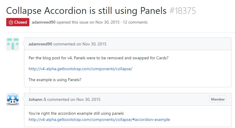
GitHub:Collapse Accordion is still using Panels