Bootstrap List
Overview
List group is a powerful and versatile component that is found in Bootstrap 4. The component is used for displaying a series or ‘list’ content. The list group items can be altered and extended to support almost any type of content within with several options available for customization within the list itself. These list groups can also be used for navigation with the use of the right modifier class.
In Bootstrap 4, the list group is a component that styles the unordered lists in a particular way since it paves the way for creating custom content within complex lists without having to worry about the presentation issue (since the language takes care of that on its own).
Features of Bootstrap List group:
Given below are the features that are available within the list group component in Bootstrap 4:
• Unordered list: The most basic type of the list group that you can create in Bootstrap 4 is an unordered list that has a series of items with the proper classes. You can built upon it with the other options that
are available in the component.
• Active items: You can highlight the current active selection by simply adding the .active command to a .list-group-item. This is helpful for when you want to create a list of items that is clickable.
• Disabled items: You can also de-highlight a list item to make it appear as though it has been disabled. You simply have to add the .disabled extension to the .list-group-item for doing so.
• Links and Buttons: With the help of the buttons tag, you can easily create an actionable item in the list group which means that you will be able to add hover, active, and disabled states to these items through the use of the .list-group-item-action option. You can separate these pseudo-classes from the remaining classes to ensure that the non-interactive elements in your code such as <div>-s or <li>-s are not clickable or actionable as well. It is advised that you do not use the standard button classes i.e. .btn here.
• Contextual classes: This is another nifty feature that is part of the list group component that allows you to style each list item with a descriptive color and background. These are particularly useful for highlighting particular items or categorizing them according to color-code.
• Badges: You can also add badges to a list item to show the unread counts, activity on the item, and enable other interactive features through the use of some other utilities.
All in all, list group is a helpful and robust component in Bootstrap 4 that allows you to make an unordered list more organized, interactive, and responsive without compromising on the appearance or layout of the list items themselves.
Let us take a look at a couple of cases
Standard example
Easily the most essential list group is an unordered list together with the list objects and the appropriate classes. Build on it having the features that follow, or even with your specific CSS as required.
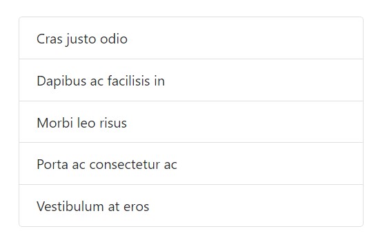
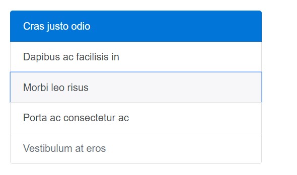
<ul class="list-group">
  <li class="list-group-item">Cras justo odio</li>
  <li class="list-group-item">Dapibus ac facilisis in</li>
  <li class="list-group-item">Morbi leo risus</li>
  <li class="list-group-item">Porta ac consectetur ac</li>
  <li class="list-group-item">Vestibulum at eros</li>
</ul>
Active elements
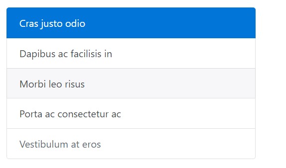
Put in a .active to a .list-group-item to indicate the existing active selection.

<ul class="list-group">
  <li class="list-group-item active">Cras justo odio</li>
  <li class="list-group-item">Dapibus ac facilisis in</li>
  <li class="list-group-item">Morbi leo risus</li>
  <li class="list-group-item">Porta ac consectetur ac</li>
  <li class="list-group-item">Vestibulum at eros</li>
</ul>
Disabled elements
Include .disabled to a .list-group-item to make it appear like disabled. Keep in mind that some features with are going to as well demand custom-made JavaScript to totally eliminate their select occasions (e.g., hyperlinks).
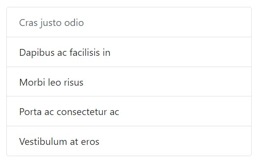
<ul class="list-group">
  <li class="list-group-item disabled">Cras justo odio</li>
  <li class="list-group-item">Dapibus ac facilisis in</li>
  <li class="list-group-item">Morbi leo risus</li>
  <li class="list-group-item">Porta ac consectetur ac</li>
  <li class="list-group-item">Vestibulum at eros</li>
</ul>
Url links and tabs
Utilize <a>-s or even <button>-s in order to produce workable list group pieces having hover, disabled, and active states through adding in .list-group-item-action. We separate these pseudo-classes to make certain list groups made of non-interactive elements (like <li>-s or even <div>-s) do not give a click on or even touching affordance.
Ensure to not use the standard .btn classes here.
<div class="list-group">
  <a href="#" class="list-group-item active">
    Cras justo odio
  </a>
  <a href="#" class="list-group-item list-group-item-action">Dapibus ac facilisis in</a>
  <a href="#" class="list-group-item list-group-item-action">Morbi leo risus</a>
  <a href="#" class="list-group-item list-group-item-action">Porta ac consectetur ac</a>
  <a href="#" class="list-group-item list-group-item-action disabled">Vestibulum at eros</a>
</div>
By <button>-s, you can surely additionally use the disabled feature instead of .disabled The sad thing is, <a>-s don't support the disabled feature.
<div class="list-group">
  <button type="button" class="list-group-item list-group-item-action active">
    Cras justo odio
  </button>
  <button type="button" class="list-group-item list-group-item-action">Dapibus ac facilisis in</button>
  <button type="button" class="list-group-item list-group-item-action">Morbi leo risus</button>
  <button type="button" class="list-group-item list-group-item-action">Porta ac consectetur ac</button>
  <button type="button" class="list-group-item list-group-item-action" disabled>Vestibulum at eros</button>
</div>
Contextual classes
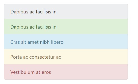
Use contextual classes to mode list pieces using a stateful background along with the color option.
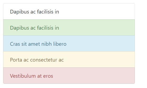
<ul class="list-group">
  <li class="list-group-item">Dapibus ac facilisis in</li>
  <li class="list-group-item list-group-item-success">Dapibus ac facilisis in</li>
  <li class="list-group-item list-group-item-info">Cras sit amet nibh libero</li>
  <li class="list-group-item list-group-item-warning">Porta ac consectetur ac</li>
  <li class="list-group-item list-group-item-danger">Vestibulum at eros</li>
</ul>
Contextual classes equally do the job with .list-group-item-action. Consider the accession of the hover designs here not present in the last situation. In addition the .active is supported; implement it to signify an active selection on a contextual list group item.
<div class="list-group">
  <a href="#" class="list-group-item list-group-item-action">Dapibus ac facilisis in</a>
  <a href="#" class="list-group-item list-group-item-action list-group-item-success">Dapibus ac facilisis in</a>
  <a href="#" class="list-group-item list-group-item-action list-group-item-info">Cras sit amet nibh libero</a>
  <a href="#" class="list-group-item list-group-item-action list-group-item-warning">Porta ac consectetur ac</a>
  <a href="#" class="list-group-item list-group-item-action list-group-item-danger">Vestibulum at eros</a>
</div>
Revealing meaning directed toward assistive technological innovations.
Working with coloration to provide signifying simply gives a visual signal, that will definitely not be shared to users of assistive technological innovations - such as screen readers. Make sure that data marked via the colour is either clear from the content in itself (e.g. the detectable text message), or is provided through other methods, just like supplementary text covered having the .sr-only class.
Having badges
Put in badges to any sort of list group element to reveal unread sums, activity, and much more with the aid of a number of utilities. Consider the justify-content-between utility class and the badge's position.
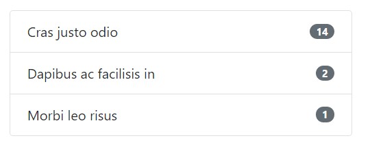
<ul class="list-group">
  <li class="list-group-item justify-content-between">
    Cras justo odio
    <span class="badge badge-default badge-pill">14</span>
  </li>
  <li class="list-group-item justify-content-between">
    Dapibus ac facilisis in
    <span class="badge badge-default badge-pill">2</span>
  </li>
  <li class="list-group-item justify-content-between">
    Morbi leo risus
    <span class="badge badge-default badge-pill">1</span>
  </li>
</ul>
Custom made material
Add in practically any sort of HTML inside, and even for a linked list groups like the one below, with a flexbox utilities.
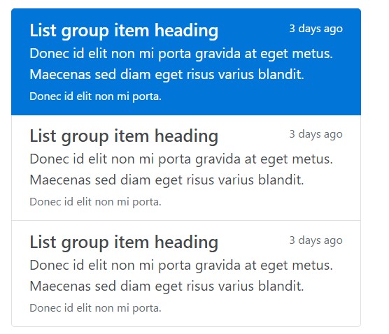
<div class="list-group">
  <a href="#" class="list-group-item list-group-item-action flex-column align-items-start active">
    <div class="d-flex w-100 justify-content-between">
      <h5 class="mb-1">List group item heading</h5>
      <small>3 days ago</small>
    </div>
    <p class="mb-1">Donec id elit non mi porta gravida at eget metus. Maecenas sed diam eget risus varius blandit.</p>
    <small>Donec id elit non mi porta.</small>
  </a>
  <a href="#" class="list-group-item list-group-item-action flex-column align-items-start">
    <div class="d-flex w-100 justify-content-between">
      <h5 class="mb-1">List group item heading</h5>
      <small class="text-muted">3 days ago</small>
    </div>
    <p class="mb-1">Donec id elit non mi porta gravida at eget metus. Maecenas sed diam eget risus varius blandit.</p>
    <small class="text-muted">Donec id elit non mi porta.</small>
  </a>
</div>
Conclusions
Overall, list group is a robust and helpful component within Bootstrap 4 which lets you to get an unordered list much more planned, interactive, and responsive with no compromising on the visual appeal or layout of the list pieces themselves.
Check several video clip information regarding Bootstrap list:
Linked topics:
Bootstrap list main records
Bootstrap list training
Bootstrap list trouble