Bootstrap Tooltip
Intro
In some cases, especially on the desktop it is a good idea to have a subtle callout with some tips emerging when the visitor places the mouse cursor over an element. This way we make sure the right info has been given at the right time and hopefully improved the user experience and ease when using our pages. This behavior is handled by the tooltip element which has a cool and consistent to the entire framework styling appearance in the latest Bootstrap 4 version and it’s really easy to add and configure them – let’s see how this gets done.
Factors to realize while applying the tooltip plugin:
- Tooltips depend on the Third party library Tether for arranging . You need to provide tether.min.js right before bootstrap.js needed for tooltips to work !
- Tooltips are actually opt-in for performance factors, so you need to initialize them by yourself.
- Tooltips with zero-length titles are never presented.
- Indicate container: 'body' to stay clear of rendering complications in much more complex
elements (like input groups, button groups, etc).
- Setting off tooltips on hidden components will definitely not operate.
- Tooltips for .disabled or disabled features ought to be triggered on a wrapper element.
- When triggered from web page links that span a number of lines, tooltips will be centralized. Apply white-space: nowrap; on your <a>-s to steer clear of this activity.
Got all of that? Outstanding, let's see exactly how they deal with several examples.
How you can put into action the Bootstrap Tooltips:
First of all in order to get use of the tooltips functionality we should enable it since in Bootstrap these elements are not enabled by default and require an initialization. To do this add a simple <script> element somewhere at the end of the <body> tag making sure it has been placed after the call to JQuery library since it uses it for the tooltip initialization. The <script> element should be wrapped around this initialization line of code $(function () $('[data-toggle="tooltip"]').tooltip()) which will activate the tooltips functionality.
What the tooltips actually do is getting what’s inside an element’s title = ”” attribute and displaying it in a stylizes pop-up element. Tooltips can be used for various elements but are generally most suitable for <a> and <button> elements since these are used for the visitor’s interaction with the page and are much more likely to be needing some clarifications about what they actually do when hovered with the mouse – right before the eventual clicking on them.
Once you have activated the tooltips functionality in order to assign a tooltip to an element you need to add two mandatory and one optional attributes to it. A “tool-tipped ” elements should have title = “Some text here to get displayed in the tooltip” and data-toggle = “tooltip” attributes – these are quite enough for the tooltip to work out emerging over the desired element. If however you want to specify the placement of the hint text regarding the element it concerns – you can also do that in the Bootstrap 4 framework with the optional data-placement =” ~ possible values are – top, bottom, left, right ~ “ attribute which values as quite self-explanatory. The data-placement default value is top and if this attribute is omitted the tooltips appear over the specified element.
The tooltips appearance and behavior has remained pretty much the same in both the Bootstrap 3 and 4 versions since these really do work pretty well – nothing much more to be required from them.
Situations
One approach to activate all tooltips on a web page would be to choose them through their data-toggle attribute:
$(function ()
  $('[data-toggle="tooltip"]').tooltip()
)
Fixed Demo
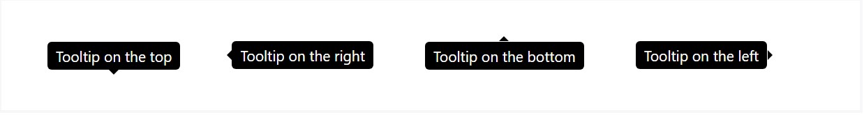
4 alternatives are readily available: top, right, bottom, and left coordinated.
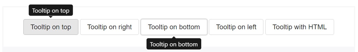
Interactive
Hover over the buttons beneath to see their tooltips.
<button type="button" class="btn btn-secondary" data-toggle="tooltip" data-placement="top" title="Tooltip on top">
  Tooltip on top
</button>
<button type="button" class="btn btn-secondary" data-toggle="tooltip" data-placement="right" title="Tooltip on right">
  Tooltip on right
</button>
<button type="button" class="btn btn-secondary" data-toggle="tooltip" data-placement="bottom" title="Tooltip on bottom">
  Tooltip on bottom
</button>
<button type="button" class="btn btn-secondary" data-toggle="tooltip" data-placement="left" title="Tooltip on left">
  Tooltip on left
</button>
And with custom made HTML added:
<button type="button" class="btn btn-secondary" data-toggle="tooltip" data-html="true" title="<em>Tooltip</em> <u>with</u> <b>HTML</b>">
  Tooltip with HTML
</button>
Usage
The tooltip plugin generates material and markup as needed, and by default places tooltips after their trigger component.
Activate the tooltip with JavaScript:
$('#example').tooltip(options)Markup
The demanded markup for a tooltip is only a data attribute and title on the HTML component you wish to have a tooltip. The obtained markup of a tooltip is quite easy, though it does require a location (by default, set to top by means of the plugin).
Helping make tooltips work with key board and assistive technology users.
You ought to just add in the tooltips to HTML elements that are definitely interactive and usually keyboard-focusable ( like urls or form controls). Although arbitrary HTML elements ( like <span>-s) can possibly be produced focusable simply by incorporating the tabindex="0" attribute, this are going to provide confusing and most likely irritating tab stops on non-interactive elements for key pad users. Additionally, most assistive technologies actually do not really reveal the tooltip within this circumstance.
<!-- HTML to write -->
<a href="#" data-toggle="tooltip" title="Some tooltip text!">Hover over me</a>

<!-- Generated markup by the plugin -->
<div class="tooltip tooltip-top" role="tooltip">
  <div class="tooltip-arrow"></div>
  <div class="tooltip-inner">
    Some tooltip text!
  </div>
</div>
Solutions
Opportunities can be successfully pass using data attributes or JavaScript. For data attributes, add the option name to data-, like inside data-animation="".
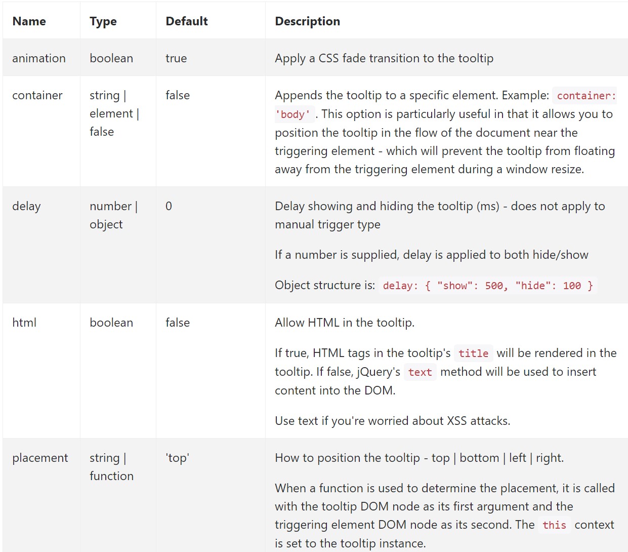
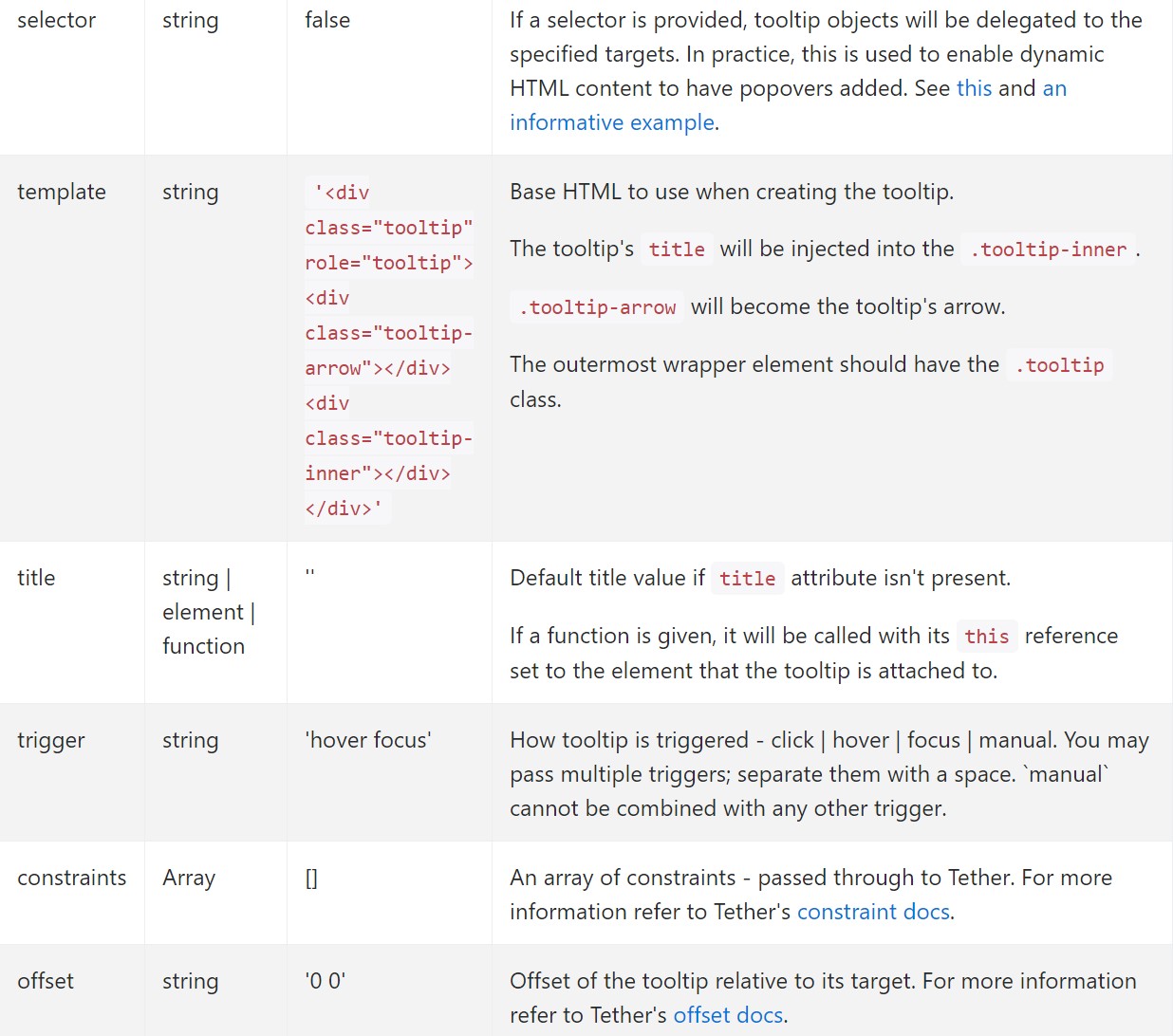
Data attributes for individual tooltips
Possibilities for individual tooltips can additionally be indicated with the use of data attributes, just as explained above.
Approaches
$().tooltip(options)
Connects a tooltip handler to an element assortment.
.tooltip('show')
Exposes an element's tooltip. Returns to the customer just before the tooltip has in fact been revealed ( such as right before the shown.bs.tooltip activity occurs). This is considered a "manual" triggering of the tooltip. Tooltips with zero-length titles are never revealed.
$('#element').tooltip('show').tooltip('hide')
Disguises an element's tooltip. Goes back to the caller before the tooltip has in fact been concealed (i.e. right before the hidden.bs.tooltip event takes place). This is considered a "manual" triggering of the tooltip.
$('#element').tooltip('hide').tooltip('toggle')
Toggles an element's tooltip. Returns to the caller right before the tooltip has actually been revealed or else covered ( such as right before the shown.bs.tooltip or hidden.bs.tooltip event happens). This is kept in mind a "manual" triggering of the tooltip.
$('#element').tooltip('toggle').tooltip('dispose')
Hides and erases an element's tooltip. Tooltips which employ delegation ( which in turn are developed working with the selector opportunity) can not be separately destroyed on descendant trigger components.
$('#element').tooltip('dispose')Occasions
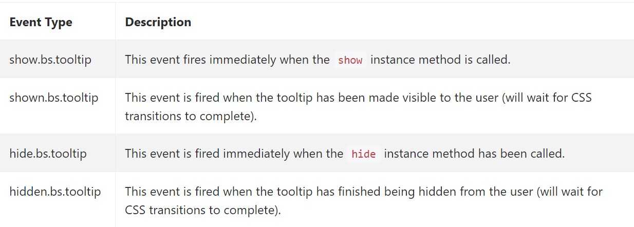
$('#myTooltip').on('hidden.bs.tooltip', function ()
  // do something…
)
Conclusions
A thing to consider here is the amount of info which comes to be placed inside the title attribute and eventually – the placement of the tooltip according to the position of the main element on a screen. The tooltips should be exactly this – short meaningful tips – placing too much info might even confuse the visitor rather than help getting around.
Additionally if the main element is too close to an edge of the viewport placing the tooltip at the side of this very edge might cause the pop-up text to flow out of the viewport and the info inside it to become practically unusable. So when it comes to tooltips the balance in using them is essential.
Look at several video clip guide regarding Bootstrap Tooltips:
Linked topics:
Bootstrap Tooltips main records
Bootstrap Tooltips training
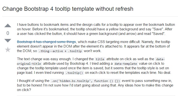
Change Bootstrap 4 Tooltip template without refresh