Bootstrap Header
Overview
As in printed documents the header is one of the most important parts of the web pages we create and get to use every day. It securely holds the most essential information about the identity of the organization or person behind the page itself and the essence of the whole site – its navigation structure which along with the header itself should be thought and crafted in such way that a visitor in a hurry or not actually knowing which way to go to just take a glance at and find the needed info. This is the ideal case – in the real world getting as near as possible to this appearance and behavior also goes since we almost each time have some project specific limitations to consider. Additionally unlike the written documents in the world of web we should always keep in mind the diversity of possible devices on which our pages could possibly get displayed – we should assure their responsive behavior or in other words – make sure they will display best at any screen size possible.
So let's take a look and see how a navbar gets created in Bootstrap 4.
The best way to employ the Bootstrap Header:
First of all in order to create a page header or as it gets referred to in the framework – a navbar – we need to wrap the whole thing inside a <nav> element with the .navbar and .navbar-toggleable- ~ screen size ~ if you would need it to collapse in a mobile style where the screen size is one of the predefined Bootstrap 4 screen sizes at the reach of which the actual collapse will take place. Additionally this is the place to add some of the brand new for this version background color .bg-* and color scheme classes – like .navbar-light and .navbar-light
Inside of this parent element we should start by placing a button element which shall be used to display the collapsed content on a smaller screen sizes – to do that create a <button> with the class .navbar-toggler and additionally - .navbar-toggler-left or .navbar-toggler-right classes which will adjust the toggle button's position in the collapsed header element. This element should also carry some attributes like type = " button " , data-toggle ="collapse" and data-target = " ~ the collapse element ID ~ which we shall define in just a few steps further.
What's bright new for latest alpha 6 release of the Bootstrap 4 framework is that inside the .navbar-togler you should also wrap a <span> element with the .navbar-toggler-icon which is introduced for improving the flexibility in editing the appearance of the togler button itself making it blend better to the overall page's appearance.
Next to the toggle button we should now place the elements presenting our brand – to do this create an <a> element with the .navbar-brand class and wrap your logo as an <div class="img"><img></div> tag and brand name inside it or if you prefer – insert just the logo or even omit the element entirely – it's not a must but in case you want it display before the site navigation – this is the most common place it should take.
Now – the essential part – creating the collapsible container for the main site navigation – to do it create an element with the .collapse and .navbar-collapse classes applied to wrap the whole navigation structure up. It is important for you to also assign an unique id = " ~ same as navbar toggler data-target ~ " property to this element. Next – this is the most common approach – inside this .collapse element create an <ul> with the .navbar-nav class assigned to it. Inside of this <ul> place some <li> elements with the .nav-item class assigned and inside them – the actual navigation links - <a> elements carrying the .nav-link class. This whole classes structure is new for Bootstrap 4 since the previous version did not use the .nav-item and.nav-link classes.
This navigation structure in this framework fully supports multiple levels of navigation wrapped inside of the dropdown elements. To create one make sure along with the .nav-item you have also assigned .dropdown class to the <li> element and .dropdown-toggle - to the .nav-link inside it. Next inside the very same .nav-item element create a <div> with the .dropdown-menu class and inside of it – place the needed secondary level links assigning them to the .dropdown-item class. Repeat as many times as necessary.
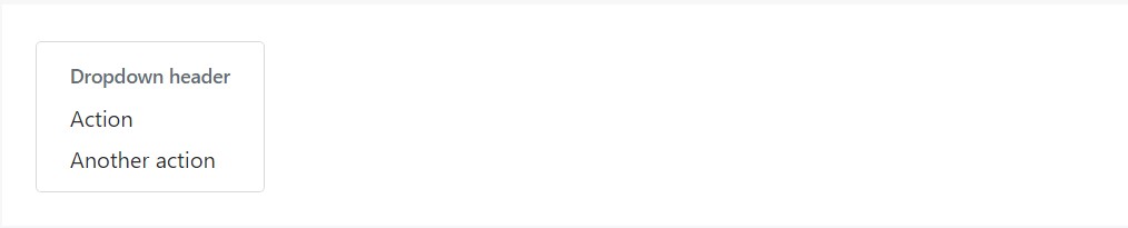
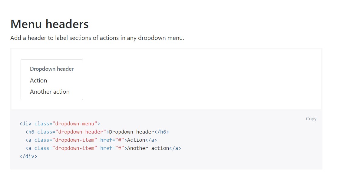
An example of menu headers
Add in a header to label segments of activities into any dropdown menu.
<div class="dropdown-menu">
  <h6 class="dropdown-header">Dropdown header</h6>
  <a class="dropdown-item" href="#">Action</a>
  <a class="dropdown-item" href="#">Another action</a>
</div>
Even more capabilities
Another new thing for this version is the possibility to insert an inline forms in your .navbar using the .form-inline class or some text using a <span> with the .navbar-text assigned to it.
Conclusions
When it comes to the header elements in the latest Bootstrap 4 version this is being taken care of with the built in Collapse plugin and some navigation specific content classes – some of them designed especially for keeping your brand's identity and others – to make sure the actual page navigational structure will display best collapsing in a mobile style menu when a specified viewport width is reached.
Examine a number of youtube video training about Bootstrap Header
Connected topics:
Bootstrap Header: official documents
Bootstrap Header tutorial
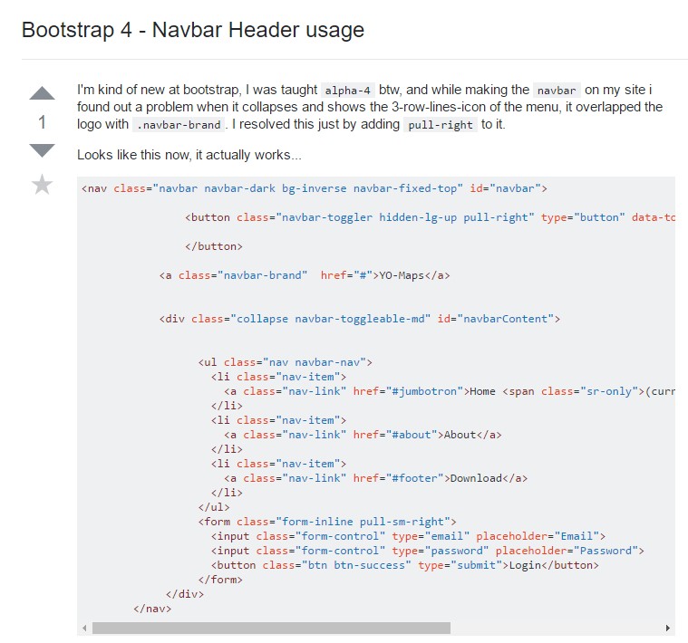
Bootstrap 4 - Navbar Header utilization