Bootstrap Slider
Overview
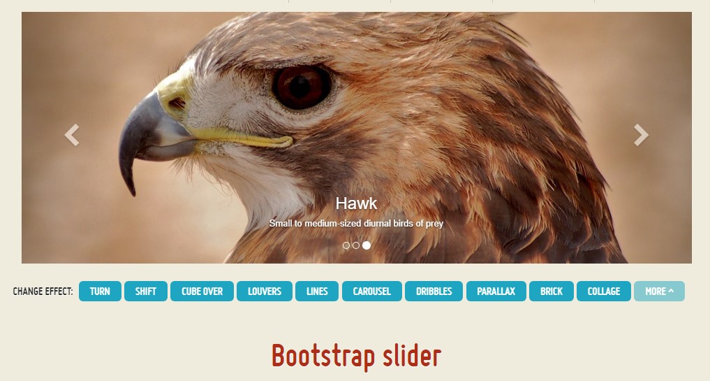
Motion is the most amazing thing – it gets our attention and keeps us evolved at least for a while. For how long – well it all depends on what’s actually moving – if it’s something great and appealing we watch it longer, if it’s boring and monotone – well, there always is the close tab button, right. So when you think you have some great content out there and want it included in your pages the image slider is often the one you first think about. This element got actually so popular in the last few years so the internet literally go flooded with sliders – just browse around and you’ll see almost every second page starts with one. That’s why the latest web design trends inquiries show more and more designers are actually trying to replace the sliders with other expression means in order to add a bit more personality to their pages.
Maybe the golden ration lies somewhere in between – like utilizing the slider element but not with the good old filling the whole element area images but maybe some with opaque areas to make them it like a particular elements and not the whole background of the slider moves – the decision is entirely up to you and of course is different for each project. Anyway – the slider element remains the simple and most convenient solution when it comes to adding some moving images accompanied with powerful text and call to action buttons to your pages.
How you can utilize the Bootstrap slider:
The image slider is a part of the main Bootstrap 4 framework and is fully supported by both the style sheet and the JavaScript files of the latest version of still the most popular responsive framework around. When we talk about the image sliders in Bootstrap we actually address the element as Carousel – which is exactly the same thing just with a different name.
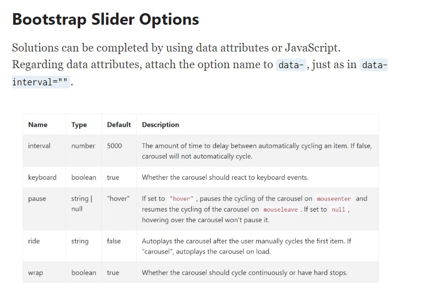
Creating a carousel element with Bootstrap is rather easy – all you need to do is follow a simple structure – to start wrap the whole thing inside a <div> with the classes .carousel and .slide - the second one is optional defining the subtle sliding transition between the images instead if just jumpy changing them after a few seconds. You’ll also need to assign the data-ride = “carousel” to this one in case you want it to auto play on page load. The default timeout is 5s or 5000ms – if that’s too fast or too slow for you – adjust it with the data-interval=” ~ some value in milliseconds here ~ “ attribute assigned to the main .carousel element. This one should also have an unique id = “” attribute defined.
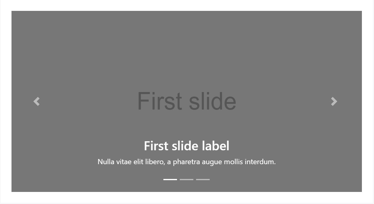
Carousel indicators – these are the small elements showing you the position each images takes in the slider – you can also click on them to jump to a specific image. In order to add indicators element create an ordered list <ol> assigning it the .carousel-indicators class. The <li> elements within it should have two data- attributes assigned like data-target=” ~ the ID of the main carousel element ~ ” and data-slide-to = “ ~ the desired slide index number ~ “ Important thing to note here is the first image from the ones we’ll add in just a minute has the index of 0 but not 1 as might be expected.
Example
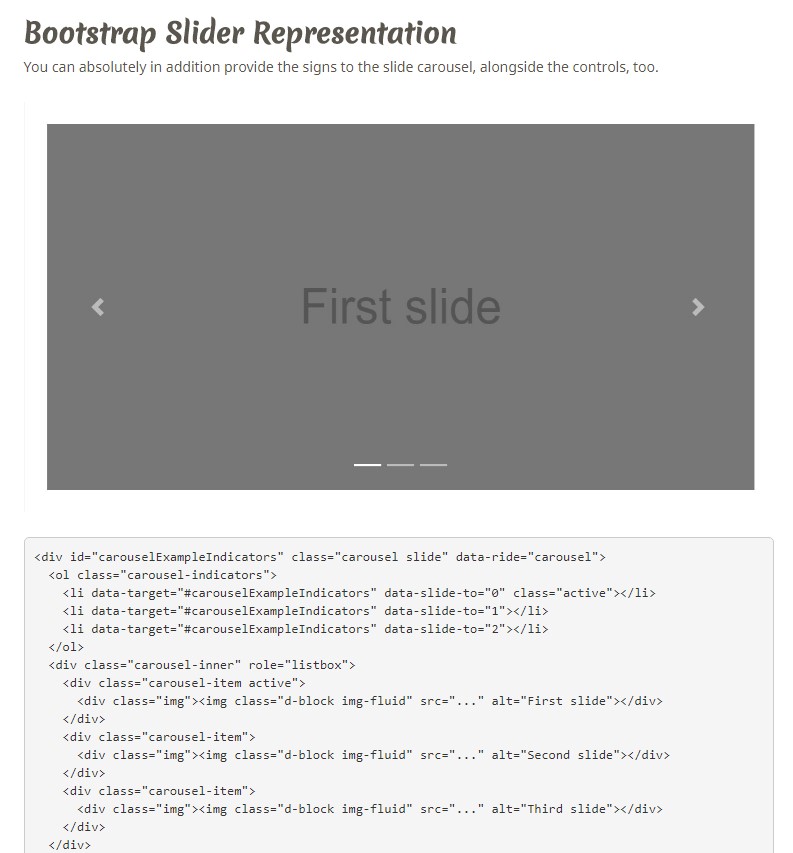
You may as well add the indications to the carousel, alongside the controls, too

<div id="carouselExampleIndicators" class="carousel slide" data-ride="carousel">
  <ol class="carousel-indicators">
    <li data-target="#carouselExampleIndicators" data-slide-to="0" class="active"></li>
    <li data-target="#carouselExampleIndicators" data-slide-to="1"></li>
    <li data-target="#carouselExampleIndicators" data-slide-to="2"></li>
  </ol>
  <div class="carousel-inner" role="listbox">
    <div class="carousel-item active">
      <div class="img"><img class="d-block img-fluid" src="..." alt="First slide"></div>
    </div>
    <div class="carousel-item">
      <div class="img"><img class="d-block img-fluid" src="..." alt="Second slide"></div>
    </div>
    <div class="carousel-item">
      <div class="img"><img class="d-block img-fluid" src="..." alt="Third slide"></div>
    </div>
  </div>
  <a class="carousel-control-prev" href="#carouselExampleIndicators" role="button" data-slide="prev">
    <span class="carousel-control-prev-icon" aria-hidden="true"></span>
    <span class="sr-only">Previous</span>
  </a>
  <a class="carousel-control-next" href="#carouselExampleIndicators" role="button" data-slide="next">
    <span class="carousel-control-next-icon" aria-hidden="true"></span>
    <span class="sr-only">Next</span>
  </a>
</div>
Initial active component wanted
The .active class has to be included in one of the slides. Otherwise, the slide carousel will certainly not be in sight.
Images container – this one is a regular <div> element with the .carousel-inner class assigned to it. Inside this container we can start inserting the particular slides in <div> elements each one of them having the .carousel item class applied. This one is new for Bootstrap 4 – the old framework used the .item class for this purpose. Important thing to note here as well as in the carousel indicators is the first slide and indicator which by the way should also be linked to each other additionally carry the .active class since they will be the ones being displayed upon page load.
Captions
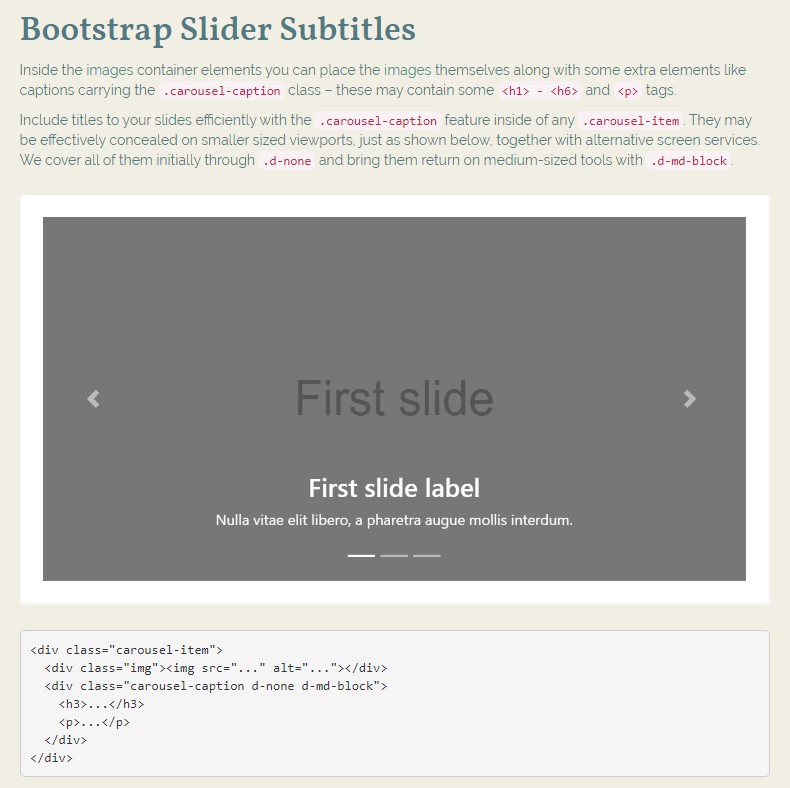
Inside of the images container elements you can place the images themselves along with some extra elements like captions carrying the .carousel-caption class – these may contain some <h1> - <h6> and <p> tags.
Include captions to your slides quickly by using the .carousel-caption element in any .carousel-item. They can be easily hided on a smaller viewports, as presented here, along with alternative display screen functions. We conceal all of them primarily through .d-none and get them return on medium-sized gadgets by using .d-md-block.
<div class="carousel-item">
  <div class="img"><img src="..." alt="..."></div>
  <div class="carousel-caption d-none d-md-block">
    <h3>...</h3>
    <p>...</p>
  </div>
</div>
Finally inside the main .carousel element we should also place some markup creating the arrows on the sides of the slider allowing the user to browse around the images presented. These along with the carousel indicators are of course optional and can be omitted. But if you decide to add such what you’ll need is two <a> tags both carrying .carousel-control class and each one - .left and data-ride = “previous” or .right and data-ride = “next” classes and attributed assigned. They should also have the href attribute pointing to the main carousel wrapper like href= “~MyCarousel-ID“. It is a good idea to also add some kind of an icon in a <span> so the user actually gets to see them since so far they will appear as opaque elements over the slider.
Activities
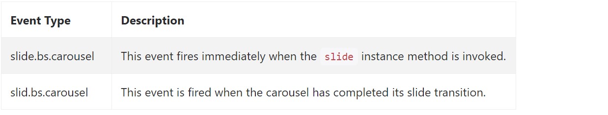
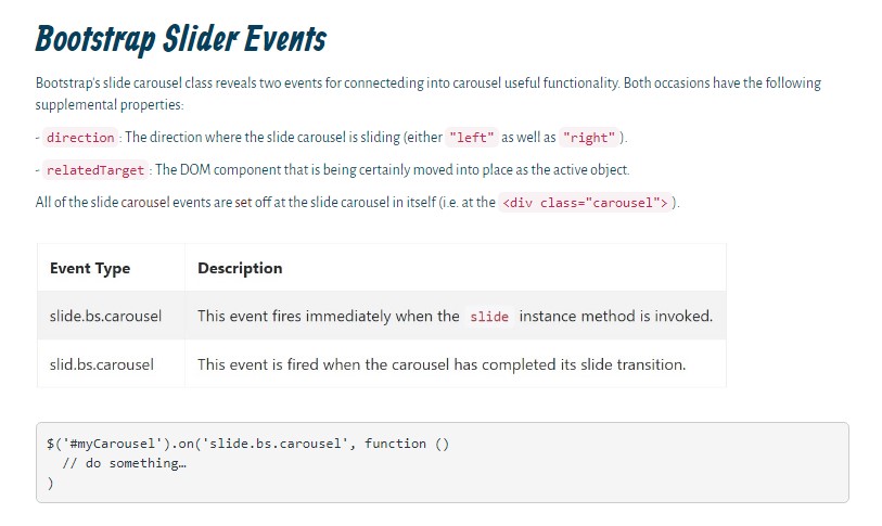
Bootstrap's slide carousel class reveals two events for hooking in to a carousel capability. Each of the events have the following added properties:
- direction: The direction in which the carousel is flowing (either "left" or "right").
- relatedTarget: The DOM element which is being certainly pulled into location just as the active item.
All of the slide carousel occasions are fired at the slide carousel itself ( such as at the <div class="carousel">).
$('#myCarousel').on('slide.bs.carousel', function ()
  // do something…
)
Conclusions
Basically that’s the structure of an image slider ( or carousel ) which you should have with the Bootstrap 4 framework. Now all you need to do is think of some appealing images and text to place inside it.
Look at a couple of online video short training about Bootstrap slider:
Connected topics:
Bootstrap slider formal information
Bootstrap slider article
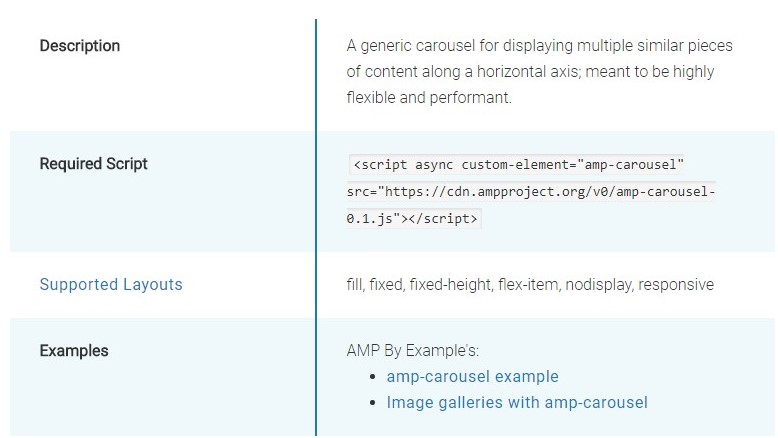
Why don't we examine AMP project and AMP-carousel element
HTML Bootstrap Slider with Swipe
Responsive Bootstrap Image Slider Example

Bootstrap Image Slider Slideshow
HTML Bootstrap 4 Slider with Autoplay
CSS Bootstrap Slider Carousel
Bootstrap 4 Slider Slideshow
jQuery Bootstrap Slider with Autoplay
Responsive Bootstrap Slider Carousel
CSS Bootstrap Slider Slideshow