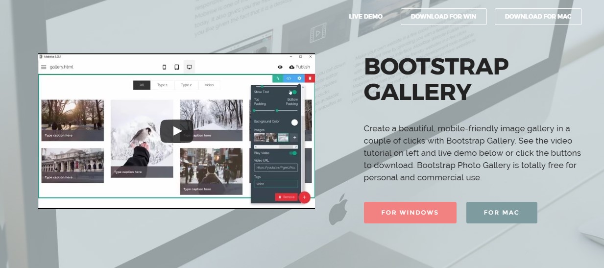
Bootstrap Image
Overview
Pick your illustrations into responsive behaviour (so they never ever get bigger than their parent components) plus incorporate lightweight styles to them - all by means of classes.
No matter how powerful is the text showcased in our pages no doubt we need some as powerful images to back it up making the content really shine. And since we are in the mobile devices era we also need those images acting accordingly in order to display best at any screen size since no one likes pinching and panning around to be able to actually see what a picture stands up to show.
The guys behind the Bootstrap framework are perfectly aware of that and from its start the most popular responsive framework has been providing easy and powerful tools for best appearance and responsive behavior of our image elements. Here is how it work out in the latest version.
Differences and changes
Unlike its predecessor Bootstrap 3 the fourth version utilizes the class .img-fluid instead of .img-responsive as it used to be. What this class stands for is the image will fill up the entire width of its container scaling up or down accordingly to maintain its proportions. So for starters – make sure you add .img-fluid to your <div class="img"><img></div> elements when including them into Bootstrap 4 powered web pages.
You can also take advantage of the predefined styling classes making a particular image oval with the .img-cicrle class, display with a subtle rounded border with a slight offset from the actual content applying the .img-thumbnail class or just slightly round the sharp edges with the .img-rounded class to gain a bit friendlier appearance.
Responsive images
Illustrations in Bootstrap are made responsive using .img-fluid. max-width: 100%; and height: auto; are related to the pic to ensure that it scales using the parent component.

<div class="img"><img src="..." class="img-fluid" alt="Responsive image"></div>SVG images and IE 9-10
Within Internet Explorer 9-10, SVG pics using .img-fluid are actually disproportionately sized. To resolve this, bring in width: 100% \ 9; where necessary. This solution inaccurately sizes other pic formats, in this way Bootstrap does not use it automatically .
Image thumbnails
Apart from our border-radius utilities , you are able to work with .img-thumbnail to present an image a curved 1px border look.
<div class="img"><img src="..." alt="..." class="img-thumbnail"></div>Aligning images
When it comes to alignment you can take advantage of a few quite powerful tools like the responsive float helpers, text alignment utilities and the .m-x.auto class as follows:
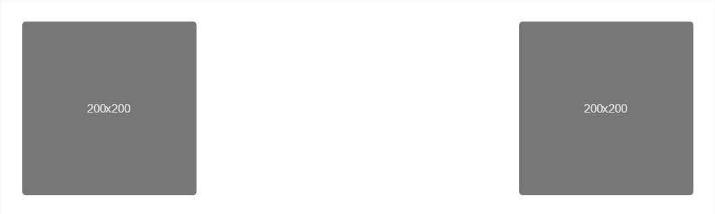
The responsive float tools could be used to place an responsive image floating left or right and change this placement according to the dimensions of the current viewport. This classes have taken a few transformations – from .pull-left and .pull-right in the previous Bootstrap 3 version to .pull- ~ screen size ~ - left and .pull- ~ screen size ~ - right at Bootstrap 4 up to alpha 5 and finally at the sixth alpha – to .float-left and .float-right replacing the .float-xs-left and .float-xs-right classes with the dropping of the -xs- infix leaving the other .float- ~ screen sizes md and up ~ - lext / right as they were in Bootstrap 4 alpha 5.
Centering the images in Bootstrap 3 used to take place utilizing the .center-block class. In the latest version of the framework this now happens with the .m-x.auto class along with .d-block in order to set the image to display as a block.
Line up pics by having the helper float classes as well as text alignment classes. block -level images may possibly be centralized utilizing the .mx-auto margin utility class.
<div class="img"><img src="..." class="rounded float-left" alt="..."></div>
<div class="img"><img src="..." class="rounded float-right" alt="..."></div>
<div class="img"><img src="..." class="rounded mx-auto d-block" alt="..."></div>
<div class="text-center">
  <div class="img"><img src="..." class="rounded" alt="..."></div>
</div>
On top of that the message placement utilities might be utilized applying the .text- ~ screen size ~-left, .text- ~ screen size ~ -right and .text- ~ screen size ~ - center to the parent component in which the definite <div class="img"><img></div> feature has been wrapped. A brand-new option in the latest alpha 6 build of the Bootstrap 4 again deals with the losing of the -xs- infix - so on the occasion that you like to for instance concenter an illustration globally - for all sizes along with the text utilities just utilize the .text-center class.
Final thoughts
Generally that’s the way you can add just a few easy classes to get from regular images a responsive ones with the latest build of the most popular framework for creating mobile friendly web pages. Now all that’s left for you is finding the right ones.
Examine a few youtube video short training relating to Bootstrap Images:
Linked topics:
Bootstrap images official documentation
Bootstrap image gallery
Bootstrap Image issue - no responsive.