Bootstrap Tabs
Introduction
Sometimes it’s quite useful if we can just place a few segments of info sharing the same space on the page so the visitor easily could browse through them without actually leaving the screen. This gets easily achieved in the new fourth version of the Bootstrap framework with the help of the .nav and .tab- * classes. With them you can easily create a tabbed panel with a different types of the content held inside each tab allowing the user to just click on the tab and get to view the desired content. Let’s take a closer look and see how it’s done.
The best way to make use of the Bootstrap tabs:
First of all for our tabbed panel we’ll need some tabs. In order to get one create an <ul> element, assign it the .nav and .nav-tabs classes and place some <li> elements inside carrying the .nav-item class. Inside of these list the actual link elements should take place with the .nav-link class assigned to them. One of the links – usually the first should also have the class .active since it will represent the tab being currently open when the page gets loaded. The links also need to be assigned the data-toggle = “tab” property and each one should target the appropriate tab panel you would want displayed with its ID – for example href = “#MyPanel-ID”
What’s new in the Bootstrap 4 framework are the .nav-item and .nav-link classes. Also in the previous version the .active class was assigned to the <li> element while now it get assigned to the link itself.
Now once the tabs structure has been prepared it’s time for creating the panels holding the actual content to be displayed. First we need a master wrapper <div> element with the .tab-content class assigned to it. Inside of this element a few elements carrying the .tab-pane class should take place. It also is a good idea to add the class .fade in order to assure fluent transition when switching between the tabs. The element which will be displayed by on a page load should also carry the .active class and in case you go for the fading transition - .in along with the .fade class. Each .tab-panel should have a unique ID attribute which will be used for linking the tab links to it – like id = ”#MyPanel-ID” to match the example link from above.
You can also create tabbed panels using a button – like appearance for the tabs themselves. These are also referred as pills. To do it just make sure instead of .nav-tabs you assign the .nav-pills class to the .nav element and the .nav-link links have data-toggle = “pill” instead of data-toggle = “tab” attribute.
Nav-tabs tactics
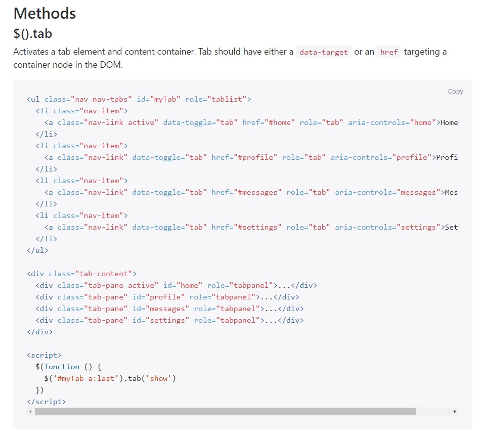
$().tab
Turns on a tab component and content container. Tab should have either a data-target or an href targeting a container node inside of the DOM.
<ul class="nav nav-tabs" id="myTab" role="tablist">
  <li class="nav-item">
    <a class="nav-link active" data-toggle="tab" href="#home" role="tab" aria-controls="home">Home</a>
  </li>
  <li class="nav-item">
    <a class="nav-link" data-toggle="tab" href="#profile" role="tab" aria-controls="profile">Profile</a>
  </li>
  <li class="nav-item">
    <a class="nav-link" data-toggle="tab" href="#messages" role="tab" aria-controls="messages">Messages</a>
  </li>
  <li class="nav-item">
    <a class="nav-link" data-toggle="tab" href="#settings" role="tab" aria-controls="settings">Settings</a>
  </li>
</ul>

<div class="tab-content">
  <div class="tab-pane active" id="home" role="tabpanel">...</div>
  <div class="tab-pane" id="profile" role="tabpanel">...</div>
  <div class="tab-pane" id="messages" role="tabpanel">...</div>
  <div class="tab-pane" id="settings" role="tabpanel">...</div>
</div>

<script>
  $(function ()
    $('#myTab a:last').tab('show')
  )
</script>
.tab(‘show’)
Chooses the provided tab and gives its connected pane. Any other tab which was previously picked becomes unselected and its associated pane is covered. Come backs to the caller before the tab pane has really been revealed (i.e. right before the shown.bs.tab activity happens).
$('#someTab').tab('show')Events
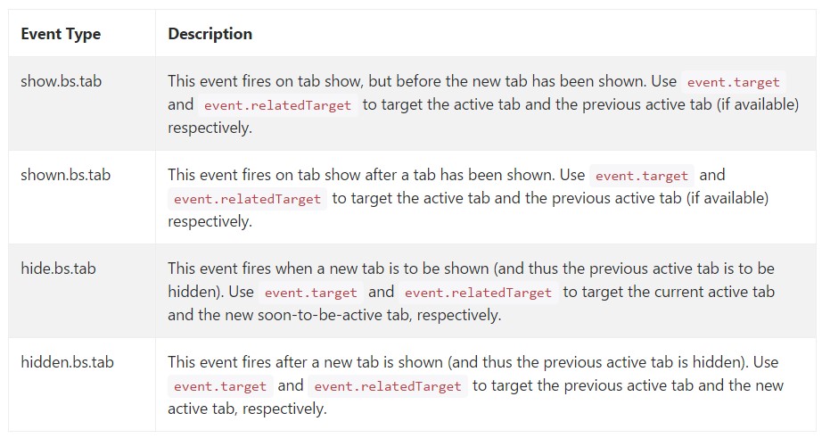
When showing a brand-new tab, the events fire in the following ordination:
1. hide.bs.tab ( on the present active tab).
2. show.bs.tab ( on the to-be-shown tab).
3. hidden.bs.tab ( on the previous active tab, the very same one when it comes to the hide.bs.tab event).
4. shown.bs.tab ( on the newly-active just-shown tab, the same one when it comes to the show.bs.tab event).
In the event that no tab was readily active, then the hide.bs.tab and hidden.bs.tab events will not be fired.
$('a[data-toggle="tab"]').on('shown.bs.tab', function (e)
  e.target // newly activated tab
  e.relatedTarget // previous active tab
)
Conclusions
Well basically that’s the way the tabbed panels get created with the latest Bootstrap 4 version. A thing to pay attention for when creating them is that the different contents wrapped inside each tab panel should be more or less the same size. This will help you avoid some “jumpy” behavior of your page when it has been already scrolled to a specific position, the visitor has started browsing through the tabs and at a certain point gets to open a tab with significantly more content then the one being seen right before it.
Review some video clip tutorials regarding Bootstrap tabs:
Related topics:
Bootstrap Nav-tabs: approved documents
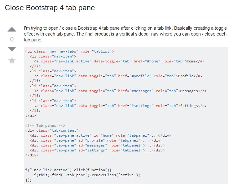
Exactly how to turn off Bootstrap 4 tab pane
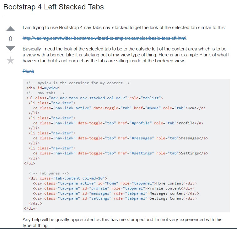
Bootstrap 4 Left Stacked Tabs