Bootstrap Radio
Introduction
Sometimes the tiny things come to be the most essential since the whole picture is actually a whole consisting of plenty of small details polished and gathered in order to look and display as a well-oiled shiny machine. These strong words might sound a bit too much when it comes to form controls but if you just think about it for a bit there is only a single element allowing the visitor to pick up one among a few available options. So in case you’re having some forms with this kind of options controls over your different web sites does this mean they will all look alike? And most importantly – would you settle for that?
Luckily for us the latest version of the most popular mobile friendly framework - Bootstrap 4 comes fully loaded with a bright new approach to the responsive behavior of the radio button controls and what is bright new for this version – the so called custom form controls – a palette of predefined appearances you can just take and use in order to add the so desired these days variety in the visual presentations of more or less boring form elements. So let’s take a look how the radio buttons are meant to be defined and styled in Bootstrap 4.
The best way to work with the Bootstrap radio button:
In order to create a radio button we first need a <div> element to wrap it into with the .form-check or .form-check-inline applied. The first class will assign the radio button a block appearance and the second will align the element inline along with eventually a few more others like it. These are new classes for Bootstrap 4 – in the previous versions they used to be defined as .radio and .radio-inline. If you want the radio button to take place on page but to be disabled for clicking – make sure you’ve also added the .disabled class here.
Inside the .form-check element we should first add a <label> with the .form-check-label class assigned and inside it an <input> with the .form-check-input class and some attributes applied like type = “radio” , name = “ ~ same name for all the options ~ ” if you have a few radio buttons describing a few options a user should pick up from they should carry the same name but different unique id = “ ~ unique ID ~ “ attribute and a value=” ~some value here ~ ” attribute. Finally if you’re aiming to disable the control – also add the disabled attribute to the <input> element. This is also the place do define if you want the radio control to initially load as checked once the page gets loaded. If this is what you’re after – instead of disabled add the checked attribute to the <input> . If you happen to intentionally or by mistake add a few radio buttons with the checked attribute – the last one read will be also the one displaying as checked on page load.
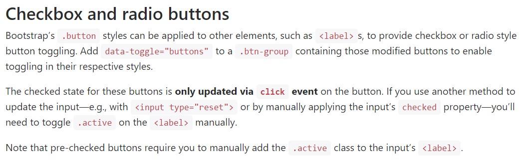
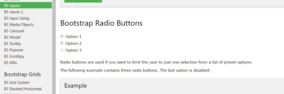
Checkbox and even radio buttons some examples
The inspected condition for all of these buttons is only updated by using click event on the button. If you put into action an additional option to improve the input - e.g., with <input type="reset"> or by manually applying the input's checked property - you'll have to toggle .active on the <label> by hand.
Bear in mind that pre-checked buttons require you to manually provide the .active class to the input's <label>.
Checkbox

<div class="btn-group" data-toggle="buttons">
  <label class="btn btn-primary active">
    <input type="checkbox" checked autocomplete="off"> Checkbox 1 (pre-checked)
  </label>
  <label class="btn btn-primary">
    <input type="checkbox" autocomplete="off"> Checkbox 2
  </label>
  <label class="btn btn-primary">
    <input type="checkbox" autocomplete="off"> Checkbox 3
  </label>
</div>
Radio
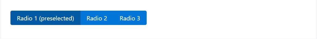
<div class="btn-group" data-toggle="buttons">
  <label class="btn btn-primary active">
    <input type="radio" name="options" id="option1" autocomplete="off" checked> Radio 1 (preselected)
  </label>
  <label class="btn btn-primary">
    <input type="radio" name="options" id="option2" autocomplete="off"> Radio 2
  </label>
  <label class="btn btn-primary">
    <input type="radio" name="options" id="option3" autocomplete="off"> Radio 3
  </label>
</div>
Radio button opportunity
Anytime we require the user to pick only one of a set of selections, we can easily put into action input elements of the radio style.
Solely one particular might be chosen when there is more than just one element of this particular form having the similar value within the name attribute.
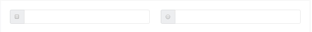
<div class="row">
  <div class="col-lg-6">
    <div class="input-group">
      <span class="input-group-addon">
        <input type="checkbox" aria-label="Checkbox for following text input">
      </span>
      <input type="text" class="form-control" aria-label="Text input with checkbox">
    </div>
  </div>
  <div class="col-lg-6">
    <div class="input-group">
      <span class="input-group-addon">
        <input type="radio" aria-label="Radio button for following text input">
      </span>
      <input type="text" class="form-control" aria-label="Text input with radio button">
    </div>
  </div>
</div>
Final thoughts
Basically this is the way the default radio buttons get defined and work along in Bootstrap 4 – now all you need are some options for the users to pick from.
Examine a number of video clip information about Bootstrap Radio Button:
Related topics:
Bootstrap radio formal documents
Bootstrap Radio button - training
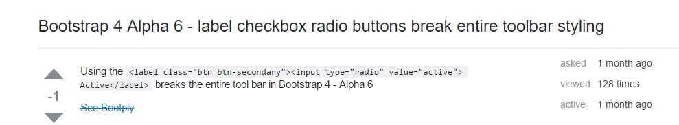
Checkbox radio buttons break entire toolbar styling