Bootstrap Columns
Overview
In the past few years and surely the next ones to come the world of internet spread more and more widely across all kinds of devices so now almost half of the views of the pages out there are done not on desktop and laptop screens but from various mobile devices with all kinds of small screen dimensions. So if a page will not display properly – meaning to resize and automatically find its best fit on the device used its most likely it will get browsed away to be replaced by a mobile friendly page offering similar product or service. Furthermore – the indexing engines like Google do the so called mobile-friendly test and show far down your pages in the search results. This pushing down is even farther if the search is committed by a mobile device – the search engines take this matter quite seriously. So not having a mobile friendly page almost means not having a page at all.
How to apply the Bootstrap columns:
But what actually a page being responsive means – generally – fitting the whole width of the screen that gets displayed on presenting the elements in convenient and legible way at any size. To take care of this the Bootstrap framework uses so called columns and breakpoints. In a few words the breakpoints are predefined screen widths at which a change takes place and the columns get reordered to hopefully fit better. The previous version used 4 breakpoints and the most recent Bootstrap 4 framework introduces one more so they get actually five. Here they are with the maximum value they stretch to. The exact boundary number itself belongs to the next screen size.
Extra small up to 34em ( or 544px) – up to Bootstrap 4 Alpha 5 had the -xs- infix. In Bootstrap 4 alpha 6 this infix is dropped so just the number follows;
Small – from 34em up to 48em ( or 768px ) – has the -sm- infix;
Medium – from 48em up to 62em ( or 992px ) – has the -md- infix;
Large – from 62em up to 75em ( 1200px ) - -lg- infix;
Extra large – 75em and everything above it – the new size in Bootstrap 4 – has the -xl- infix.
Extra techniques
The horizontal space in Bootstrap 4 framework gets distributed into 12 parts equal in width – these are the so called columns – they all carry the .col- prefix. Next comes the screen size infix which defined down to which screen size the column element will span the specified number of columns. Id the screen size is smaller – the column element occupies the whole screen width – as if it was assigned .col-12 (.col-xs-12 up to Bootstrap 4 alpha 5) .
Auto layout columns
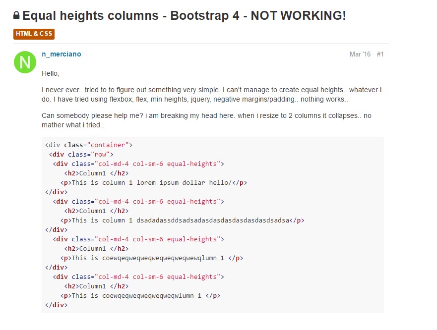
Apply breakpoint-specific column classes for equal-width columns. Include any quantity of unit-less classes for every breakpoint you need to have and each and every column will certainly be the equivalent width.
Identical width
As an example, right here are two grid styles that put on every gadget and viewport, from xs.
<div class="container">
  <div class="row">
    <div class="col">
      1 of 2
    </div>
    <div class="col">
      1 of 2
    </div>
  </div>
  <div class="row">
    <div class="col">
      1 of 3
    </div>
    <div class="col">
      1 of 3
    </div>
    <div class="col">
      1 of 3
    </div>
  </div>
</div>
Putting one column width
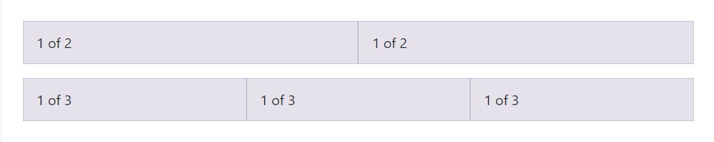
Auto-layout for flexbox grid columns additionally shows that you can set the width of one column and the others will promptly resize around it. You may possibly utilize predefined grid classes ( while indicated here), grid mixins, or inline widths. Notice that the additional columns will resize despite the width of the center column.
<div class="container">
  <div class="row">
    <div class="col">
      1 of 3
    </div>
    <div class="col-6">
      2 of 3 (wider)
    </div>
    <div class="col">
      3 of 3
    </div>
  </div>
  <div class="row">
    <div class="col">
      1 of 3
    </div>
    <div class="col-5">
      2 of 3 (wider)
    </div>
    <div class="col">
      3 of 3
    </div>
  </div>
</div>
Variable width material
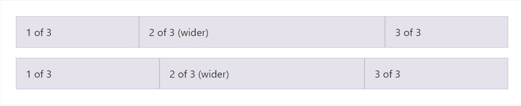
Working with the col- breakpoint -auto classes, columns can absolutely size on its own built upon the usual width of its content. This is very handy by having single line web content just like inputs, numbers, and so on. This, together with horizontal alignment classes, is really useful for centralizing styles together with unequal column sizes as viewport width improves.
<div class="container">
  <div class="row justify-content-md-center">
    <div class="col col-lg-2">
      1 of 3
    </div>
    <div class="col-12 col-md-auto">
      Variable width content
    </div>
    <div class="col col-lg-2">
      3 of 3
    </div>
  </div>
  <div class="row">
    <div class="col">
      1 of 3
    </div>
    <div class="col-12 col-md-auto">
      Variable width content
    </div>
    <div class="col col-lg-2">
      3 of 3
    </div>
  </div>
</div>
Equal width multi-row
Generate equal-width columns which stretch over multiple rows simply by adding a .w-100 precisely where you desire the columns to break to a new line. Help make the splits responsive with putting together the .w-100 by having some responsive display screen utilities.
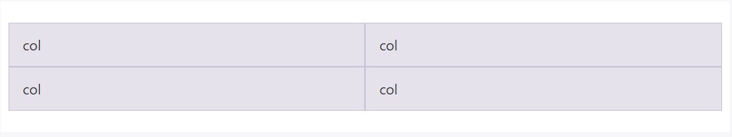
<div class="row">
  <div class="col">col</div>
  <div class="col">col</div>
  <div class="w-100"></div>
  <div class="col">col</div>
  <div class="col">col</div>
</div>
Some other new thing
Another new thing with the latest Alpha 6 build of Bootstrap 4 is if you add just a few .col-~ some number here ~ elements spanning less than 12 columns they will actually distribute proportionally to take all the space available on the row and will remain this way at any screen width – even under 32em.
Conclusions
So now you know how the column elements form the structure and responsive behavior of the Bootstrap framework and all that’s left for you is creating something really great with them.
Take a look at a number of video training about Bootstrap columns
Connected topics:
Bootstrap columns authoritative records
Responsive columns in Bootstrap
Issue with a heights of the Bootstrap columns