Bootstrap Input
Intro
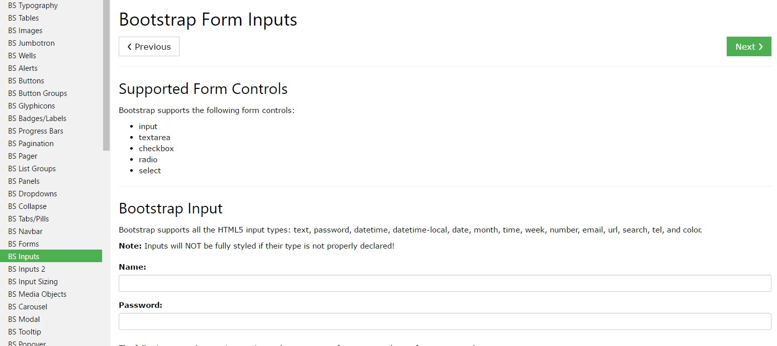
Most of the elements we use in forms to capture user information are from the <input> tag.
You can easily extend form controls by adding text, buttons, or button groups on either side of textual <input>-s.
The different types of inputs are determined by the value of their type attribute.
Next, we'll detail the accepted types for this tag.
Text
<Input type ="text" name ="username">
Probably the most common type of input, which has the attribute type = "text", is used when we want the user to send a simple textual information, since this element does not allow the entry of line breaks.
When sending the form, the information entered by the user is accessible on the server side by means of the “name” attribute, used to identify each information contained in the request parameters.
To access the information typed when we treat the form with some type of script, to validate the content for example, it is necessary to obtain the contents of the value property of the object in the DOM.
Parole
<Input type="password" name="pswd">
The input that receives the type = "password" attribute is similar to the text type, except that it does not display exactly the text entered by the user, but rather a series of symbols “*” or another depending on the browser and operational system.
Basic example
Place one add-on or button on either side of an input. You may also place one on both sides of an input. Bootstrap 4 does not supports multiple form-controls in a single input group.
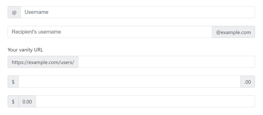
<div class="input-group">
  <span class="input-group-addon" id="basic-addon1">@</span>
  <input type="text" class="form-control" placeholder="Username" aria-describedby="basic-addon1">
</div>
<br>
<div class="input-group">
  <input type="text" class="form-control" placeholder="Recipient's username" aria-describedby="basic-addon2">
  <span class="input-group-addon" id="basic-addon2">@example.com</span>
</div>
<br>
<label for="basic-url">Your vanity URL</label>
<div class="input-group">
  <span class="input-group-addon" id="basic-addon3">https://example.com/users/</span>
  <input type="text" class="form-control" id="basic-url" aria-describedby="basic-addon3">
</div>
<br>
<div class="input-group">
  <span class="input-group-addon">$</span>
  <input type="text" class="form-control" aria-label="Amount (to the nearest dollar)">
  <span class="input-group-addon">.00</span>
</div>
<br>
<div class="input-group">
  <span class="input-group-addon">$</span>
  <span class="input-group-addon">0.00</span>
  <input type="text" class="form-control" aria-label="Amount (to the nearest dollar)">
</div>
Sizing
Bring in the related form proportions classes to the .input-group itself and contents located in will automatically resize - no need for reproducing the form regulation sizing classes on the each component.
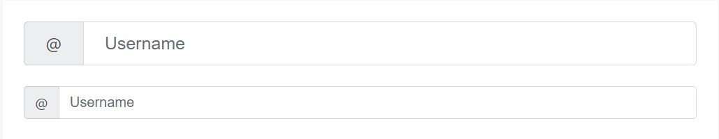
<div class="input-group input-group-lg">
<span class="input-group-addon" id="sizing-addon1">@</span>
<input type="text" class="form-control" placeholder="Username" aria-describedby="sizing-addon1">
</div>
<br>
<div class="input-group">
<span class="input-group-addon" id="sizing-addon2">@</span>
<input type="text" class="form-control" placeholder="Username" aria-describedby="sizing-addon2">
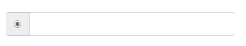
</div>Apply any kind of checkbox or radio option inside an input group’s addon instead of of text.
Checkbox
The input element of the checkbox type is very often used when we have an option that can be marked as yes or no, for example "I accept the terms of the user contract", or "Keep the active session" in forms Login.
Although widely used with the value true, you can determine any value for the checkbox.
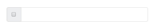
<div class="col-lg-6">
    <div class="input-group">
      <span class="input-group-addon">
        <input type="checkbox" aria-label="Checkbox for following text input">
      </span>
      <input type="text" class="form-control" aria-label="Text input with checkbox">
    </div>
</div>
Radio button opportunity
When we want the user to choose only one of a series of options, we can use input elements of the radio type.
When there is more than one element of this type with the same value in the name attribute, only one can be selected.
<div class="col-lg-6">
    <div class="input-group">
      <span class="input-group-addon">
        <input type="radio" aria-label="Radio button for following text input">
      </span>
      <input type="text" class="form-control" aria-label="Text input with radio button">
    </div>
</div>
Numerous addons
Several attachments are promoted and may possibly be incorporated with checkbox and radio input versions.

<div class="row">
  <div class="col-lg-6">
    <div class="input-group">
      <span class="input-group-addon">
        <input type="checkbox" aria-label="Checkbox for following text input">
      </span>
      <span class="input-group-addon">$</span>
      <input type="text" class="form-control" aria-label="Text input with checkbox">
    </div>
  </div>
  <div class="col-lg-6">
    <div class="input-group">
      <span class="input-group-addon">$</span>
      <span class="input-group-addon">0.00</span>
      <input type="text" class="form-control" aria-label="Text input with radio button">
    </div>
  </div>
</div>
Input group: other buttons variances
<Input type ="button" name ="show_dialogue" value ="Click here!">
The input element with thetype="button" attribute renders a button inside the form, but this button has no direct function on it and is commonly used to trigger events for script execution.
The button text is determined by the value of the "value" attribute.
Add-ons of the buttons
Buttons in input groups have to be wrapped in a .input-group-btn for correct positioning and sizing. This is requested due to default browser designs that can not really be overridden.
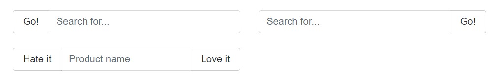
<div class="row">
  <div class="col-lg-6">
    <div class="input-group">
      <span class="input-group-btn">
        <button class="btn btn-secondary" type="button">Go!</button>
      </span>
      <input type="text" class="form-control" placeholder="Search for...">
    </div>
  </div>
  <div class="col-lg-6">
    <div class="input-group">
      <input type="text" class="form-control" placeholder="Search for...">
      <span class="input-group-btn">
        <button class="btn btn-secondary" type="button">Go!</button>
      </span>
    </div>
  </div>
</div>
<br>
<div class="row">
  <div class="col-lg-offset-3 col-lg-6">
    <div class="input-group">
      <span class="input-group-btn">
        <button class="btn btn-secondary" type="button">Hate it</button>
      </span>
      <input type="text" class="form-control" placeholder="Product name">
      <span class="input-group-btn">
        <button class="btn btn-secondary" type="button">Love it</button>
      </span>
    </div>
  </div>
</div>
Drop-down buttons
<div class="row">
  <div class="col-lg-6">
    <div class="input-group">
      <div class="input-group-btn">
        <button type="button" class="btn btn-secondary dropdown-toggle" data-toggle="dropdown" aria-haspopup="true" aria-expanded="false">
          Action
        </button>
        <div class="dropdown-menu">
          <a class="dropdown-item" href="#">Action</a>
          <a class="dropdown-item" href="#">Another action</a>
          <a class="dropdown-item" href="#">Something else here</a>
          <div role="separator" class="dropdown-divider"></div>
          <a class="dropdown-item" href="#">Separated link</a>
        </div>
      </div>
      <input type="text" class="form-control" aria-label="Text input with dropdown button">
    </div>
  </div>
  <div class="col-lg-6">
    <div class="input-group">
      <input type="text" class="form-control" aria-label="Text input with dropdown button">
      <div class="input-group-btn">
        <button type="button" class="btn btn-secondary dropdown-toggle" data-toggle="dropdown" aria-haspopup="true" aria-expanded="false">
          Action
        </button>
        <div class="dropdown-menu dropdown-menu-right">
          <a class="dropdown-item" href="#">Action</a>
          <a class="dropdown-item" href="#">Another action</a>
          <a class="dropdown-item" href="#">Something else here</a>
          <div role="separator" class="dropdown-divider"></div>
          <a class="dropdown-item" href="#">Separated link</a>
        </div>
      </div>
    </div>
  </div>
</div>
More than that, buttons may possibly be segmented
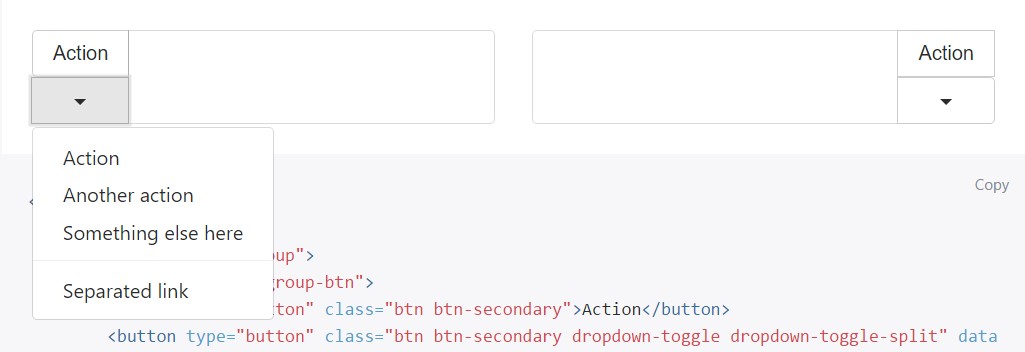
<div class="row">
  <div class="col-lg-6">
    <div class="input-group">
      <div class="input-group-btn">
        <button type="button" class="btn btn-secondary">Action</button>
        <button type="button" class="btn btn-secondary dropdown-toggle dropdown-toggle-split" data-toggle="dropdown" aria-haspopup="true" aria-expanded="false">
          <span class="sr-only">Toggle Dropdown</span>
        </button>
        <div class="dropdown-menu">
          <a class="dropdown-item" href="#">Action</a>
          <a class="dropdown-item" href="#">Another action</a>
          <a class="dropdown-item" href="#">Something else here</a>
          <div role="separator" class="dropdown-divider"></div>
          <a class="dropdown-item" href="#">Separated link</a>
        </div>
      </div>
      <input type="text" class="form-control" aria-label="Text input with segmented button dropdown">
    </div>
  </div>
  <div class="col-lg-6">
    <div class="input-group">
      <input type="text" class="form-control" aria-label="Text input with segmented button dropdown">
      <div class="input-group-btn">
        <button type="button" class="btn btn-secondary">Action</button>
        <button type="button" class="btn btn-secondary dropdown-toggle dropdown-toggle-split" data-toggle="dropdown" aria-haspopup="true" aria-expanded="false">
          <span class="sr-only">Toggle Dropdown</span>
        </button>
        <div class="dropdown-menu dropdown-menu-right">
          <a class="dropdown-item" href="#">Action</a>
          <a class="dropdown-item" href="#">Another action</a>
          <a class="dropdown-item" href="#">Something else here</a>
          <div role="separator" class="dropdown-divider"></div>
          <a class="dropdown-item" href="#">Separated link</a>
        </div>
      </div>
    </div>
  </div>
</div>
Submit
<Input type ="submit" name ="send" value ="Submit">
The input element with the type "submit" attribute is similar to the button, but when triggered this element initiates the call that sends the form information to the address indicated in the action attribute of <form>.
Image
You can replace the submit form button with an image, making it possible to create a more attractive look for the form.
Reset
<Input type="reset" name="reset" value="Clear">
The input with type="reset" eliminates the values entered previously in the elements of a form, allowing the user to clean the form.
<Input> and <button>
The <input> tag of the button, submit, and reset types can be replaced by the <button> tag. In this case, the text of the button is now indicated as the content of the tag. It is still necessary to specify the value of the type attribute, even if it is a button:
<Button type="button" name="send">Click here</button>
File
<Input type ="file" name ="attachment">
When it is necessary for the user to send a file to the application on the server side, it is necessary to use the file type input.
For the correct sending of the files, it is often also necessary to add the enctype="multipart/form-data" attribute in the <form> tag.
Hidden
<Input type="hidden" name ="code" value ="abc">
Often we need to send and receive information that is of no direct use to the user and therefore should not be displayed on the form.
For this purpose, there is the input of the hidden type, which only carries a value.
Availableness
Display readers will likely have trouble with your forms assuming that you don't provide a label for each input. For these input groups, make sure that every extra label or functionality is brought to assistive technologies.
The examples in this section provide a few suggested, case-specific approaches.
Look at a number of online video information regarding Bootstrap Input
Connected topics:
Bootstrap input: main documentation
Bootstrap input tutorial
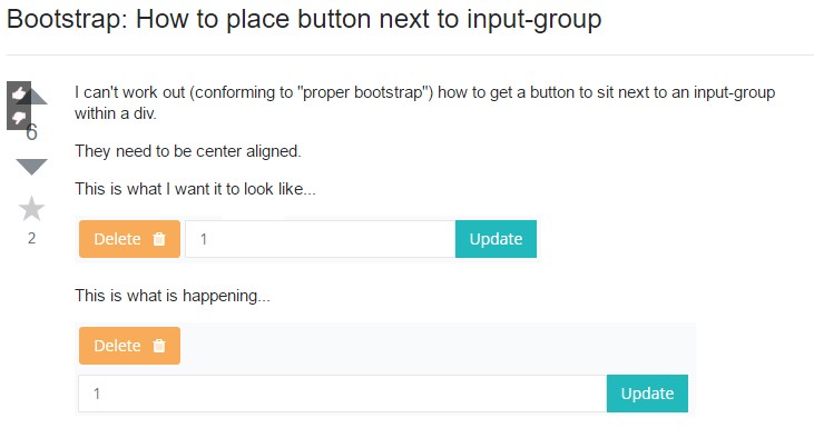
Bootstrap: How to place button next to input-group