Bootstrap Textarea
Intro
In the pages we create we use the form elements in order to collect some information from the visitors and return it back to the site owner serving various purposes. To do it properly – meaning getting the right answers, the right questions should be asked so we architect out forms structure carefully, thinking of all the possible cases and types of information needed and possibly provided.
But no matter how precise we are in this, there always are some cases when the information we need from the user is rather blurry before it gets actually provided and needs to spread over much more than just the regular a single or a few words generally filled in the input fields. That’s where the <textarea> element comes in – it’s the only and irreplaceable element in which the visitors can freely write back some sentences providing a feedback, sharing a reason for their actions or just a few thoughts to hopefully aid us making the product or service the page is about even better.
The ways to employ the Bootstrap textarea:
In the latest version of the most popular responsive framework – Bootstrap 4 the <textarea> element is fully supported automatically adjusting to the width of the screen page gets displayed on.
Creating it is quite straightforward - all you need is a parent wrapper <div> element carrying the .form-group class applied.
Inside it we need to place a label for the <textarea> element carrying the for = “ - the textarea ID - " and appropriate caption in order to make it easy for the user to understand what kind of information you would need written in.
Next we need to create the <textarea> element itself – assign it the .form-control class and an appropriate ID. Do note the ID you have assigned inside the for = "" attribute if the previous <label> should match the one to the <textarea> element. You should also add a rows=" ~ number ~ " attribute in order to set the lines the <textarea> will initially spread when it gets displayed when the page initially loads – 3 to 5 is a nice value for this one since if the text gets too much the user can always resize this control by dragging or just use the inner scrollbar appearing when text gets too much.
Since this is a responsive element by default it spreads the whole width of its parent element.
Extra recommendations
On the opposite – there are some cases you would want to limit the feedback provided inside a <textbox> to a specific length in characters – if this is your case you should also add a maxlenght = " ~ some number here ~ " attribute setting the characters limit you need – do consider carefully though if the limit you set will be enough for the info you need to be written correctly and detailed enough – remember how frustrated you were when you were asked something and in the middle of the answer were not able to write further – this is essential since it is possible reaching the limit might potentially annoy the visitors and push them away from submitting the form or even from the page itself.
For examples
Bootstrap's form controls expand on Rebooted form styles using classes. Work with these classes to opt into their customized displays for a more consistent rendering across web browsers and devices . The example form listed below demonstrates typical HTML form elements that get up-dated looks from Bootstrap with additional classes.
Just remember, given that Bootstrap employs the HTML5 doctype, all of inputs must have a type attribute.
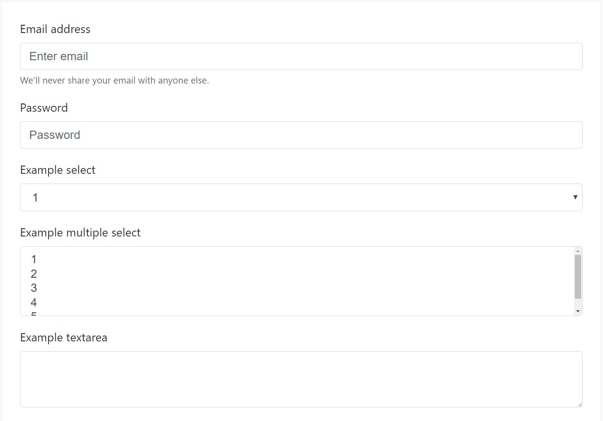
<form>
<div class="form-group">
<label for="exampleInputEmail1">Email address</label>
<input type="email" class="form-control" id="exampleInputEmail1" aria-describedby="emailHelp" placeholder="Enter email">
<small id="emailHelp" class="form-text text-muted">We'll never share your email with anyone else.</small>
</div>
<div class="form-group">
<label for="exampleInputPassword1">Password</label>
<input type="password" class="form-control" id="exampleInputPassword1" placeholder="Password">
</div>
<div class="form-group">
<label for="exampleSelect1">Example select</label>
<select class="form-control" id="exampleSelect1">
<option>1</option>
<option>2</option>
<option>3</option>
<option>4</option>
<option>5</option>
</select>
</div>
<div class="form-group">
<label for="exampleSelect2">Example multiple select</label>
<select multiple class="form-control" id="exampleSelect2">
<option>1</option>
<option>2</option>
<option>3</option>
<option>4</option>
<option>5</option>
</select>
</div>
<div class="form-group">
<label for="exampleTextarea">Example textarea</label>
<textarea class="form-control" id="exampleTextarea" rows="3"></textarea>
</div>
<div class="form-group">
<label for="exampleInputFile">File input</label>
<input type="file" class="form-control-file" id="exampleInputFile" aria-describedby="fileHelp">
<small id="fileHelp" class="form-text text-muted">This is some placeholder block-level help text for the above input. It's a bit lighter and easily wraps to a new line.</small>
</div>
<fieldset class="form-group">
<legend>Radio buttons</legend>
<div class="form-check">
<label class="form-check-label">
<input type="radio" class="form-check-input" name="optionsRadios" id="optionsRadios1" value="option1" checked>
Option one is this and that—be sure to include why it's great
</label>
</div>
<div class="form-check">
<label class="form-check-label">
<input type="radio" class="form-check-input" name="optionsRadios" id="optionsRadios2" value="option2">
Option two can be something else and selecting it will deselect option one
</label>
</div>
<div class="form-check disabled">
<label class="form-check-label">
<input type="radio" class="form-check-input" name="optionsRadios" id="optionsRadios3" value="option3" disabled>
Option three is disabled
</label>
</div>
</fieldset>
<div class="form-check">
<label class="form-check-label">
<input type="checkbox" class="form-check-input">
Check me out
</label>
</div>
<button type="submit" class="btn btn-primary">Submit</button>
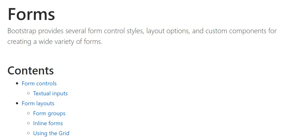
</form>Listed here is generally a full listing of the certain form commands assisted simply by Bootstrap plus the classes that customise them. Extra documentation is provided for each and every group.

Conclusions
So now you know how to set up a <textarea> element inside your Bootstrap 4 powered web pages – now all you need to figure out are the right questions to ask.
Inspect several youtube video information about Bootstrap textarea:
Linked topics:
Concepts of the textarea
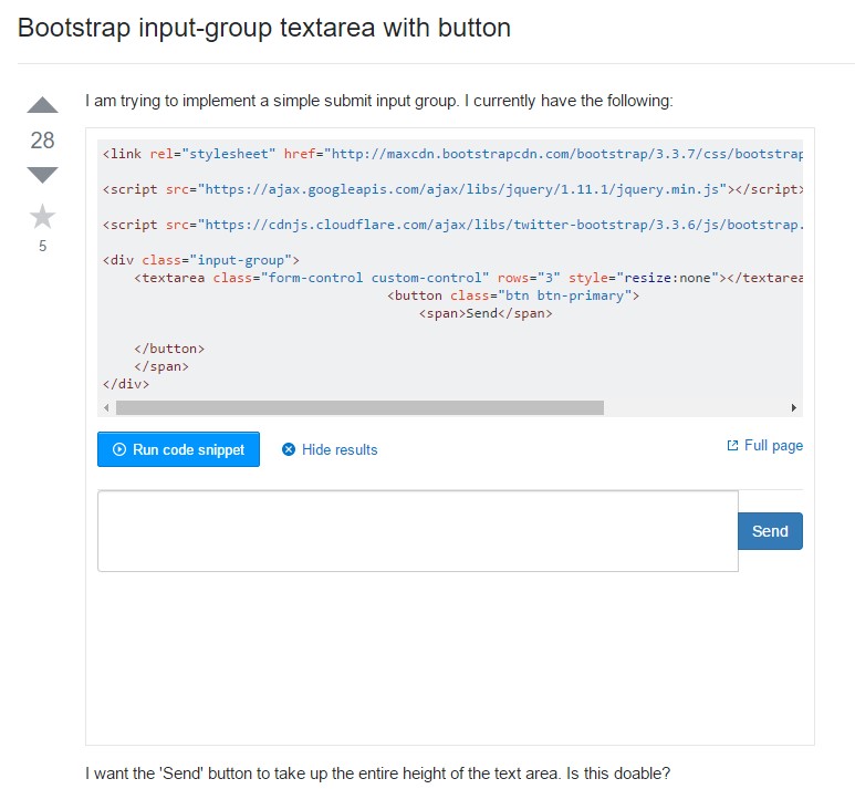
Bootstrap input-group Textarea button utilizing
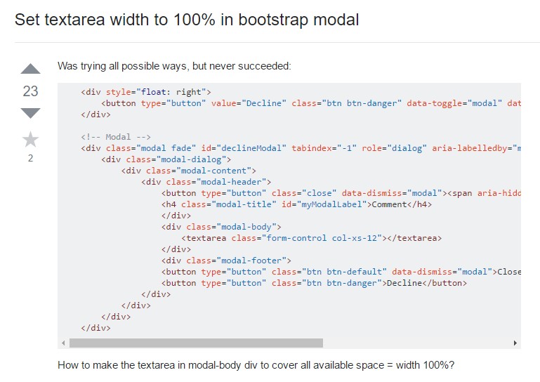
Create Textarea width to 100% in Bootstrap modal