Bootstrap Jumbotron
Intro
Sometimes we need showcasing a statement loud and clear from the very start of the page – like a promotion information, upcoming event notification or whatever. In order to make this statement loud and clear it's also probably a good idea placing them even above the navbar as kind of a general caption and statement.
Including such elements in an appealing and most importantly – responsive way has been thought of in Bootstrap 4. What the latest version of the most popular responsive framework in its latest fourth version has to face the need of stating something with no doubt fight in front of the page is the Jumbotron element. It gets styled with large text and some heavy paddings to obtain clean and appealing appearance.
Efficient ways to apply the Bootstrap Jumbotron:
In order to include such element in your pages create a <div> with the class .jumbotron applied and eventually – .jumbotron-fluid next to make your jumbotron spread the whole viewport width if you think it will look better this way – this is actually a new feature introduced in Bootatrap 4 – the previous version didn't have
.jumbotron-fluid class.
And as simple as that you have created your Jumbotron element – still empty so far. By default it gets styled with slightly rounded corners for friendlier appearance and a light grey background color - now all you need to do is wrapping some content like an appealing <h1> heading and some meaningful text wrapped in a <p> paragraph. This is the simplest approach possible since there is no direct limitation to the jumbotron's content. Do have in mind though if a statement is supposed to be really powerful a good thing to do is making also simple short and understandable content – placing a bit more complicated content in a jumbotron might confuse your visitors bothering them instead of dragging their attention.
As an examples

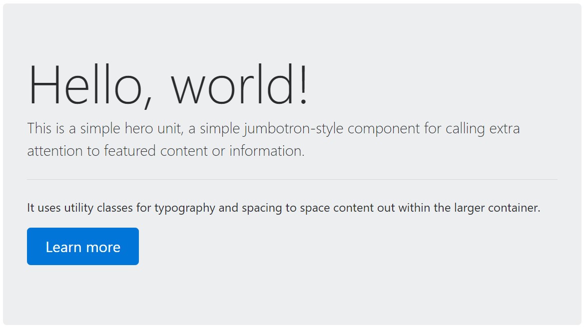
<div class="jumbotron">
  <h1 class="display-3">Hello, world!</h1>
  <p class="lead">This is a simple hero unit, a simple jumbotron-style component for calling extra attention to featured content or information.</p>
  <hr class="my-4">
  <p>It uses utility classes for typography and spacing to space content out within the larger container.</p>
  <p class="lead">
    <a class="btn btn-primary btn-lg" href="#" role="button">Learn more</a>
  </p>
</div>
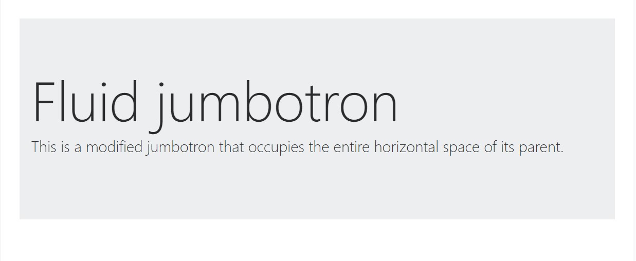
To make the jumbotron full width, and without rounded corners , incorporate the .jumbotron-fluid modifier class and also incorporate a .container or else .container-fluid within.

<div class="jumbotron jumbotron-fluid">
  <div class="container">
    <h1 class="display-3">Fluid jumbotron</h1>
    <p class="lead">This is a modified jumbotron that occupies the entire horizontal space of its parent.</p>
  </div>
</div>
Yet another issue to mention
This is the easiest way sending your visitor a loud and clear message using Bootstrap 4's Jumbotron element. It should be carefully used again considering all the possible widths the page might appear on and especially – the smallest ones. Here is why – as we discussed above generally some <h1> and <p> tags will take place there pushing down the page's actual content.
This combined with the a bit larger paddings and a few more lined of text content might cause the elements filling in a mobile phone's whole screen height and even spread beneath it which might eventually confuse or even frustrate the visitor – especially in a hurry one. So again we get back to the unwritten requirement the Jumbotron messages should be short and clear so they grab the visitors instead of pushing them away by being too shouting and aggressive
Final thoughts
So now you know how to create a Jumbotron with Bootstrap 4 and all the possible way it can affect your audience – now all that's left for you is carefully thinking out its content.
Inspect a number of online video information relating to Bootstrap Jumbotron
Related topics:
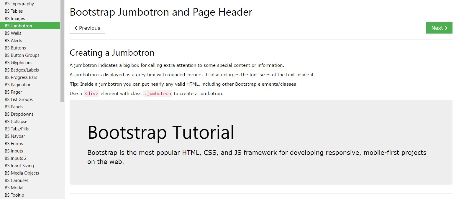
Bootstrap Jumbotron official documentation

Bootstrap Jumbotron guide

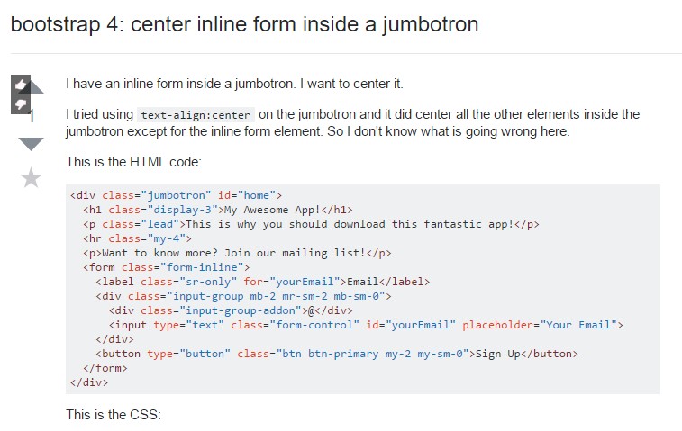
Bootstrap 4: focus inline form inside a jumbotron
