Bootstrap Clearfix
Introduction
Power in our expression means and better flexibility – that's what's never enough when we're sketching the very next layout for our new project since there always is a bold appearance idea or even two of them we leave behind to try implementing next time. But the feeling something isn't quite complete still remains until we look for a way actually implementing this brilliant thought we had while the project was still being sketched on a piece of paper. That’s how some clever workarounds like the Clearfix plugin get to life in order to provide maybe not the best at all times but still working solutions and help us implement what we initially were had in mind.
The best ways to employ the Bootstrap Clearfix plugin:
Generally what Clearfix does is fighting the zero height container issue when it comes to containing floated elements – for example – if you have only two elements inside a container one floated left and the other one - right and you want to style the element containing them with a specific background color without the help of the clearfix plugin the whole workaround will end up with a thin line in the needed background color taking place over the floated elements nevertheless the background colored element is actually the parent of the two floated ones.
To take care of this the Bootstrap framework has the clearfix plugin included so to achieve the needed result from the above example all you need is just applying the class .clearfix to the parent element making it spread behind its floated content as it intuitive seems it should be – as simple as that – the clearfix plugin doesn't have any adjustable options or additional classes for different behavior – it does a single thing but does it well each and every time.
Examples
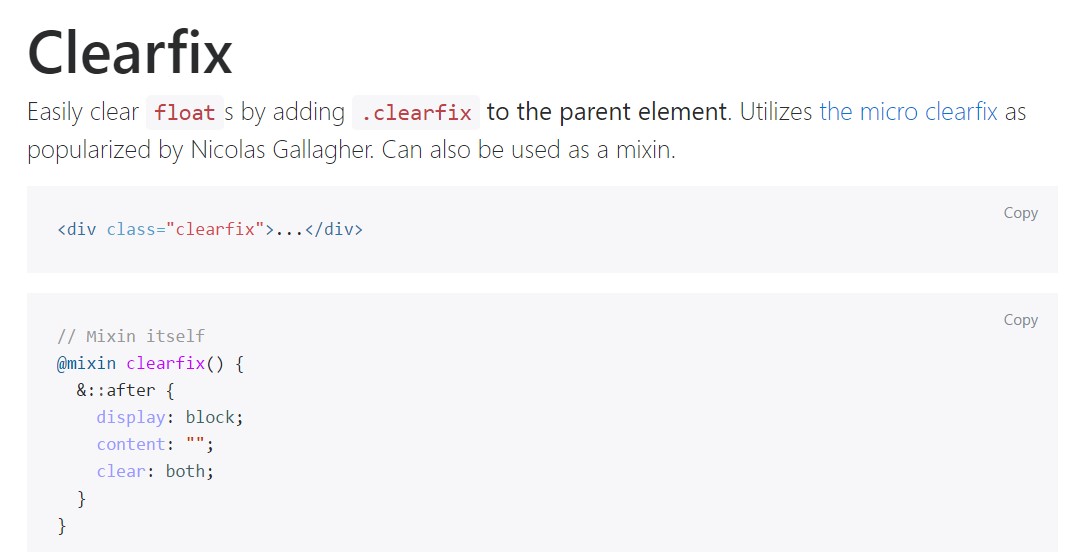
Conveniently clear float- s by incorporating .clearfix to the parent feature. Applies the micro clearfix as spread by Nicolas Gallagher. It is able to be additionally utilized as a mixin.
<div class="clearfix">...</div>// Mixin itself
@mixin clearfix()
&::after
display: block;
content: "";
clear: both;
// Usage as a mixin
.element
@include clearfix;The following illustration displays the way the clearfix can possibly be utilized. With no the clearfix the wrapping div would not actually span around the tabs which in turn would cause a broken layout.

<div class="bg-info clearfix">
  <button class="btn btn-secondary float-left">Example Button floated left</button>
  <button class="btn btn-secondary float-right">Example Button floated right</button>
</div>
Brand new Solutions
In the latest version of the most popular responsive framework – Bootstrap 4 alpha 6 the clearfix is still fully supported however in time will probably get less and less used and probably – even left behind since the dev team has decided embracing the flexbox layout for many of the common page elements – it's a much more powerful and modern approach for sizing, placing and distributing a particular element's children without the need of floats and therefore – the .clearfix class applied for making the parent elements behave.
This approach is bright new for the latest alpha 6 of Bootstrap 4 and might be considered rather a bold step since it also means dropping the IE9 support for and best appearance of the pages created on modern browsers only but as the technology evolution goes this doesn't seem like a potential issue at all. Of course there still be some cases when we will still need the good classic float approaches so when we do that – we also have the .clearfix class to help us make our elements display best.
Final thoughts
So now you know what the .clerfix in Bootstrap 4 stands for – do have it in mind when you encounter unexpected appearance of some wrappers containing floated elements but the best thing to do is actually spending com time taking a look at the way the new star in town – flexbox makes the things done since it provides a handful of pretty neat and easy layout sollutions to get our pages to the very next level.
Review a number of video clip tutorials relating to Bootstrap Clearfix
Related topics:
Bootstrap clearfix authoritative information

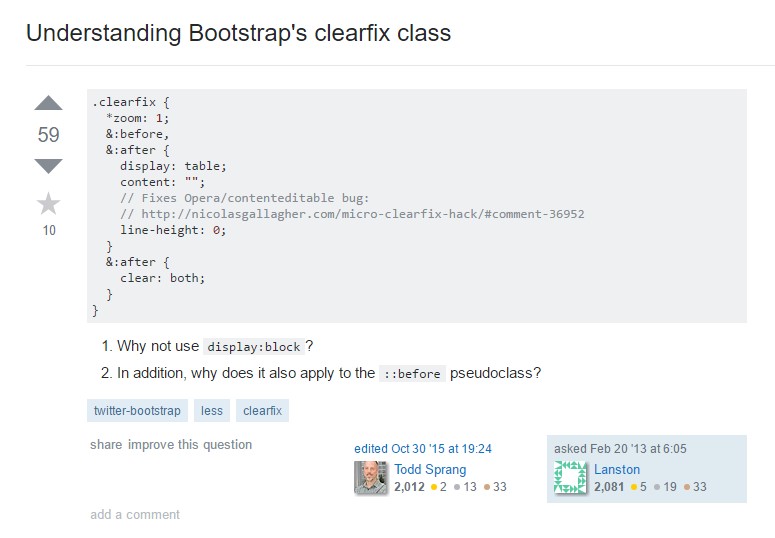
Recognizing Bootstrap's clearfix class

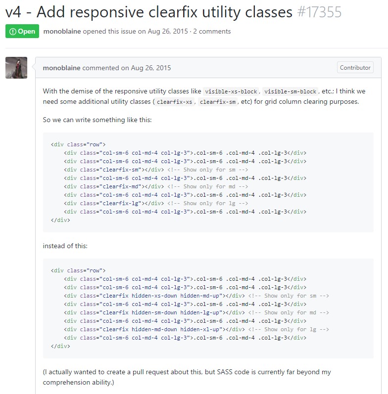
Bootstrap v4 - Bring in responsive clearfix utility classes
