Best Free Website Builder Review
Mobirise Free Website Builder v3 with the Additional Blocks Pack
In any particular occupation having the right tool can save you time, money, efforts and therefore a small part of your life will be used for something else instead of doing something you’ve already accomplished. So the right tools are very important – at least this is my opinion.
I’m creating websites with Mobirise Web Builder from almost half of year – got aware of the existence of the project somewhere around the version 2.0 something and it’s my best website builder ever. I like the simple and intuitive way things get done in the Website Builder environment. I also like the idea of getting the creation of a website available to the masses so anybody needing a website could create a great looking one.
Nevertheless my deeper sympathy to the Mobirise Free Website Builder I’ve always known that there is no such thing as blocks predefined EXACTLY to match ANY vision – these can be developed only by a team of flying Unicorns. No matter how universal and flexible blocks get created there always is additional tweaking through some custom CSS or HTML or a minor compromises and changes to the initial design – that’s just the way it is. If I am sometimes uncertain how something would look best – how can someone at a distant location create something fitting exactly my unclear at the time vision?
Anyway – in time I have faced multiple tasks with Mobirise Builder and completed them nevertheless the lack of an exact block in the side panel. And these exact quests have evolved me as a person and a professional each time I got something done. Instead of complaining about some functionality or content blocks missing I was always asking myself – What can be done to improve things? And the results of my quests I’ve tried sharing through these articles. The solutions were not perfect but somehow managed to fill (at least for me) the gap in functionality and appearance within the native Mobirise blocks.
Maybe this gap gave a chance of multiple Third party Mobirise themes which had variety of blocks but unfortunately often lacked sometimes even basic customization features or acted in unexpected way sometimes. Trying some of them I even experienced the emerging of a horizontal scroll bar into what was supposed to be a Bootstrap powered responsive website! So even though I found figuring out these underwater stones quite refreshing I got to a conclusion that I can’t trust such theme enough to go for a real life project with it. I decided what I do with Mobirise would rest on native Mobirise team products I could rely and on the results of my own efforts.
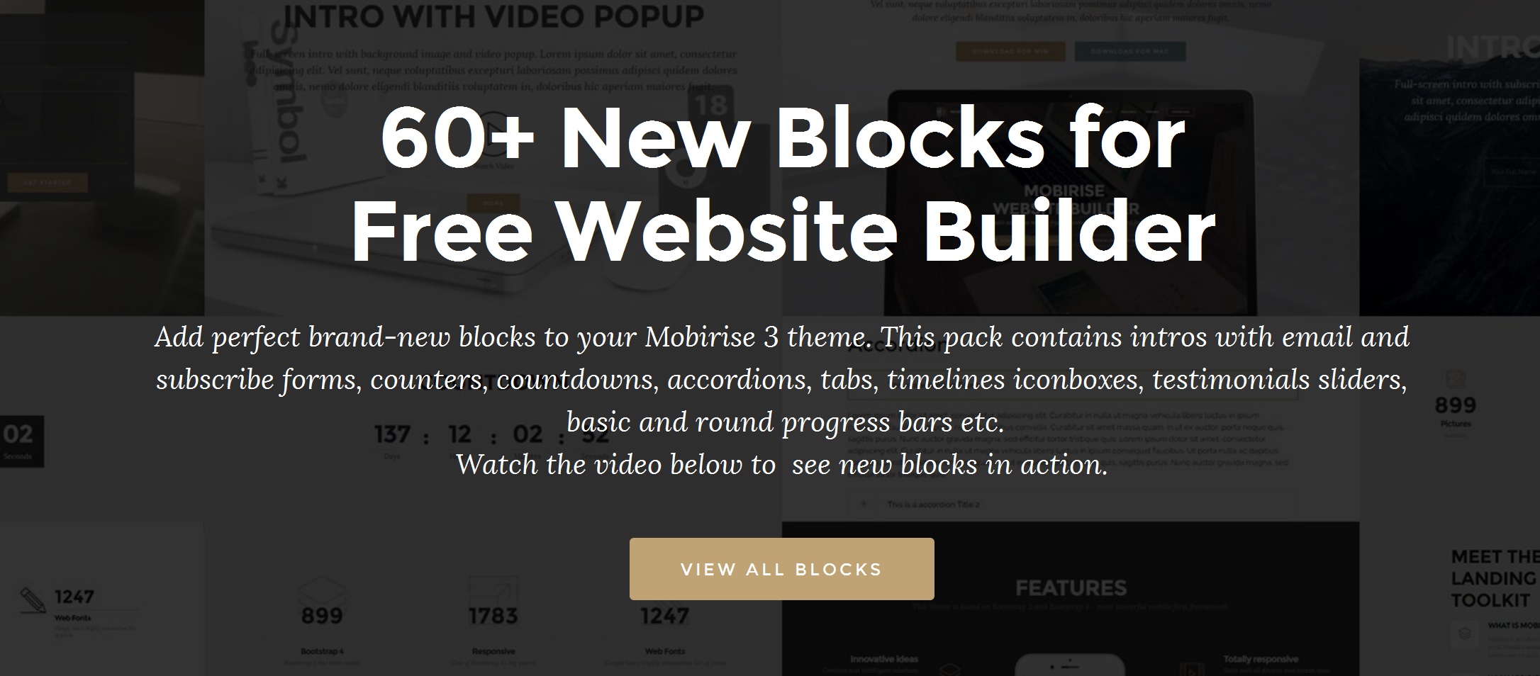
Time and versions passed away until recently I got aware of the existence of the Additional Blocks Pack for Mobirise Builder which we are going to explore today. In its more than fifty blocks I found most of the things I was ever needing for my projects alongside with a great source of inspiration within some blocks I didn’t think about so far.
The Additional Blocks Pack combines new functionality and fresh unexpected appearances with very well thought customization options and swift performance in Builder. Before starting this article I draw them all out in a test project and carefully observed for sharp edges as usually when I explore a new product. It was a very pleasant surprise to discover there merely were any. Today we’re going to take a detailed look at all of them, discuss the possible uses and appearances which can be achieved and eventually some small improvements which will help us making them almost perfect. So, let’s begin.
Overall structure
The Additional blocks are organized fallowing the same logic the Native Mobirise Themes do.
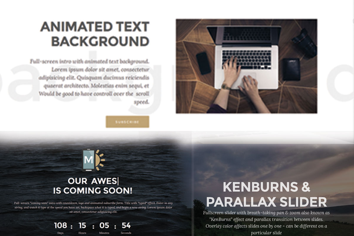
First you’ve got Intro blocks combining different functionalities – subscriptions and feedback forms, video popups, and content with clever styled images. The last update also introduced some new expression ways with the typed effects and animated backgrounds. We’ve also got an impressive Ken burns slider and contact intro combining images, icons, a contact forma and even a Google Map in one block so it gets fully functionally and content loaded.
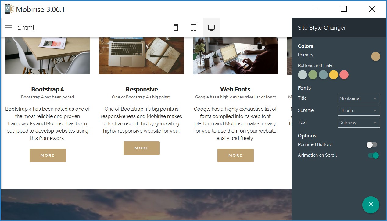
Then the features blocks come to take place. Among them you’ll find multiple segmented layouts allowing you to showcase topics or items of equal significance or outline the importance of some for example with the number in a row or with some expressive icons and images. The multiple different predefined layouts impress with well thought control panels and flexible options. There also are some of the significant Intro blocks tweaked for presenting a content – fully packed with sizing and padding options.
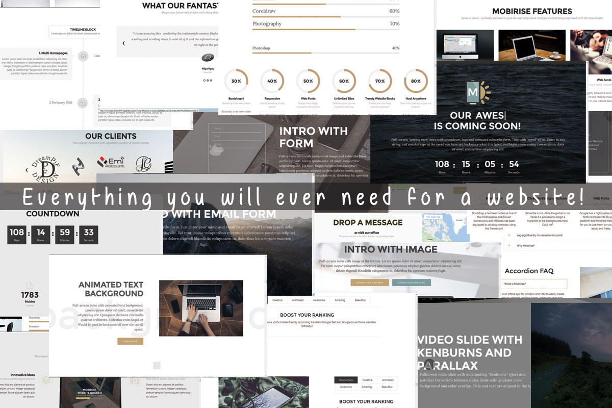
Further you’ll find my personal favorites – progress bars, countdown blocks, accordions, toggles and tabbed content blocks arranged in multiple ways. These are entirely new types of blocks to the native Mobirise theme giving tons of interactive functionality and visual pleasure. Nevertheless they are bright new they are also quite well thought and flexible as we’ll see further.
And the jewel of the crown – the content slider. A brilliant thought – arranging content carrying elements into a slider giving the user to select the number of the blocks being displayed at one slide. I love this block! It is being called testimonials block but the truth is just like the testimonials block from the native Mobirise3 it can be successfully used for practically any type of content.
Lastly there is the additional footer block which can be useful if you would like to add some kind of simple mini navigation at the end of your pages.
It is important to note that unlike the native Mobirise Mobile Web Builder themes almost all of the blocks in the Additional Blocks Pack Extension are unique – you won’t find a copy of the same block with different switches on in the properties panel.
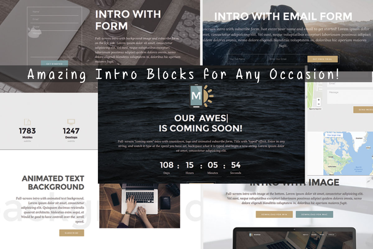
Intro blocks
These are actually the first ones the user will see and should be chosen and styled carefully. It is proven that too crowded or unattractive intro can directly push the users away. The Blocks Pack got you covered – all the intro blocks are quite balanced offering expression and functionality sharing space on screen without messing up with each other. What is really good to see is the various implements of something so far seen in Mobirise only by third party theme developers – we now have intros with forms, intros with colorful icons allowing to present various essential features and even combinations – of appealing captions and text, features with icons and a form aside. And since it’s a Mobirise development – they all resize flawlessly without any unexpected behavior we often see in the third parties.
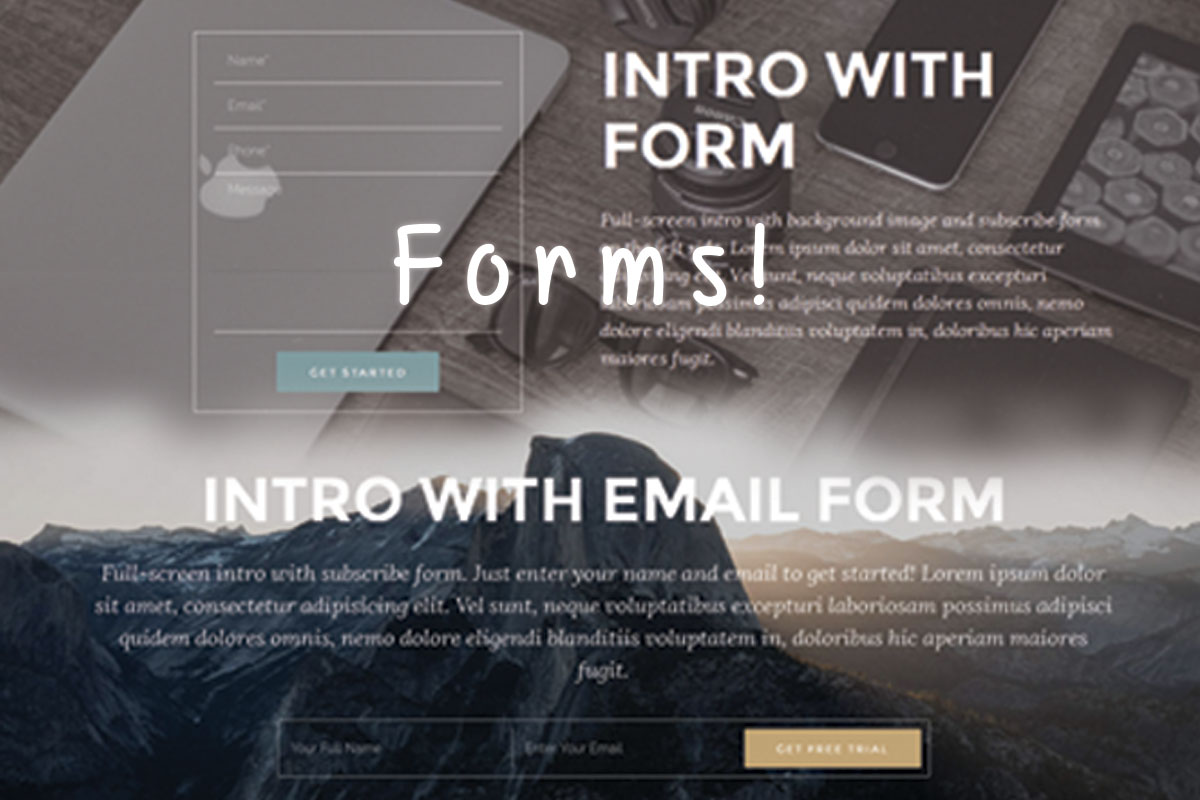
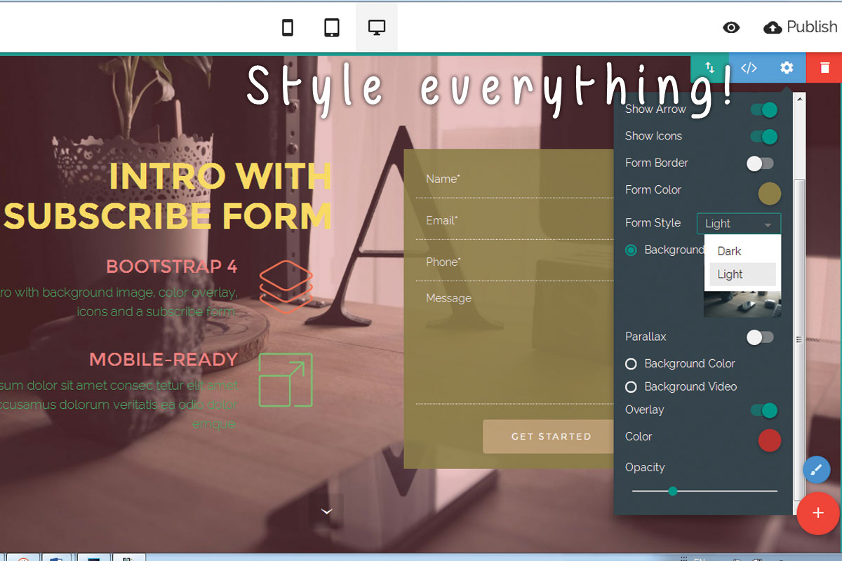
Regarding the forms there is one more thing should be said – we have a multiplication factor here since along with the multiple given layouts the user of the Website Builder can also pick from multiple styling appearances of the functional elements. We have light forms with only subtle underline distinguishing the fields, we have forms with outlined fields we even have forms with subtle semitransparent background alongside with the rather classical appearance of the solid filled ones. There
The customization options are crafted to provide the designer comfort speed and almost full control of the appearance. It shows a lot of thinking has been done here. What should be mentioned regarding intro blocks and forms in particular is the useful Dark/Light appearance dropdown, the color picker for form background color when needed alongside with the good beloved options to of reversing the layout or freely selecting the background and its overlay and parallax effect.
There are also some fresh and inspiring implements like a centered image with a caption and some text and an overlay layer spreading to the middle of the image – almost like a border revealing the real world from the one of talks and descriptions.
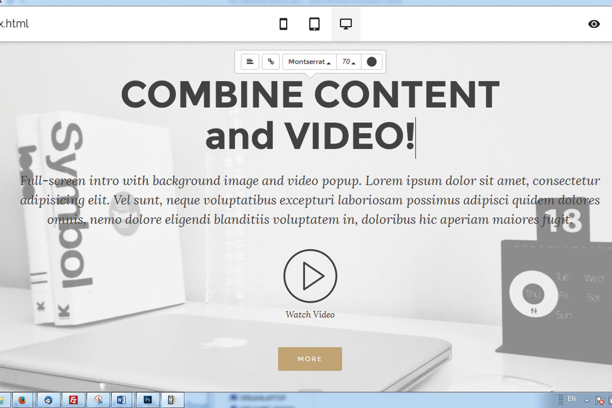
Another fresh approach is the video popup leaving the space clean and tidy from the embedded video’s black rectangle leaving the user to pick when and if to call it out. Another benefit from this is video starts in a light box automatically taking the entire space when needed saving those annoying “full screen” clicks and the restart of the video in order to see what’s been missed while clicking on full screen.
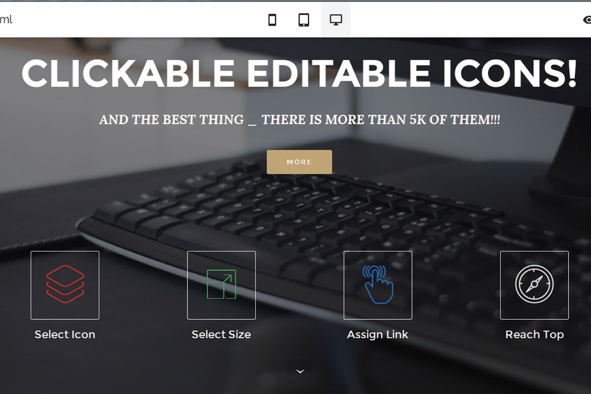
Let’s spend a minute talking about icons. A few versions now I enjoy watching the getting more and more both in number and quality. The icons extension really did grow to be some kind of a Swiss Army Knife offering an appropriate symbolic image for almost any occasion. And this comes in combination with flexible and well thought control panel allowing you to customize each element to the appropriate appearance. This way the thousands of icons sitting there come to be the perfect addition for the intro blocks and most importantly – with their help can be implemented almost any kind of appearance.
To amaze your clients and please the eye even more near the end of the intro blocks stack there are some blocks utilizing movement as an expression mean in fresh and appealing way. I’m talking about the Title with typed effect, animated background and the "Kenburns" and Parallax slider.
Think of kitten watching ping pong match. Fallowing rapidly moving / changing things is a reflex coming from the times people had to pay attention at such in order to live a bit longer. So what a better way attracting your user’s attention of some large captions being typed and deleted and retyped again – works like a magnet for the eye. We also have the “Let’s see what comes next” element – it’s becoming like a micro story told in just three changing words. Or looking at it from the angle of Messaging Era – becomes like some kind of a conversation – you see what the other guy’s typing and retyping trying to figure out which one fits best. Magnetic and powerful block.
There is a small pebble underwater here – utilizing this block you should take count of the length of the words you use and the size of the text itself. Selecting too long words might cause overflowing to a next line which scrolling down the site will result a jumpy appearance every time the long word in the block gets typed. This might confuse and even frighten the user – the first time I mentioned this effect was when preparing for this article. I had all blocks drawn out, the resulting site previewed and it happened this way I had to do something else aside from my laptop. So here I am discussing something and with my peripheral vision I spot something on my screen appearing and going back up. It was the bottom of a block being pushed down on screen but remember I was doing something else and just spotted something dark coming out of my dark navbar - so I thought somebody got in and messes out with my files! It was quite an emotional moment.
So to spare your users this kind of moments – select the changing words and the caption size carefully and it will all be just brilliant.
Now let’s take a look at the far more subtle effect used by the animated text background block. You’ve got the good golden content showcasing layout consisting of a caption text and image but hey, what’s going on here – there is some text moving in the background giving the feeling of depth almost like the main content and the image float in the air or over calm water. And of course the user stops to see what’s gracefully passing underneath. The block has a speed setting for the text movement – you can make it move quicker but my advice is – don’t – you’ll spoil the grace. Let it flow slowly calming the user, stopping him or her to just observe for a while. Combine this with a short or medium in length strong positive message and your users will thank you.
A little pebble here too – nevertheless there are image and video options for the background of the block you would want to stick with the solid color for now and this is for two reasons - it looks much cleaner and appealing this way and until probably the next update setting background different than solid disables the scrolling text option. My thoughts on this – I love many foods but don’t mix them all in one pot – the best way this expression mean works is with solid background and maybe the image and video background options should be omitted. On the other hand what if a subtle moving gif or video comes for a background – almost still but just almost – wow, this could work great! So my final opinion is – please make the scrolling text available with image and video backgrounds and let the designer’s conscious lead them.
Remember those occasions when you’re creating something functional and beautiful and it’s almost ready, just almost and the need of sharing it to the world kind of twirls inside your stomach but hey, it’s not ready yet should wait a bit longer. Or for example when you want to point the user’s attention to a great upcoming event and try pointing out its significance? This is what the countdown intro blocks are just perfect for. In them I see an approach showing all over the Blocks Pack – combining multiple cool features into one peace and this way utilizing the space much more efficiently, giving the user better experience and the web designer – freedom and ease.
The Intro blocks with countdown provide few appearances in order to meet different occasions. We’ve got a classical Title/ Subtitle/ Countdown / Subscribe form appearance, followed by an impressing combination of resizable image (which is initially meant to be company logo but as well could be a product mock-up or one of the thousand predefined icons for example) animated caption utilizing the typing and retyping effect we talked about, of course – some meaningful content, clean and subtle countdown block and a very pleasant way to display a subscribe form – with a single button sliding aside on hover revealing the subscribe form field. This collapsed form actually suits my taste quite a bit since nevertheless the subtle styling forms have always been taking too much of the space out there and let’s face it – most of the times have been just passed away. This have always seemed like an awful waste of space and bother for the eye to me – an issue this approach totally solves.
So far we’ve discussed Intro blocks focused on the content with appealing images on the background mostly a bit dimmed from the overlay layer in order to obtain legibility for the content. The next intro block we’re going to talk about utilizes the images and the effects applied to them as a standalone expression means – you’ve probably guessed it – it’s the Ken burns & parallax slider. The subtle movement of the images adds the feeling of depth – it’s almost like they really move out there through the window. In addition you’ve got the well-known content areas as Heading, body and buttons to insert some content along the beauty moving out there.
And finally from the segment of Intro blocks there are the outstanding blocks with a map and a contact form. To utilize the space most efficiently there also are some short content areas spiced with icons but due to the well thought Block Properties this is purely optional and again we have the choice for subtle or classical forms appearance.
›› Read Next: Part 2 - Features and Functionality in New Responsive Website Builder ››
_____________________________________________
Weebly Website Builder Review
When you want to do business in 2016, you need a web presence. More people do online research on a business than sometimes even word of mouth. Not everyone, however, is skilled at the coding, writing or general design of putting together a website. Is this an excuse to not be a part of the search process your customers, friends or the world in general uses? For those people, one option is Weebly. And, no there won’t be any references to wobbling (and you know how old you are if you get the reference). An advantage that Weebly promotes is free website design. It’s reported that they have over 12 million users that both professionally and personally use Weebly for designing sites for a variety of reasons for both the fact that you can build a website easily but also cheaply, or free!
If you know CSS, the coding language for building websites, you probably either aren’t interested in using this or you’re being lazy. The rest of us have some options and there are a wide variety of options for putting together webpage using the over 100 templates provided and you can customize these with their Build Editor that allows you to drag and drop these modules onto your page and it happens on your browser, in actual real time so you can see the results immediately and change things that you like or don’t like. Because you don’t have install anything onto your computer, even if you don’t own a computer or if you’re out in public at a library for example, you can build or update your contribution to the Internet without having IT skills of a college graduate or the typical genius kid down the block from you. Another benefit to Weebly is their assistance for web design in the form of the Site Planner. Yes, you could just randomly drag and drop the elements like text and video blocks onto your page but besides it not really looking all that aesthetic, perhaps it would have a better flow for visitors dropping in for the first or fortieth time. The Site Planner will work with you, based on how little or much help you want, to put together a page that will reflect your goals. This feature also helps you customize your text for Search Engine Optimization that works with major search engines and not get you red flagged for abuse.
Another major factor with our on the go society is a website that not only looks good on your home computer with the thirty inch monitor but on your mobile device. Weebly best free website builder works with the user to ensure that the site seen on a home laptop will be the same seen on a table or phone.
A nice bonus is that advertising isn’t a forced issue. Typically, free websites have to pay the bills somehow and they tell you upfront, or you find out, that ads will be inserted as a trade-off. Weebly promises users that they can use their own ads, work with Google or have nothing without concerns of being surprised by ads for products or services the designer may be opposed to.
The prices aren’t quite easy to find (you typically have to sign up for a free account) but you have the option of a Free, Starter, Pro and Business Accounts with prices of $3.29, $6.63 and $19.54 respectively for a monthly cost with support naturally increasing with the higher levels.
Is it worth it? You get quite a few perks for free with the aforementioned bonus of no forced advertising. If you know CSS then you obviously get more from it and of course if you’re a paying customer you’ll get more support and options but for someone who wants or needs an online presence, Weebly responsive menu gives you great features and a builder assistant that will help you put a great website together for your personal or business needs.