Responsive website builder
Features and Functionality in New Responsive Website Builder
Note: It's part 2 of Mobirise Builder review. ‹‹ Read the Prev Part 1
The Features
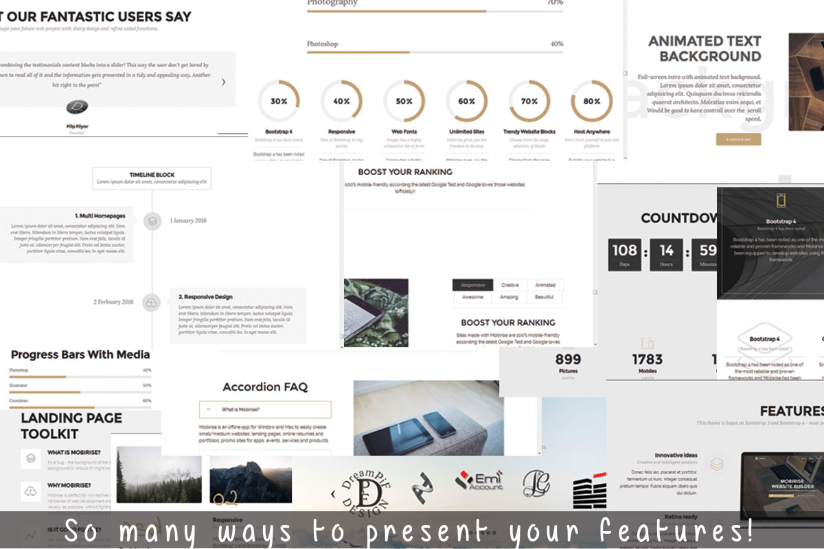
After we’ve introduced the user to the main topics of our site it’s time to talk about the details. This is where the features blocks come in hand. And with the Blocks Pack there are plenty ways to do that. First of all – any effect introduced with the Intro blocks can be utilized for features showcase but only this time you’ve got the necessary settings to stack the blocks either tight or loose according to your vision – the properties panel includes padding settings. With these you can make a few blocks of a kind stick to each other and look like a whole content section since sometimes we need few elements of a kind and sometimes – quite many.
Since lately I kind of got addicted to spending time in the Mobirise forums I witnessed many websites with all kind of features presented so I think there is no such thing as too many predefined featured layouts. But with the Blocks Pack even the pickiest user would find some difficulties complaining about lack of means expressing the content. Again they are combined like few of a kind with a significant difference in color scheme or styling. Let’s take a detailed look...
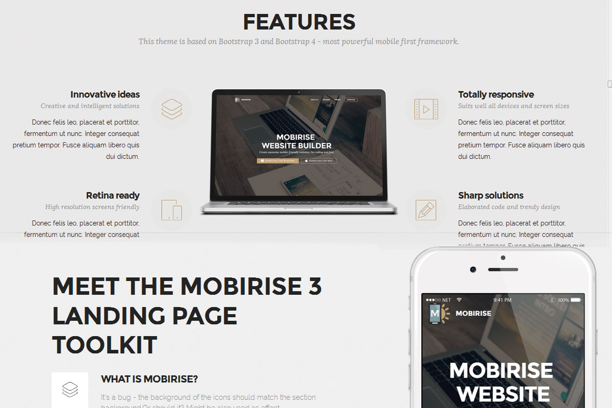
Gorgeous image with listed featured fortified with a fancy Icon – best way to present your product and describe with a few words what are the most essential things about it. Whatever are the dimensions of the product – better fitting a portrait or landscape frame – there is a predefined block for that. If it’s a short and wide the features can be placed around it and if it’s thin and tall – the features conveniently float along with it. So it really is a win – win situation.
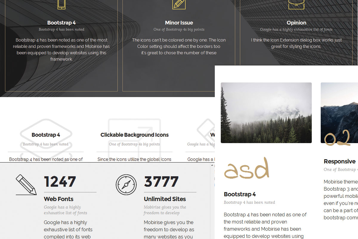
Now let’s explore the blocks consisting of elements especially designed by the bootstrap framework for multiple items of a type showcasing – the cards. It is one of the most flexible and universal elements allowing almost infinite appearances for any type of situation and this is clearly seen in the multiple features blocks consisted of cards.
Cards can generally contain any kind of content but are basically constructed of image, title, subtitle some text content and some buttons. But with some creative styling and the aid of the thousands of icons in the icons pack the possibilities become unlimited. According to the particular appearance and fallowing the grid layout of the bootstrap network there can be up to six card elements in a row and since it’s multiple elements we’re talking about the minimal number is two. This flexibility combined with the well thought Block Properties options and the newly introduced Style editor gives the user almost unlimited capabilities without any knowledge of code.
The blocks consisted of cards are so powerful that they are used also for constructing the blocks in which you can share what your clients think and say about you – we’ll talk about these a bit later.
But first let’s talk a bit about functionality
Welcome, Functionality – so nice to finally meet you!
Since the beginning of my work with the Mobirise Responsive Web Builder alongside with admiring the ease and intuitive way web sites come to life with it I was always missing some functional elements in order to better express or organize my content.
I’m sure you’ll agree with me for example a stack of long texts containing essential information can easily bother the eye and draw the user away from your website. Another example – you’ve purchased a domain, set up the emails and almost instantly released multiple Identity materials with the domain and the emails on them. This have happened to me several times with not so aware clients coming in search of a business card, flyer or a brochure design to blow their clients heads away and providing me with nothing but their Gmail address which in my opinion is not the most serious thing to place over a luxury presentation. In occasions like these gathering a web site and uploading it to the server due yesterday becomes more than essential. And since as you might figure no actual content or a concept is present at the time the only solution comes to be creating an Expect us soon page and making it as beautiful as possible. What I love most about these pages appearance is adding as many moving and scrolling (on certain occasions even blinking!) elements giving the user the feeling there is really something going on behind the stage. Now with the Additional Blocks Pack I can easily add a countdown appealing image and one of those constantly typing and deleting and retyping again elements – it is already set and waiting for me in the intro blocks. But If I decide doing something entirely different utilizing the same elements – I still easily can – all the interactive elements are also available as feature blocks so I can combine them freely.
Another thing I love about the interactive elements is they give me additional expression means – like the flapping countdown cards or the rapidly ascending counters allowing me to briefly state some numbers about the subject of the site and make them swiftly understood with the expressive and scalable icons. And let’s not forget the circular and linear progress bars showing multiple degrees of completion or perfection in a field.
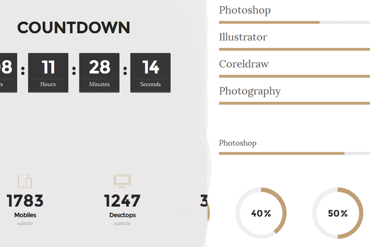
Probably the best thing about these elements is they do not come as a standalone implements proudly taking place in the middle of the block. They are all combined in multiple creative appearances giving you the power to just pick the one fitting your needs best.
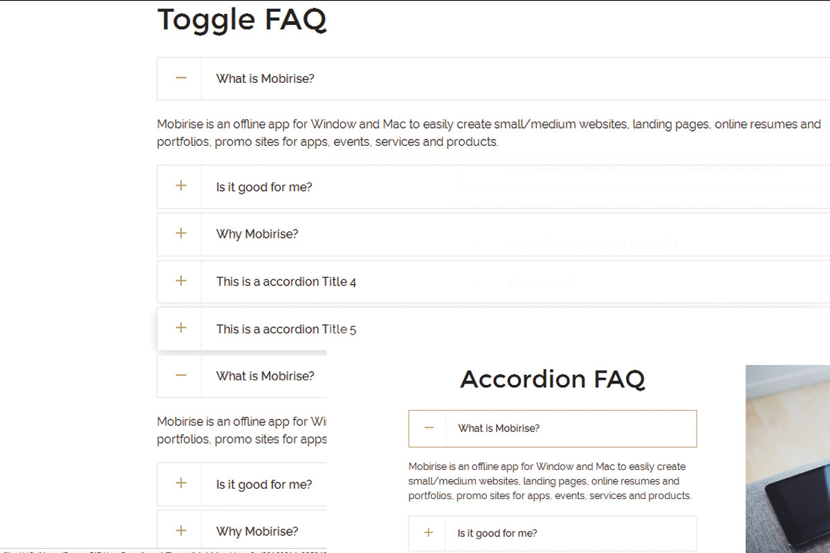
A few words about gathering intense text content into one place and making it look light to the user – it was a pleasant surprise for me discovering the collapsible and tabbed content blocks. They come with customizable number of elements – up to 6 actually which is more than enough and in a standalone and combined with an image layout. In addition the accordion and toggle elements can be easily expanded practically without limit by just placing two or more elements of a kind underneath each other and setting the corresponding padding value to minimum. This creates a seamless appearance on the preview and the user sees it as a single element as it should be.
Testimonials blocks
The great looking and versatile testimonials blocks are actually also cards but his time we’ve got an additional element – a cool row of icons letting you add some links to the social network profiles of each member in some of the blocks. The number of these is being fixed to four which in is quite plenty for placing the most essential links and just enough not to overwhelm the segment and assure best appearance even with the six cards in a row option selected. Some of us do have less social media profiles though – easy thing – just select a color blending with the background, Icon Size of 1 and set the target url to # - this practically solves the issue still leaving you options if you need to change it later on.
Another great thing about the testimonials blocks is the amazing way they get implemented into customizable sliders. So now if you have multiple feedbacks to share with your potential clients they don’t have to scroll and scroll down and (again) eventually get bored and browse away. All they need is read and the website changes the available feedbacks for them!
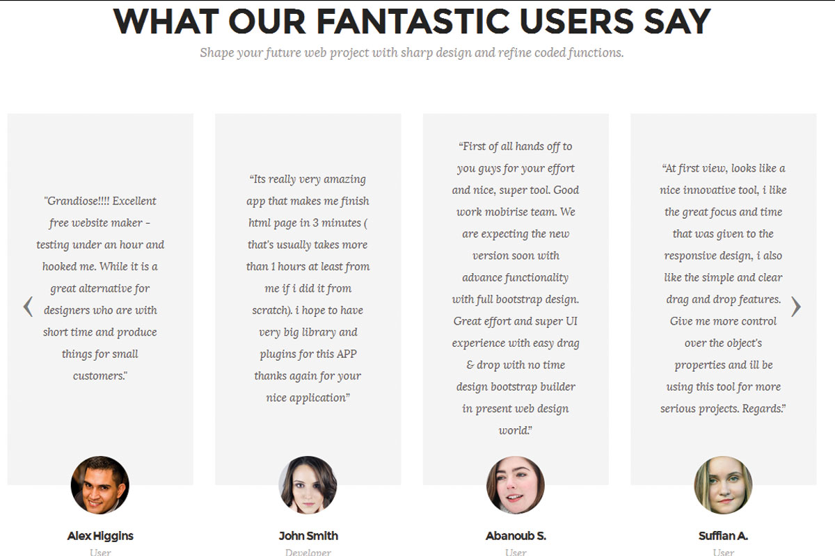
Combining content elements into a slider like behavior is a brilliant idea! You even get to choose how many items to display – from one to four regarding the length of the feedbacks you wish to share. It is a practical thing to consider that the length of the feedbacks combined with the count of them you decide to display at once might strongly influence the overall appearance of the entire element – choosing multiple long testimonials at one screen might cause the block expanding beyond the screen height turning what’s meant to be easy for the user to perceive into an exhausting experience. So be careful with this.
Order your timeline!
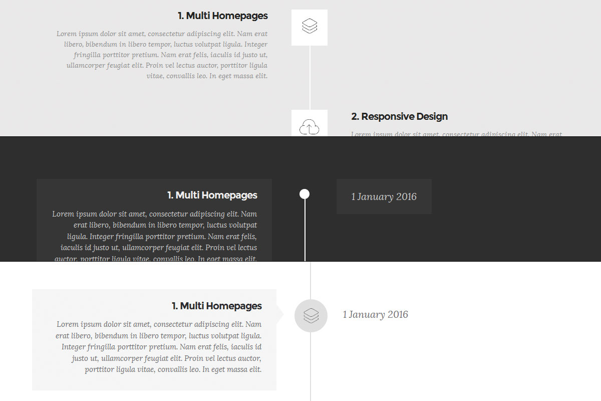
Lastly but not in significance come to be discussed the timeline blocks. These are actually much flexible elements that one could possibly think at first. Look at it this way – the so called timeline bock actually come to graphically represent a sequence – ANY type of sequence. It can of course be the history of your company or a project but as well can successfully describe the way a product gets assembled or properly installed. It might be used for any type of guidance you’ll eventually need and since there are implements utilizing icons as midpoints you can fortify your content with one of the thousands predefined graphics. So it is useful and flexible block at the same time.
About preferences and design options
To be frank with you this is not the first large set of predefined blocks offering all kinds of appearances and functionality I’m exploring and writing about. Earlier this year I had the chance taking a look over an external theme claiming to have it all. And yes it did – just like on the preview and at the same time – no it didn’t because of the almost total lack of customization available. So at a certain point I found myself engaged in the riddle of composing the CSS code giving the designer who might actually use the thing one day the ability to style things in a way different than the way they already are. It was quite an adventure.
This time it’s the other way around. You’ve probably already noticed there is no custom code in the entire article. This is because there is nothing to be asked more than what’s already included in the Block Preferences and the Style Editor Panels. This is the reason I like the native Mobirise extensions best – they are actually doing what are intended to – they just work well. And in my opinion what’s most important for any tool is the convenience it is reliable. Just like all the native Mobirise Themes and extensions.
Conclusion
Today we tried getting familiar with the Additional Blocks Pack for the Mobirise Mobile Web Editor released by the development team recently. The truth is this was just a quick glance since the topic is rather vast. There are so many blocks with so many customization options I this package that the possibilities are unlimited and as I see it the best way getting really familiar with something is using it on a real project with real life client requirements – this is where all the strong and weak sides come out almost immediately. But I’m pretty calm about the Additional Blocks Pack – it will perform just fine even perfect and I’ll tell you why.
I’m actually picky and cautious with the new products. Nevertheless how perfect seems to look a product at a first glance I’m always trying to spot its weaknesses, the hidden catchups – I think it’s better this way since I know what I’m dealing with from the start – so I look for potential issues carefully. My approach is no different with the products of the Mobirise team and as we saw together in the previous articles if I find something – I’m trying not to criticize but to propose a solution to it – after all The Mobirise Project is a work in process – improves almost every day.
The good news are with the Blocks Pack I was unable to find an issue big enough requiring some custom CSS in order to make things as they should be. Everything is in place, works as supposed to and has all the styling options one would ever need in order to make blocks fit any appearance.
It does cost money someone might say – why should I pay – someone might say. Well folks Yes It does. But let’s leave the Additional Blocks pack aside – will get back to it in just a bit – and think of some other field in life – let’s say woodworking. Do you imagine creating a shelf or a chair just with your utility knife? Most certainly you could – in a few weeks or something – but you certainly would not try doing it this way. If you consider taking time doing some woodworking you would definitely gather at least the minimum tools for that. And unless you already have someone to take the tools from for a while you’ll have to spend some money for these, right?
Now back to Mobirise Builder – it is free. And with the free version you can achieve a lot without spending anything. A startup business or an individual can have a great looking website for free (paying actually only to the hosting service containing it). But if you already feel the need for something more, want to do something better with your sites or maybe started doing it for others as an additional or main business I think the price for the Blocks Pack is quite fair. For your money you’ll get a quality power tool not a Chinese shiny piece of junk.
So basically that’s it guys :) And remember Mobirise in not just a great web site building solution – it’s also a Community. So make sure you visit the forums, share your opinion and experience get some inspiration and maybe even help others – that’s what communities are for.
Happy designing!
_____________________________________________
GoDaddy Responsive Website Builder
Have you ever looked into buying a domain name, building a website, or watched a Super Bowl? If so, you’ve probably heard of GoDaddy. As the largest registrar in the world, GoDaddy manages millions of domains, as well as providing a suite of features and tools for those who take the DIY approach to web design.
When you sign up to use GoDaddy’s responsive website builder, you’re met with a choice of three plans. Each of them carries an introductory price, starting at $1.00 per month for Personal, $5.99 for Business, and then $10.99 for Business Plus. After the first year, the prices rise to $5.99, $10.99, and $14.99 per month.
While the Personal plan is the least expensive, it comes with few options. You’ll get a free domain name, about 50 templates, and a reasonable amount of bandwidth and storage for a small site. Move up to Business, and you’ll see the 100% price hike gives you many more responsive and mobile-ready templates--over 300-- to work with. Add triple the bandwidth allowance of the Personal plan, along with a mobile site and business email accounts, and you have everything a growing small business needs. The last plan, Business Plus, adds more of almost everything though the real value is in the included SEO and SSL certificates.
So what’s it like using the website builder? The only way to know is read reviews or buy in. GoDaddy could easily win more converts if they would give potential customers a free trial. Even if the templates were restricted to a handful, and publishing wasn’t allowed, we’re confident it would still win over most dabblers. If you still want to try, remember the low introductory price and their easy 45 day refund policy.
The builder is commonly referred to as a “blank canvas” builder. Within the context of the templates, you can drag and drop elements at will. If something is in the way, you might have to manually move several elements to make room. The builder won’t shuffle them automatically. Still, it’s easy to add elements, especially when you pull them from the ample pool of included social media plugins and other widgets.
The general features are what you’d expect in a proprietary builder. The themes are well categorized and cover the needs of almost all users, even coming with mobile versions. Shopping carts are available, but sometimes cost extra. Website backups are fairly simple. Exporting your site isn’t an option, meaning once you create it in the GoDaddy responsive site builder, that’s where it stays. If you think you might eventually want to move your site to Wordpress or some other platform, it’s best to avoid creating the initial version in GoDaddy’s environment.
If you have other questions or something goes wrong while you’re building, reach out to support. GoDaddy routinely receives accolades for their support ticket response and timely solutions.
In the end, GoDaddy’s bootstrap html builder is comparable to what most big registrar sites offer. For basic needs, you’ll have a choice of plans, plenty of templates, and a relatively easy learning curve. You’ll still need some design sense, or outside help, if you want a well crafted site that meets the expectations of modern users.
Whatever your needs, GoDaddy’s website builder with responsive design can probably meet them. Though a free trial is still an option we’d prefer, we’re comfortable recommending the initial $1.00 buy in to get started. For it’s flaws, it’s still one of the better low cost builders you’ll find.
