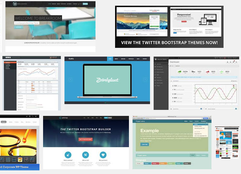
Free bootstrap themes
SpaceM Free Bootstrap Theme – simple, clean, powerful. Perfect for a serious showcase – just clean and functional content. The best theme for a serious startup
Content is the essence of the document. All we do, whatever fancy styling we apply or appealing pictures we pick to brighten our sites it all narrows down to it in the end. The content it the foundation of every project – the flash we wrap around the structure of our concepts and polish with some fancy appearances. The content is the bond making the web site consistent and showcasing it the best way is the responsibility of the designer.
When it comes to a serious matter – like technical or financial details for example or showcase of an engineering project for example probably the most important styling rule comes to be the KISS one – “Keep it simple, Stupid” – people used to reading dry numbers and charts might get confused and even pushed away from too much shiny effects, sliders and forms taking place in your web site. At the same time alongside with being business or exact science people such kind of audience can get bored by monotonous content showcase as well as the common user would – let’s not forget they are also people. And lastly but not in importance – a website is meant to evoke certain reaction – trill, get attention of the audience even provoke them taking certain action. Think of a site for a startup entrepreneur trying to sell his or hers idea and get funds for developing it or a startup business trying to break through with a great new product.
At the bottom line it all comes to balance – how to neither shock the audience and scare them away nor put them to sleep but to trill them just enough to read what you need till the end and say “Hey! That’s good – let’s try it out!”
Now let’s flip the pancake and observe the question about creating serious content web site from a different angle. Let’s say it’s exactly a startup new business we’re talking here – a one man army fighting on achieving a dream. What such has – probably a lot of energy and enthusiasm? What it probably lacks – skills in areas different then its own (which for the example we’ll assume differs from web design and programing) and funds hiring other people (creating a web site to showcase the project to the world). Judging from my personal experience such people have tons of knowledge in their own sphere but lack any interest in taking much time learning something outside it.
How could such startup get a simple website of their own – they most obviously need one if a funding should be raised, product or an idea sold – don’t they? So eventually they get faced a dilemma – hiring an external contractor creating a web site for them – meaning spending money and time in explanations at first and multiple corrections later die to the specific matter of the content OR somehow doing their website on their own typing just the right words and placing just the exact images. In addition they often happen to be part of the same sphere as their audience so it’s most probable they happen to know the exact way to structure and showcase the content in order the audience to get it best.
Stated this way it looks like building a web site on your own comes to be the better solution but there is still the probable lack of any knowledge about what web sites are and how they get created issue.
This is where Mobirise Bootstrap Theme Builder and the SpaceM bootstrap theme we’re going to talk about today come on scene to save the day!
What is it?
Since you’re reading this you probably are aware that the Mobirise Bootstrap Builder is an awesome lightning fast offline solution for creating great looking totally responsive websites without any knowledge in coding using just the skills you have from working with your ordinary office applications like text editor and file browser – I’m not going to bother you with that.
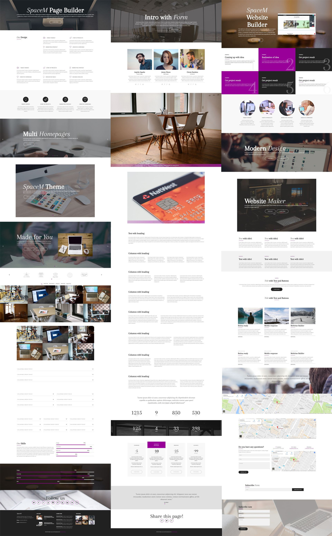
What I think is much more interesting to discuss today is the brand new SpaceM theme freshly introduced in the 3.06.4 version of the software. It provides exactly what’s needed to launch a startup business in the outer space with the sleek balanced and appealing appearance provided by the predefined Mobirise blocks.
Simplicity, consistency and guidance
Simple and clean rule all over the theme. Space is being utilized the most practical way – the intro blocks (having a shiny image backgrounds as an unwritten rule these days) have practical padding options allowing them to take just the place needed for the text content and no more in order not the bother the users in a hurry with scrolling, the content blocks provide multiple ways listing different feature and fortifying them with one of a thousands icons provided, long text content blocks can be tidy put in collapsible elements to save space an come out only when needed and even balanced movement is added to the theme with the counters, progress bars and forms. It’s all about the balance we’ve just talked about and Space M happens to have exactly what’s needed to create a simple and clean still appealing appearance.
The blocks are flexible enough to obtain structuring multiple consistent layouts without the gaps between the particular elements being recognized by the viewer. Showcasing your content you get guided choosing a single color to rule all over your website – for example your company’s logo main color – obtaining a balanced and easy readable appearance. Through the relative recent new function in Mobirise Bootstrap Builder – The Style Editor you can experiment with this color and change it for the entire web site with a few clicks – your choice gets reflected all over the project instantly.
Nevertheless you do have multiple styling options available in each block’s Properties panel the designers of the theme have taken care of guiding you along the way setting the most preferable as default in case clean view is what you seek. Almost any block can have an image or video with overlaying solid color adjustable in opacity but by default the background is being set to the good old solid white color being associated with both purity and the good old sheets of paper. This way the content gets easily perceived without any distraction. My friendly advice is - if there is something serious or difficult you need to present - keep it this way – it would be easier for the use to concentrate on what you’re trying to say.
Innovative navigation
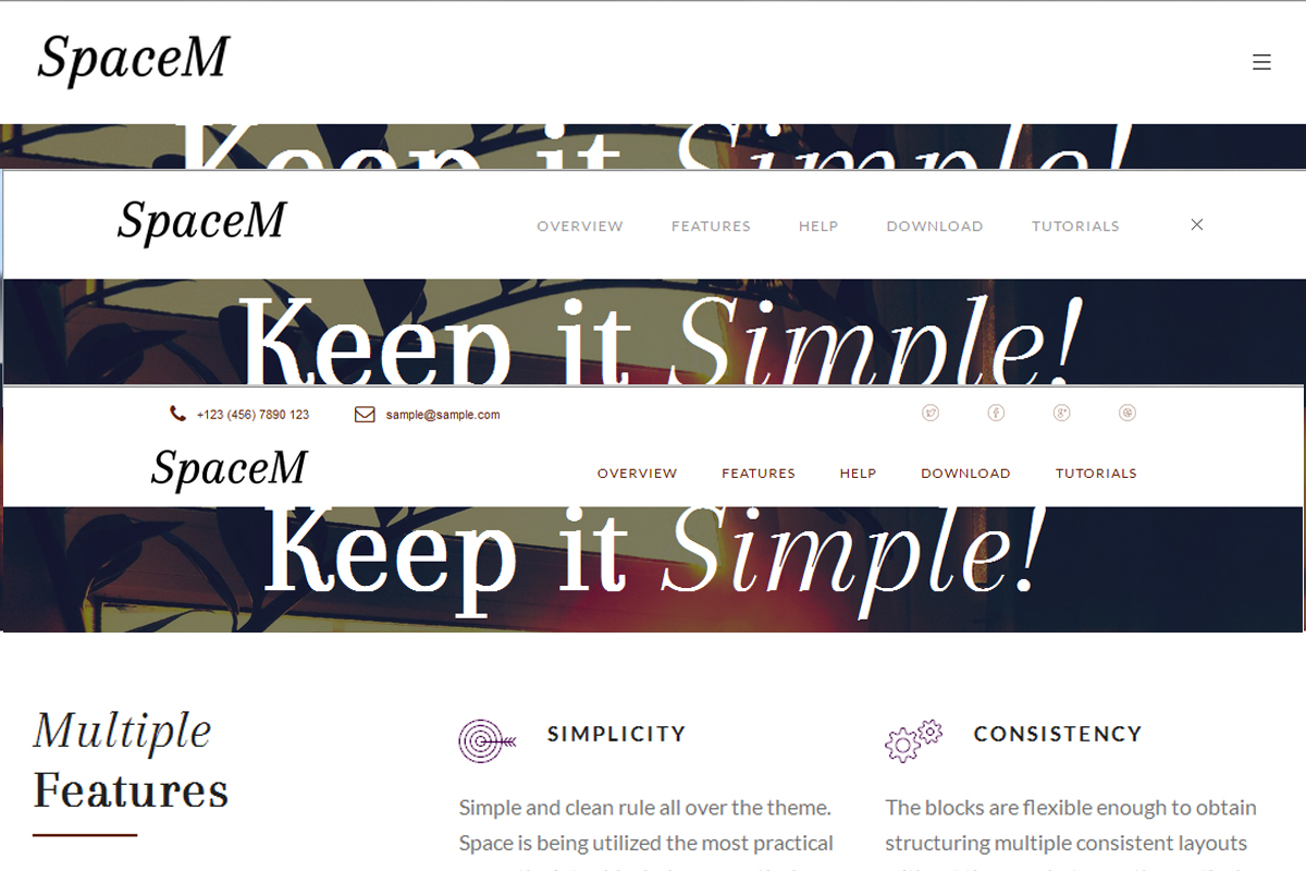
The Navbar is actually the very first thing the user sees laying an eye over your website. It should be both appealing and convenient. In SpaceM alongside with the classical one we have two more bright new Navbars included offering entirely new functionalities.
Contacts always one click away
A clever solution presented by one of the new Navbar blocks gives the opportunity of setting you contact details at the very top of your website – right above the navigation. The options available to set are more than enough – you’ve got to set your company’s phone and email alongside with links to the most popular social platforms. Everything is entirely customizable – through the Icons Extension you can replace all the icons and even set your custom color and height preferences for them. Same counts for the contact links which are being styled to act as buttons when it comes to picking a color for them.A little extra touch has been added in order to expand functionality – contact info is being made clickable so if you’re browsing the site from your phone for example a simple tap over the particular element automatically brings out the application handling it – either the phone or your favourite email client. Do note in order to keep it this way you should also keep the “tel:” “mailto:” strings in front of your actual details.
The behavior of this navbar utilizes screen space quite well again in mobile style – when you scroll down the contacts area gets hidden assuming you need more space getting familiar with website’s content. When you decide you need it however and try scrolling back up to get it the contacts appear within just a few scrolls up – clean and convenient.
Rediscover collapsing
Remember the fancy fly out feature in Mobirise 3 bootstrap theme? Well guess what – it have just evolved. The second entirely new Navigation appearance combines the collapsing feature with the classic appearance meaning at initial page load the user gets to see only the hamburger icon. Clicking on it does not bring out the heavy side panel but rather just slides all the menu items in their classical positions – over the navigation bar. For those having problem with the large amount of space taken by the fly out on Mobirise 3 – it still covers most of the page – but seeking for a way cleaning the web page vision as much as possible this would be the perfect solution I think. Of course after a certain device screen width this appearance gets replaced by the classical mobile fly out covering the screen but since it’s mobiles we’re already talking about – this way gets to be much more useful on these.Elegant Intros
The Intro elements has gone through quite a change. In order to assure the sleek and light overall appearance of the web site they are now capable of shrinking up to almost half of the screen height. This way the text and imagery content pop up without being disturbed by the background and in addition some space is being saved. These blocks height gets controlled by certain things – the amount of text they contain and its font height property, the dimensions of the inserted images and the Padding sliders values. I think paddings and text are quite intuitive to manipulate in order to maintain the desired height but when it comes to images there is a little detail you should consider – by default they are set to scale to a point where the image width and the width of the containing it element match – meaning whatever image you insert it will always be as wide as the dummy one taking the placeholder upon inserting the block.
Content blocks
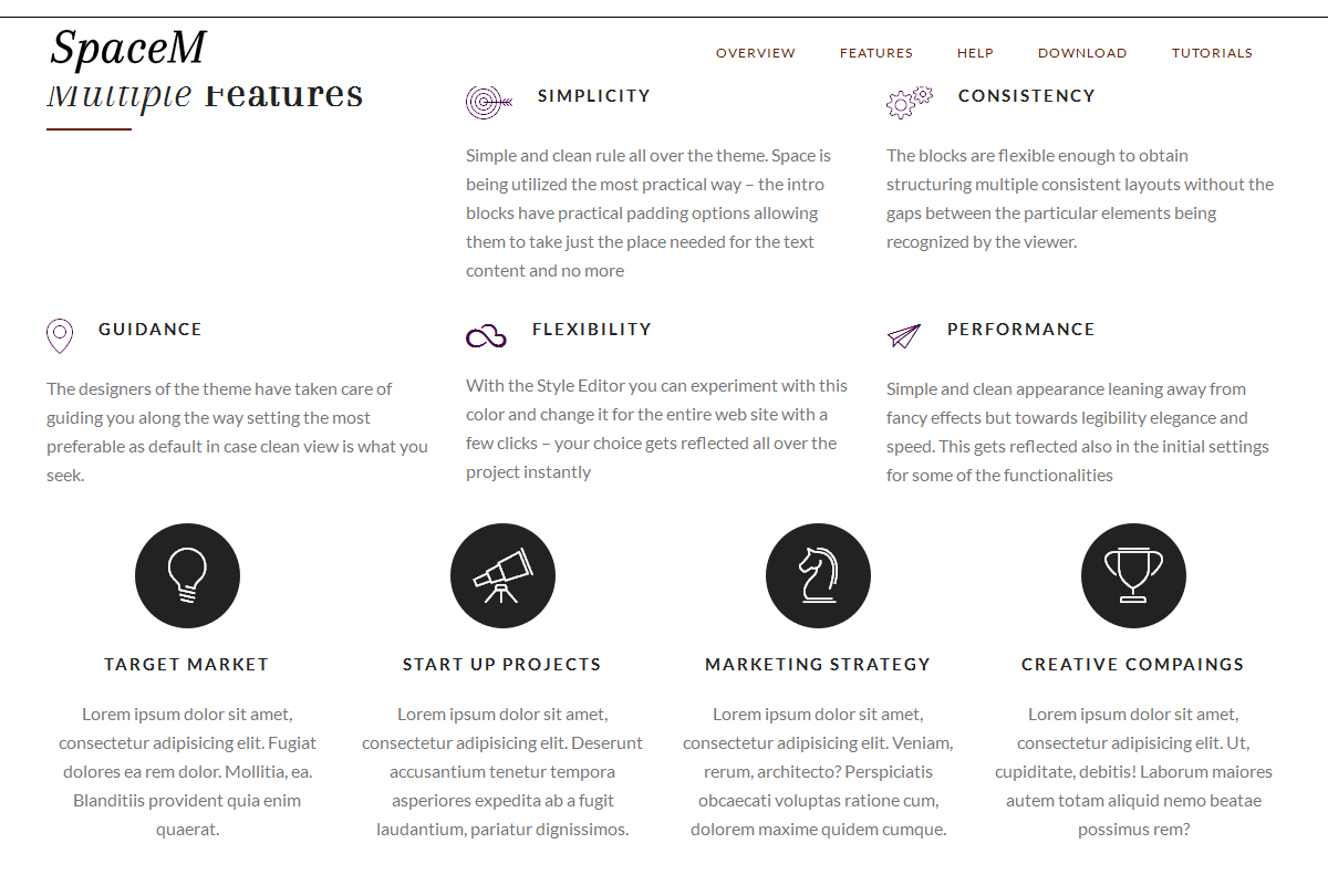
This is the gem in the crown of the SpaceM Free Bootstrap Theme. Tidy arranged and having the option of setting the caption either above with the first features listed, above them or omitting it at all. Achieving the exact number of features you need for your presentation gets done by combining few of the predefined blocks and adjusting the number of blocks displayed and the corresponding padding setting until they start looking like one whole section.
Creating an article has never been easier with all the possible column layouts taking place in the predefined blocks section. And again combining a few of them and setting the right padding settings gives the consistent appearance. There even is a block giving you the opportunity placing three short materials inline on desktop. There also is a block ready and waiting to contain your news – all you need is pour them in.
›› Read Next: Part 2 - More Blocks and Features in SpaceM Bootstrap Theme. Free ... ››
_____________________________________________
_____________________________________________
_____________________________________________
Gone are the days when website designs are like fitting a square peg in a round hole – static and non-responsive sites. Today, we have several tools and platforms that have pushed web development to an entirely new level. One of such tools is Bootstrap.
Bootstrap also known as front-end framework is a tool/collection of tools used for creating websites and web applications. It comprises of HTML and CSS framework, as well as JavaScript extension. Special features of Bootstrap include; ease of use, web-browser compatibility, open source, consistent design, responsiveness, and above all, it is absolutely free.
What is Bootstrap Theme?
Every effective website is built on an organized structure or unifying composition. Free bootstrap themes perform the same function as regular themes on other platforms. They help you define your identity. It includes your font type and size, colour scheme, and combinations, amongst others. The fun part about building websites and using themes is the fact that there is a variety of free and paid options to choose from, saving you the stress of building and customizing a theme from the scratch.
How to use Bootstrap Themes?
So how do you use Bootstrap themes? The procedures are relatively easy and vary between applications. The general process is summarized below.
- Download and install Bootstrap generator
- Visit the site that has the theme you like and purchase or download it for free, as the case may be.
- Edit the css, js, or html codes
How to Create Bootstrap Themes?
Bootstrap’s current version, v3 allows users to create and modify themes without tampering with the core of the program. The steps are summarized below.
- Create an HTML template
- Overwrite the original properties using CSS
- Or customize the Bootstrap version
N/B: Each of these methods has their advantages and disadvantages.
Best Resource to Download Bootstrap Themes
Although the list is endless, here is a list of 10 top sites to get bootstrap themes from. We’ll just list them (In no particular order).
- Bootswatch
- Bootstrap Zero
- WrapBootstrap
- Strart Bootstrap
- Black Tie
- BootstrapMaster
- Bootstraptaste
- Bootstrapmade
- Bootstrap Stage
- JumpStart Themes
Conclusion
Bootstrap is a very versatile and competitive framework that has potential, saves time, and is easy to use. In general, using Bootstrap will depend on the site you want to build, its functions, and complexity.