Bootstrap flat theme
As web design trends go, responsive design is building steam and isn’t showing any signs of slowing. One of the primary drivers of that trend has been Bootstrap. Born in the offices of Twitter in 2010, the framework has steadily evolved into a design force.
The premise of Bootstrap’s newer versions is to put the mobile design front and center, adapting to different screen sizes as needed. Behind the scenes, this responsiveness is done through LESS stylesheets, converted via JavaScript. The code is attached to a scaffolding, which lays out the page in a grid, making it simpler to place elements where you want them.
Like any modern framework, Bootstrap supports themes. To generalize, a theme is the overall look of a website, from the font styling, to color choices, to the placement of individual elements. A theme gives the site a uniform look to each page it displays. If you’ve done any web design, no doubt you’ve noticed Wordpress theme sites around every corner. Bootstrap comes with similar abilities, and theme repositories are growing with the popularity of the framework.
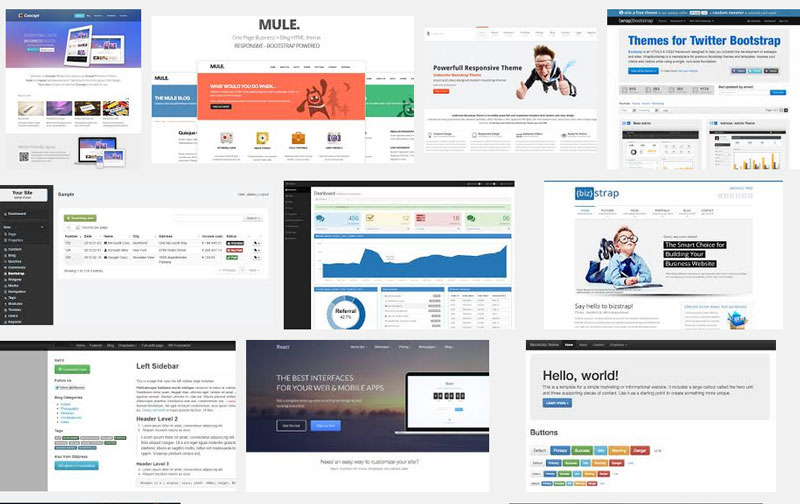
If you’re hunting for themes, we recommend checking out flat themes. As of late, flat themes have been the most downloaded, partly due to the flat look taken up by modern mobile operating systems and applications..
We’ve listed a few places to find quality selections, though not all are free.
● http://flatstrap.org/ - This site is as basic as it gets. It’s a free, flat design Bootstrap theme. The scaffolding, CSS, and JavaScript are all included, along with well written documentation on using the theme.
● https://bootswatch.com/ - A grouping of free, basic themes, easily customized for your needs.
● https://wrapbootstrap.com/ - This is similar to BootsWatch, but a paid version. All the themes are reasonably priced, and the search function helps you narrow the list down to flat themes.
But now that you’ve found and downloaded a theme, what do you do with it?
You’ll notice most theme downloads are packaged in a similar format. The file types are categorized through folders, with CSS files in a folder, graphics files in their own folder, etc. Put these files in a separate place from your live website files. It’s better to build the theme off to the side before publishing. And as with most technology projects, backup your current files before editing or replacing them. If you’re building a theme for a new site and don’t have any old content, you’re probably OK.
When it comes to customizing your theme, the basics of CSS apply. The scaffolding and CSS in the theme may have some random text filled in, called lorem ipsum, which you can replace with your own. The grid system in Bootstrap keeps things well organized. You can tinker with the structure, but start with small changes and test often, remembering your steps. Stylesheets can move from simple to complex quickly, creating troubleshooting problems later. And if you do get stuck, the www.getbootstrap.com website has thorough documentation to help you out.
To be sure, BootStrap is on the leading edge of web design. Their responsive bootstrap carousel format and devotion to open standards creates a fertile ground for designers and developers to customize sites for almost any need. Among the happy crowd you’ll find a few detractors, however. Rumblings of BootStrap being a poor choice for Wordpress, or not keeping up with other frameworks like Foundation. Overall, we still see BootStrap as a sound choice for mobile and full sized sites, and its low barrier to entry is a boost for entrepreneurs. Give it a shot and see how it can liven up your website.